- Home
- :
- All Communities
- :
- Products
- :
- ArcGIS Web AppBuilder
- :
- ArcGIS Web AppBuilder Questions
- :
- Re: Web App pop-ups issue
- Subscribe to RSS Feed
- Mark Topic as New
- Mark Topic as Read
- Float this Topic for Current User
- Bookmark
- Subscribe
- Mute
- Printer Friendly Page
- Mark as New
- Bookmark
- Subscribe
- Mute
- Subscribe to RSS Feed
- Permalink
Hi all,
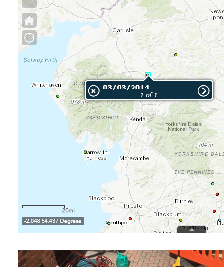
I have a web app on AGOL which uses one of the provided basemaps and a simple point vector layer. The pop up boxes on the app look great!:

But when this map is embedded into our website, everything still looks great apart from the pop up boxes which change to some nasty 90s style box! what gives?

Clicking the > button on the pop up leads to the whole web app being taken up by the pop up box!:

Thanks,
Theo
Solved! Go to Solution.
Accepted Solutions
- Mark as New
- Bookmark
- Subscribe
- Mute
- Subscribe to RSS Feed
- Permalink
Ah ok so all I had to do was add this to the end of my web map URL: &mobileBreakPoint=100
'100' being the amount of pixels the map width has to be before it switches to mobile mode with mobile pop ups. I believe the default is 600. So change it to whatever you want.
So my final embedded code is:
<style>.embed-container {position: relative; padding-bottom: 80%; height: 0; max-width: 100%;} .embed-container iframe, .embed-container object, .embed-container iframe{position: absolute; top: 0; left: 0; width: 100%; height: 100%;} small{position: absolute; z-index: 40; bottom: 0; margin-bottom: -15px;}</style><div class="embed-container"><iframe width="500" height="400" frameborder="0" scrolling="no" marginheight="0" marginwidth="0" title="Sinkhole_map" src="FULL URL OF MY WEB APP MAP&mobileBreakPoint=100"></iframe></div>
Now I'm getting the normal 'desktop' pop-ups on my embedded map. ![]()
- Mark as New
- Bookmark
- Subscribe
- Mute
- Subscribe to RSS Feed
- Permalink
Theo,
The issue you are running into is that your embedded app is at the size where WAB switches to using the mobile popup. So to workaround this you can define the WAB mobileBreakpoints to force the use of the desktop popup instead.
- Mark as New
- Bookmark
- Subscribe
- Mute
- Subscribe to RSS Feed
- Permalink
Hi Robert,
Thanks for clearing this up! I'll look into this and get back to you.
Theo
- Mark as New
- Bookmark
- Subscribe
- Mute
- Subscribe to RSS Feed
- Permalink
Hi Robert,
So looking at the code for the embedded map, there is no text referring to- mobileBreakPoint=<pixel number>
<style>.embed-container {position: relative; padding-bottom: 80%; height: 0; max-width: 100%;} .embed-container iframe, .embed-container object, .embed-container iframe{position: absolute; top: 0; left: 0; width: 100%; height: 100%;} small{position: absolute; z-index: 40; bottom: 0; margin-bottom: -15px;}</style><div class="embed-container"><iframe width="500" height="400" frameborder="0" scrolling="no" marginheight="0" marginwidth="0" title="Sinkhole_map" src="URL OF MY WEB APP MAP"></iframe></div>
Where do I change the setting?
Thanks
- Mark as New
- Bookmark
- Subscribe
- Mute
- Subscribe to RSS Feed
- Permalink
Ah ok so all I had to do was add this to the end of my web map URL: &mobileBreakPoint=100
'100' being the amount of pixels the map width has to be before it switches to mobile mode with mobile pop ups. I believe the default is 600. So change it to whatever you want.
So my final embedded code is:
<style>.embed-container {position: relative; padding-bottom: 80%; height: 0; max-width: 100%;} .embed-container iframe, .embed-container object, .embed-container iframe{position: absolute; top: 0; left: 0; width: 100%; height: 100%;} small{position: absolute; z-index: 40; bottom: 0; margin-bottom: -15px;}</style><div class="embed-container"><iframe width="500" height="400" frameborder="0" scrolling="no" marginheight="0" marginwidth="0" title="Sinkhole_map" src="FULL URL OF MY WEB APP MAP&mobileBreakPoint=100"></iframe></div>
Now I'm getting the normal 'desktop' pop-ups on my embedded map. ![]()
- Mark as New
- Bookmark
- Subscribe
- Mute
- Subscribe to RSS Feed
- Permalink
I would highly suggest going with a minimum value of 400 for &mobileBreakPoint, otherwise, your users on mobile devices are going to have a poor experience with your pretty desktop map. By setting that value at 100 none of the template's mobile functionality enhancements will kick in until the screen width is 100px wide (which will never happen).
- Mark as New
- Bookmark
- Subscribe
- Mute
- Subscribe to RSS Feed
- Permalink
How can I make a webapp map display in mobile mode (with all the mobile functionalities) on a phone or tablet BUT still retain the desktop style pop-up boxes?