- Home
- :
- All Communities
- :
- Products
- :
- ArcGIS Web AppBuilder
- :
- ArcGIS Web AppBuilder Questions
- :
- Re: WAB interface design question
- Subscribe to RSS Feed
- Mark Topic as New
- Mark Topic as Read
- Float this Topic for Current User
- Bookmark
- Subscribe
- Mute
- Printer Friendly Page
WAB interface design question
- Mark as New
- Bookmark
- Subscribe
- Mute
- Subscribe to RSS Feed
- Permalink
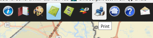
Regarding a website with WAB, I am wondering about the toolbar icons on the top. We're in the business of cartography and graphical user interface design.
What I have done:

They are all dim, unless hovered over. I'd recommend making them full opacity like below.....
... and then highlighting the background on hover, like our site www.sagis.org/home/map
I will probably implement the hover on with CSS on our WAB sites like above soon. I am considering colorizing all the buttons except Layers.
I was just curious if anyone else liked these ideas, or maybe some variation thereof? Perhaps ESRI may want to refine the standard WAB icons or at least make them not 50% opacity, perhaps add a dash of color. What does everyone think? By the way feel free to use my icons. At some point I'll probably have a public site with them. For now they are all only internal.
It would also help with accessibility for low-vision users I would think, with more contrast between icons. Bearing in mind of course that male red-green color blindness is common and building that in to the color choices.
I am seeing the flattening of UI across the Internet and white icons and text sans serif, and it seems Windows 8 has been taken as a good design cue. I am guessing it's probably a fad. Like symbology, I think it has been shown that icons should be quickly recognizeable to people, and so have unique shape, texture, and color. While balancing realism vs distilling the functionality into an icon. A cartoon of a ruler is actually more quickly recognizable than a tiny scrunched up image of a ruler, because it distills the unique visuals into a simpler and more quickly recognized image. So, thoughts from the community? This is perhaps a good project for focus group taste-testing! From the real end-users, not developers.
The end goal being discoverability. Yellow pegman and perhaps to some municipal users the Pictometry logo, are instantly recognizeable.
A sidenote, it would also be nice to have a color picker to pick an overall WAB design color from, instead of only six colors. i.e. the Dojo colorpicker.
- Mark as New
- Bookmark
- Subscribe
- Mute
- Subscribe to RSS Feed
- Permalink
Kevin,
I am a fan of the Flat UI design and would be disappointed if WAB dev team departed from this. You can always customize the themes and icons to your choosing as you are already doing. The whole color picker thing for the theme colors is a lot more complex then you might imagine (pre-generated css style sheets and rules) and this is why there are set theme colors.
- Mark as New
- Bookmark
- Subscribe
- Mute
- Subscribe to RSS Feed
- Permalink
Very good. Thank you for your comment. I will say, I haven't rolled out any WAB viewers...yet. (we are about to, soon). So, I haven't any feedback from actual end-users. These were just my thoughts. And I customized as above. If I get input from users.. I'll boil it down and post it.
Robert what do you think about the half-dim opacity versus using a background color for hover and selected as above?