- Home
- :
- All Communities
- :
- Products
- :
- ArcGIS Web AppBuilder
- :
- ArcGIS Web AppBuilder Questions
- :
- Remove logo and header on mobile device
- Subscribe to RSS Feed
- Mark Topic as New
- Mark Topic as Read
- Float this Topic for Current User
- Bookmark
- Subscribe
- Mute
- Printer Friendly Page
- Mark as New
- Bookmark
- Subscribe
- Mute
- Subscribe to RSS Feed
- Permalink
Hi
The web app I have created in Web App Builder Developer renders really well on desktops, laptops and tablets. However there is an issue on a phone where the search bar is hidden by a header on initial load.
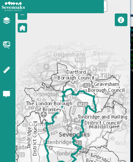
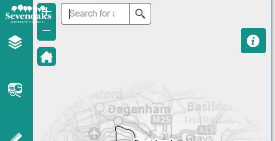
Rather than the main header, it looks like the header from the side panel as it is exactly the same width as the panel is when expanded. If the device is rotated to landscape and back again, although the logo still looks wrong:
I would like to tidy this up and the two options and I reckon there are two options:
1. Hide the logo when and header area from the side panel on a mobile device/small screen
2. Reinstate the main theme header on mobiles - this will prevent the zoom buttons and search window being shifted up and therefore they will not be obscured. I expect this may be the easier option but means there is less space on the screen for the map.
Does anyone know how I may go about making one of these adjustments - I have looked through the files and can't work out what makes it display differently on smaller screens.
Thanks in advance
Solved! Go to Solution.
Accepted Solutions
- Mark as New
- Bookmark
- Subscribe
- Mute
- Subscribe to RSS Feed
- Permalink
Mark,
OK, I found the solution. In the popup panel widget.js replace the closeWidget function with this:
closeWidget: function() {
if(this.inPanel){
//console.info(this.inPanel);
if(this.appConfig.theme.name === 'JewelryBoxTheme'){
PanelManager.getInstance().minimizePanel(this.inPanel);
}else if(this.appConfig.theme.name === 'TabTheme') {
var sbc = WidgetManager.getInstance().getWidgetsByName("SidebarController")[0];
sbc._doResize();
}else{
PanelManager.getInstance().closePanel(this.inPanel);
}
}else{
WidgetManager.getInstance().closeWidget(this);
}
},- Mark as New
- Bookmark
- Subscribe
- Mute
- Subscribe to RSS Feed
- Permalink
Mark,
What theme is this?
- Mark as New
- Bookmark
- Subscribe
- Mute
- Subscribe to RSS Feed
- Permalink
Hi Robert
Its the tabbed theme
Thanks
Mark
- Mark as New
- Bookmark
- Subscribe
- Mute
- Subscribe to RSS Feed
- Permalink
Mark,
You must have made some css of js changes then since the vanilla Tab Theme does not render the way you are showing in your screenshots. Now the fact that your logo is so wide I can see why your second screen shot is the way it is. You can hide the logo using this code change in the themes header widget.js
resize: function() {
this.switchElements(['title', 'links', 'subtitle']);
var box = html.getContentBox(this.domNode);
var logoBox = html.getMarginBox(this.logoNode);
var titlesBox = html.getMarginBox(this.titlesNode);
var linksBox = html.getMarginBox(this.linksNode);
this.width = box.w;
if (box.w <= titlesBox.w + linksBox.w + logoBox.w){
this.switchElements(['title', 'links']);
titlesBox = html.getMarginBox(this.titlesNode);
if (box.w <= titlesBox.w + linksBox.w + logoBox.w) {
this.switchElements(['title']);
if (box.w <= titlesBox.w + logoBox.w) {
this.switchElements([]);
}
}
if(box.w <=logoBox.w){
html.setStyle(this.logoNode, 'display', 'none');
}
}
},- Mark as New
- Bookmark
- Subscribe
- Mute
- Subscribe to RSS Feed
- Permalink
Thanks Robert.
I have worked out what is causing the green bar to obscure the search widget in the first screenshot - its the popup panel widget, or to be more precise the fact that it is set to 'open this widget when app starts'. I have managed to recreate this on a test app.
Do you know how I can may be able to resolve this without unchecking that box as that will lead to results appearing as popups unless the widget is opened first.
Many thanks
- Mark as New
- Bookmark
- Subscribe
- Mute
- Subscribe to RSS Feed
- Permalink
Mark,
OK, I found the solution. In the popup panel widget.js replace the closeWidget function with this:
closeWidget: function() {
if(this.inPanel){
//console.info(this.inPanel);
if(this.appConfig.theme.name === 'JewelryBoxTheme'){
PanelManager.getInstance().minimizePanel(this.inPanel);
}else if(this.appConfig.theme.name === 'TabTheme') {
var sbc = WidgetManager.getInstance().getWidgetsByName("SidebarController")[0];
sbc._doResize();
}else{
PanelManager.getInstance().closePanel(this.inPanel);
}
}else{
WidgetManager.getInstance().closeWidget(this);
}
},