Turn on suggestions
Auto-suggest helps you quickly narrow down your search results by suggesting possible matches as you type.
Cancel
- Home
- :
- All Communities
- :
- Products
- :
- ArcGIS Web AppBuilder
- :
- ArcGIS Web AppBuilder Questions
- :
- Related Table Chart widget issues in Web AppBuilde...
Options
- Subscribe to RSS Feed
- Mark Topic as New
- Mark Topic as Read
- Float this Topic for Current User
- Bookmark
- Subscribe
- Mute
- Printer Friendly Page
Related Table Chart widget issues in Web AppBuilder (Portal)
Subscribe
1041
0
05-17-2024 11:50 AM
05-17-2024
11:50 AM
- Mark as New
- Bookmark
- Subscribe
- Mute
- Subscribe to RSS Feed
- Permalink
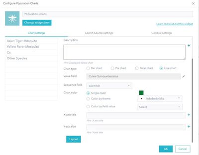
I am editing a Related Table Chart widget in a web application (Mosquito Population Surveillance Charts) using Web AppBuilder in Portal. I am attempting to create a chart for a related table, with the label field being a date field. (see screenshot below)
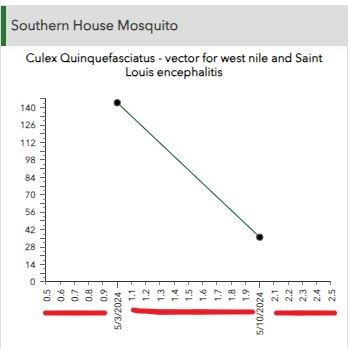
It seems like everything is set up correctly, but the widget is adding integers to the X axis (label field), along with the dates. (see screenshot below)
We want to be able to see, at a glance, changes in population over time. Another option would be a bar graph, but I do not see the option to change the layout from horizontal to vertical.
Has anyone else experienced this as well?
0 Replies

