- Home
- :
- All Communities
- :
- Products
- :
- ArcGIS Utility Network
- :
- ArcGIS Utility Network Questions
- :
- Splice Diagrams on Naperville Data
- Subscribe to RSS Feed
- Mark Topic as New
- Mark Topic as Read
- Float this Topic for Current User
- Bookmark
- Subscribe
- Mute
- Printer Friendly Page
- Mark as New
- Bookmark
- Subscribe
- Mute
- Subscribe to RSS Feed
- Permalink
hello everyone,
I am trying to generate a standard “Splice Diagram” on Naperville data and I am encountering issues that I do not understand.
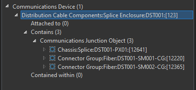
This is the workflow: I select a Splice Enclosure that contains 2 Connector Groups and a Chassis Splice (see image) and on this selection I generate the new diagram by choosing the “Splice” template.
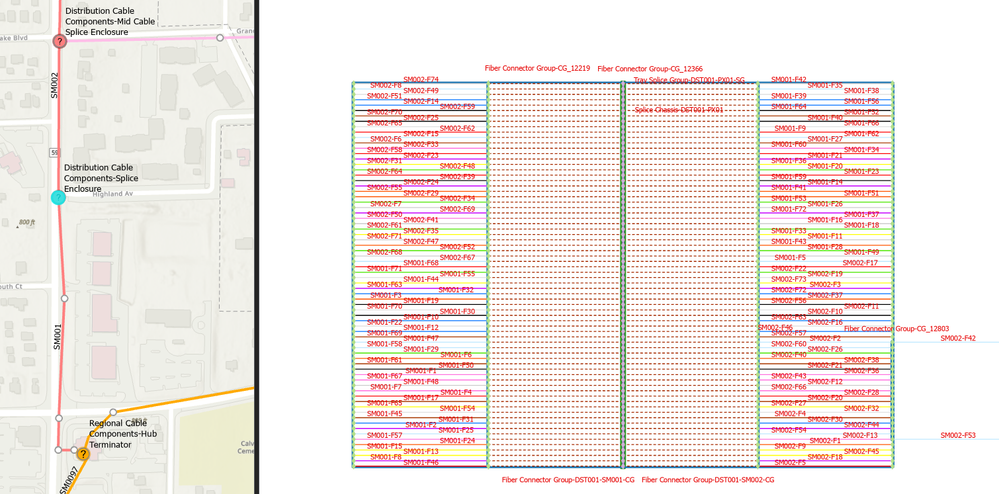
This is what I get
If I change the Layout to Mainline Tree - Left To Right I get this, which also begins to be interesting, but about which I have doubts..
These are the questions:
- correctly the Splice Points are placed in the center, with connectivities to the right and left to the Connectors of the 2 contained Connector Groups (one for each cable: which I have named SM001 and SM002), but both Splice Points are in a random order, while an order by ObjectID or rather AssetID would be more understandable, is this possible?
- why are Connector Groups also included in the Diagram that are not contained in the Device? I see 4 labeled (also for both side of fiber) while I would have expected only 2. Can I exclude them by going and deleting them in editing? I guess not.
- Can I change the spacing to compact the fibers and expand the polygons of the Junction Objects? I've tried but with each Diagram Update they come back the same as when they were created, whether the Diagram is Stored or temporary. Am I doing something wrong?
Thank you in advance for the valuable answers.
Damiano
Solved! Go to Solution.
Accepted Solutions
- Mark as New
- Bookmark
- Subscribe
- Mute
- Subscribe to RSS Feed
- Permalink
Hi @DamianoMontrasio
Here under are my comments/answers
- correctly the Splice Points are placed in the center, with connectivities to the right and left to the Connectors of the 2 contained Connector Groups (one for each cable: which I have named SM001 and SM002), but both Splice Points are in a random order, while an order by ObjectID or rather AssetID would be more understandable, is this possible?
[AY answer:] No, this is not possible. Like most of our layouts, the mainline tree layout is generic and only works on connectivity. It doesn't consider any attribute to place/order junctions and applies by default without considering containers. I mean that by default, it places junctions and edges whether they are related to the same or different containers. Also, it chooses root junctions for each subgraphs it lays out and aligns them at the left side with a logic that is not the one you expect.
However, you can develop and apply your own custom layout to place/position diagram features as you want. See below for more information about custom layouts.
- why are Connector Groups also included in the Diagram that are not contained in the Device? I see 4 labeled (also for both side of fiber) while I would have expected only 2. Can I exclude them by going and deleting them in editing? I guess not.
[AY answer:] The connector groups you do not expect in the diagram are included because the Splice Diagram template you choose to generate this diagram applies diagram rules that systematically add these devices in it. Any diagram template settings can be modified to either no longer add or remove these devices when building diagrams. However, you can never remove junctions / edges in generated diagrams. See below for more information about Splice Diagram template settings. - Can I change the spacing to compact the fibers and expand the polygons of the Junction Objects?
[AY answer:] By default, our layout runs with default parameter values. But you can edit these parameters if needed. To do so, you must click the dialog launcher (at the bottom corner of the Selection group on the Network Diagram tab in the ribbon) to open the Network Diagrams options dialog. Then uncheck the 'Use default parameters to apply layouts' checkbox.
See https://pro.arcgis.com/en/pro-app/latest/help/data/network-diagrams/review-or-edit-network-diagram-g...
When this option is unchecked and you click the layout you want to apply from the Layout gallery, the clicked layout no longer directly applies to your open diagram. Instead, the related layout geoprocessing tool loads in the Geoprocessing pane. Then, you can change the layout parameters before applying it.
However, for the layout you expect, this will not help a lot.
I've tried but with each Diagram Update they come back the same as when they were created, whether the Diagram is Stored or temporary. Am I doing something wrong?
[AY answer:] About this point, I do not understand what you mean. Diagram Update doesn't change the position of the diagram features. Could you please explain the exact workflow steps you run?
-- Custom layouts --
Based on the communications Naperville dataset you are working with, we developed a custom layout that we provide as a public add-in sample (see Create Diagram With A Custom Layout). I'm pretty sure that this layout fits your expectations.
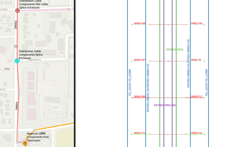
On the graphic below at the left, the Splice diagram that you get by default. At the right, the one after applying the custom layout
You can notice that the sequence of fibers started with the Globalid 3E99 at the bottom at the left was properly ordered in the generated diagram. But this was not the case for the sequence of fibers ended with GlobalID 4FEB that you expect to be reversed.
In the diagram at the right (where I applied this add-in custom layout), each sequence of fibers is properly ordered from the left to the right so all fibers inside a same connector group are regrouped at a same side.
-- Splice Diagram settings --
Your sample dataset for ArcGIS Pro SDK Community samples are downloadable: https://github.com/Esri/arcgis-pro-sdk-community-samples/releases/download/3.3.0.52636/CommunitySamp...
Once this file unzipped, have a look to the materials under Data\CreateDiagramWithACustomLayout. You will get an ArcGIS Pro project referencing a version of the Communication dataset that should be close to the one you are working with. This project also references a toolbox called Communications_CustomTemplates. Please have a look to the Splice Diagram geoprocessing model under the Enclosure & Splice toolset to know more about the Splice Diagram template settings:
To know more about diagram building process and diagram template settings, please have a look to the following resources:
- Understanding network diagrams: How to configure them
- Network Diagram Build Process Demo
- Customize diagram templates using model builders
Anne-Yvonne
- Mark as New
- Bookmark
- Subscribe
- Mute
- Subscribe to RSS Feed
- Permalink
Thank you so much for all the time you spent on my question, I really appreciated the content and I think I'm on the right direction.
Tell me if I proceeded well.
- I downloaded and located the model Builder for Splice.
- I modified the first block to run on my UN and executed
- restarted the service
- opened map with UN service
- selected the Splice Enclosure and created the new diagram
But this is what I obtain:
It's a correct workflow?
I'm using ArcGIS Pro 3.3.2
- Mark as New
- Bookmark
- Subscribe
- Mute
- Subscribe to RSS Feed
- Permalink
@DamianoMontrasio
Doing that, you updated the Splice Diagram template settings but this doesn't help to make your diagram being laid out like you expect. To apply the custom layout I told you about above to your diagram, you must install the add-in custom code. Please read the instructions here Create Diagram With A Custom Layout
- Mark as New
- Bookmark
- Subscribe
- Mute
- Subscribe to RSS Feed
- Permalink
I am looking for a tool that is not limited to use in ArcGIS Pro, but can also be used via a REST service.
The add-in seems designed to generate the diagrams only in ArcGIS Pro. I am wondering if this is indeed the case and if the solution to share them via the web is Store Diagrams.
Thanks for the support.
- Mark as New
- Bookmark
- Subscribe
- Mute
- Subscribe to RSS Feed
- Permalink
@DamianoMontrasio
Indeed, whether it can apply to a diagram created in a single database user or through a Utility Network service like shown below, this add-in command is to use in ArcGIS Pro.
However, since the main methods used in this sample custom code correspond to Network Diagrams public REST operations, nothing prevents you to apply such a custom layout through a specific command you will develop in your own custom web app.


