- Home
- :
- All Communities
- :
- Products
- :
- ArcGIS Utility Network
- :
- ArcGIS Utility Network Ideas
- :
- Utility Network export Tier data to Excel/CSV
- Subscribe to RSS Feed
- Mark as New
- Mark as Read
- Bookmark
- Follow this Idea
- Printer Friendly Page
Utility Network export Tier data to Excel/CSV
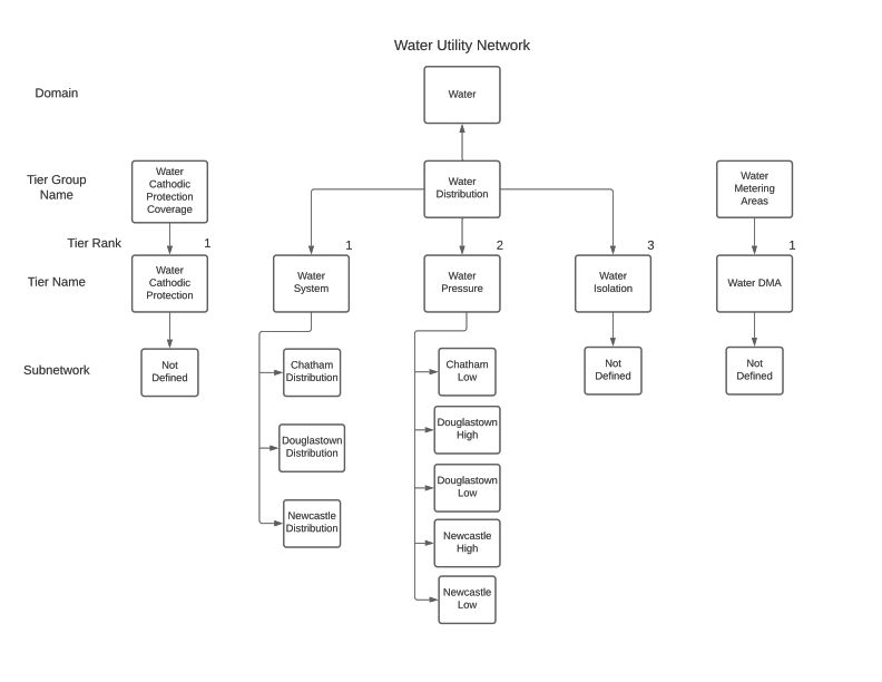
Also handy would be a visual way to look at the network Tiers, see the attached for ours.
I guess I can just post as a new post? I know one thing for sure there's got to be a better way to represent the Utility Network. When I was learning the UN and putting ours together it was nightmare looking into Network Properties to find out why I was having certain issues not to mention understanding the entire structure of the Water Template Model I used.
Yeah, it's new and will continue to get refined but these simple changes can make all users lives easier.
I'd say definitely create a new post with it because it is a separate, unique idea but equally valid.
Solutions taken from this idea (Scroll bar on Network Properties in Utility Manage... - Esri Community).
As of ArcGIS Pro 3.2 you can use the Generate Schema Report tool to create an excel or html report for your geodatabase. This includes a section that describes the tiers in your network.
You can also use the utility network properties extractor to produce this in csv format.
If you want to visualize your actual subnetworks, you can use the export subnetwork controllers tool to output all your subnetwork controllers to a csv file (that includes tiers) and use that to generate a graphic like what you referenced above.
You must be a registered user to add a comment. If you've already registered, sign in. Otherwise, register and sign in.
