Turn on suggestions
Auto-suggest helps you quickly narrow down your search results by suggesting possible matches as you type.
Cancel
- Home
- :
- All Communities
- :
- Products
- :
- ArcGIS Utility Network
- :
- ArcGIS Utility Network Ideas
- :
- Represent the Utility Network Visually
Options
- Subscribe to RSS Feed
- Mark as New
- Mark as Read
- Bookmark
- Follow this Idea
- Printer Friendly Page
2 Comments
Great stuff and hopefully this can be done via the diagrams capabilities.
Hi @RobertThomson and @ScottFierro1,
Indeed, we can imagine to generate a network diagram to visualize how the utility network is structured.
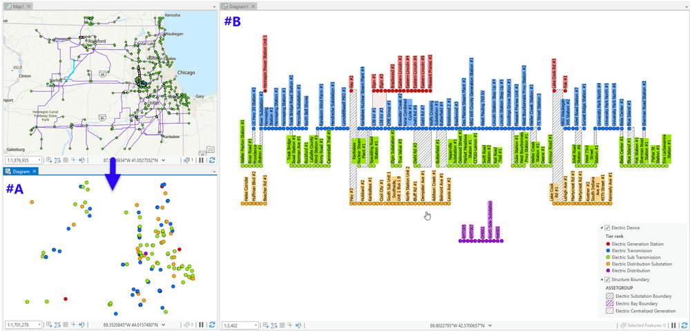
- A diagram template can be set up to generate the diagram starting from a high level network feature, from which a diagram trace rule is triggered to retrieve all the connected network features while stopping at the subnetwork controllers at the lowest level. Then, some other diagram rules can be configured on the template to systematically remove all the network features except the subnetwork controllers on which we want to focus (see diagram#A at the bottom left corner below with all subnetwork controllers at their geographical coordinates).
- Then, using our Network Diagrams ArcGIS Pro SDK API, we can develop a custom layout algorithm that positions the subnetwork controllers per tier; those related to the high level tier being horizontally aligned at the top and those related to the low level tier at the bottom (see diagram#B at the right part below)
NOTE: Such a function can be provided as an ArcGIS Pro add-in command that generates the diagram#B in one click. You can also expose the custom layout algorithm in the Layout gallery so users can manually apply the layout to the active diagram (#A => #B)
You must be a registered user to add a comment. If you've already registered, sign in. Otherwise, register and sign in.
