- Home
- :
- All Communities
- :
- Products
- :
- ArcGIS Survey123
- :
- ArcGIS Survey123 Questions
- :
- Re: Survey123 Vehicle Inspection Items & Condition...
- Subscribe to RSS Feed
- Mark Topic as New
- Mark Topic as Read
- Float this Topic for Current User
- Bookmark
- Subscribe
- Mute
- Printer Friendly Page
Survey123 Vehicle Inspection Items & Conditions
- Mark as New
- Bookmark
- Subscribe
- Mute
- Subscribe to RSS Feed
- Permalink
- Report Inappropriate Content
Hello,
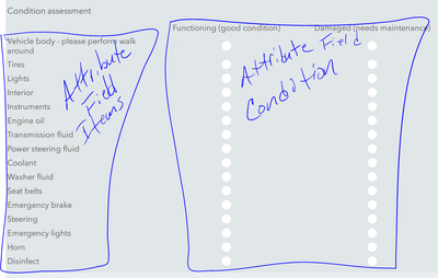
I am trying to build a vehicle inspection survey based on the ESRI Sample. The problem I'm having is that I would like to have the vehicle items inspected to populate a Chart in the Ops Dashboard with the condition of the items showing up as a Stacked chart (i.e. stacked bar graph) so that the Good and Bad conditions are shown side by side that will show a trend line as more inspections are collected. This way you will be able to see at a glance if an item is having more Good or Bad inspections over time.
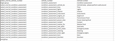
The problem I'm having is that I can't get the data to collect into the correct fields to actually be able to summarize it in the Ops Dashboard. The data needs to be in 2 fields - Item & Condition. But it also needs to be easy for data collection. Using the sample provided by ESRI doesn't work since each item is its own field and can't be aggregated as attributes of the inspection record.
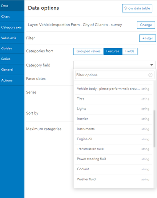
As shown below, when you go to add the data as the source for the chart in the Dashboard, you can only select 1 inspection item to display its condition. I want to use the Item category field and split it by the Condition field.
Any suggestions on how to format the Survey form to allow the data to be collected in 2 attribute fields while still making it as easy to enter as the Single Choice Grid format? I've tried a bunch of Survey options but can't seem to get it to work the way I want. I don't want to do a Repeat since the submitter will miss items or lose track of what they've done by choosing 1 item and condition at a time. Ideally, the format would look like the Single Choice Grid, but the data structure on the back end would be 2 fields pulling from the list of inspection items and conditions.
Thanks,
Andy
- Mark as New
- Bookmark
- Subscribe
- Mute
- Subscribe to RSS Feed
- Permalink
- Report Inappropriate Content
When I had this I used the new Data Expressions in the new Ops.
This is the code to grab all the codes from a field and make a unique list. You can modify this to combine all the fields into 1 for Ops.
var p = 'https://arcgis.com/';
var tbl = FeatureSetByPortalItem(Portal(p),'d12b2660551809af6da09',9,['UnknownCode'], geometry = false);
var dups = []
var Dict = {
 'fields': [{ 'name': 'dups', 'type': 'esriFieldTypeString' }],
 'geometryType': '',
 'features': []};
var index = 0
var last = ''
for (var f in OrderBy(tbl, "UnknownCode")) {
    if (f.UnknownCode == last) {
        Dict.features[index] = {
            'attributes': {
                'dups': last,
            }}
        ++index

    }
    last = f.UnknownCode
}
return FeatureSet(Text(Dict));
You could also combine them all in the form into one field but then you will prob want to parse it back out. Not sure getting the charts to act right in ops is a pain.
Hope that helps.
See these for more info
https://www.arcgis.com/home/group.html?id=ba3070ceede54f1981012811c51b7f78#overview
- Mark as New
- Bookmark
- Subscribe
- Mute
- Subscribe to RSS Feed
- Permalink
- Report Inappropriate Content
Doug,
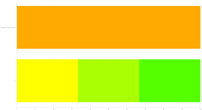
Thanks. This definitely pointed me in the right direction. Since I'm not an arcade coder, I'm having a hard time getting this to work the way I want. I am able to get fields to be included but the graph isn't displaying the way I want. Below is how I implemented the code sample from you. I tried with 2 inspection items to sample. I am able to create a stacked graph but I need to display the inspection item (i.e. Tires or Lights) on the Y axis of the graph and the condition count on the graph: Green = Good, Orange = Needs Maintenance, Grey = N/A and their size is the count or sum of the inspections submitted. I am getting separate graph elements from the inspection items in the script, but I am not sure how to label them correctly or setup so I can filter by Vehicle or Date and see how many of each condition have been reported through the survey.
I appreciate your input.
Thanks,
Andy
var p = 'https://arcgis.com/';
var tbl = FeatureSetByPortalItem(Portal(p),'434c9f800ef84a95bb0b20763135c82c',0,['*'], geometry = false);
var dups = []
var Dict = {
 'fields': [{ 'name': 'condition_assessment_tires', 'type': 'esriFieldTypeString' }],
 'geometryType': '',
 'features': []};
var index = 0
var last = ''
for (var f in OrderBy(tbl, "condition_assessment_tires")) {
    if (f.condition_assessment_tires == last) {
        Dict.features[index] = {
            'attributes': {
                'condition_assessment_tires': last,
            }}
        ++index

    }
    last = f.condition_assessment_tires
}
for (var f in OrderBy(tbl, "condition_assessment_lights")) {
    if (f.condition_assessment_lights == last) {
        Dict.features[index] = {
            'attributes': {
                'condition_assessment_lights': last,
            }}
        ++index

    }
    last = f.condition_assessment_lights
}
return FeatureSet(Text(Dict));
- Mark as New
- Bookmark
- Subscribe
- Mute
- Subscribe to RSS Feed
- Permalink
- Report Inappropriate Content
Looks likes you are only returning the second field here. The first collection you are getting is not going anywhere since you are not returning it but overwriting it.
Looking at what you want I am not sure how or of it is possible. I think a chart can count up types but you want to chart each field and status all on one chart. I am not sure how to do that. You are double segmenting the list. I think you can say return all the Goods and have that in a chart or have a chart per type. Not sure.
I would post over in Ops Dashboard they will know more about charts and how to format the data for them.
Sorry.
- Mark as New
- Bookmark
- Subscribe
- Mute
- Subscribe to RSS Feed
- Permalink
- Report Inappropriate Content
Doug,
Thanks. I'll do that and see what I can find out.
Andy


