- Home
- :
- All Communities
- :
- Products
- :
- ArcGIS Survey123
- :
- ArcGIS Survey123 Questions
- :
- Select country name from dropdown, and show the nu...
- Subscribe to RSS Feed
- Mark Topic as New
- Mark Topic as Read
- Float this Topic for Current User
- Bookmark
- Subscribe
- Mute
- Printer Friendly Page
Select country name from dropdown, and show the number of submissions relating to the country on a Dashboard map?
- Mark as New
- Bookmark
- Subscribe
- Mute
- Subscribe to RSS Feed
- Permalink
- Report Inappropriate Content
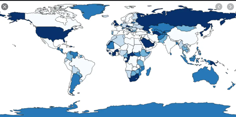
Hi, I am struggling to find a method to format a xls form to allow survey users to select a country name from a dropdown list, then have the data show on a map on the dashboard. Specifically I would like the country colour/shading to be displayed according to the count of submissions relating to each country.
Is this a feature available in ArcGIS? For some reason I have been unable to find any blogs or help articles with instructions to this, so far I have only come across geopoint related information. I thought this would have been a fairly simple and commonly-used function?
Any help would be greatly appreciated! 🙂
Solved! Go to Solution.
Accepted Solutions
- Mark as New
- Bookmark
- Subscribe
- Mute
- Subscribe to RSS Feed
- Permalink
- Report Inappropriate Content
You can absolutely pull the survey data into a web map and visualize it that way. You'll need to create an attribute join between a layer of country polygons and the output table of your survey, since your survey sounds like it will be non-spatial.
Here's an article about performing a join. Note that if you're working in AGOL, you have the option of making a Hosted View, so the data will stay up-to-date as new responses come in.
Once you have your join layer created, you can visualize it by the sum statistic and then bring that layer into your dashboard's web map.
Kendall County GIS
- Mark as New
- Bookmark
- Subscribe
- Mute
- Subscribe to RSS Feed
- Permalink
- Report Inappropriate Content
Are you using your form embedded in a dashboard?
You can get a dashboard to filter features, but not to change the symbology.
Kendall County GIS
- Mark as New
- Bookmark
- Subscribe
- Mute
- Subscribe to RSS Feed
- Permalink
- Report Inappropriate Content
Hi Josh,
Thank you for your response. I have a survey123 form separate to the dashboard (not embedded), and the resulting data from the survey is used to create the dashboard. The survey users input the data from either a web form or survey app in the field, then view the dashboard for the summaries after the fact.
Is it completely impossible to create a map similar to this in ArcGIS dashboard directly from a Survey123 output data?
Thanks!
- Mark as New
- Bookmark
- Subscribe
- Mute
- Subscribe to RSS Feed
- Permalink
- Report Inappropriate Content
You can absolutely pull the survey data into a web map and visualize it that way. You'll need to create an attribute join between a layer of country polygons and the output table of your survey, since your survey sounds like it will be non-spatial.
Here's an article about performing a join. Note that if you're working in AGOL, you have the option of making a Hosted View, so the data will stay up-to-date as new responses come in.
Once you have your join layer created, you can visualize it by the sum statistic and then bring that layer into your dashboard's web map.
Kendall County GIS
- Mark as New
- Bookmark
- Subscribe
- Mute
- Subscribe to RSS Feed
- Permalink
- Report Inappropriate Content
Thank you for the explanation! I'm guessing ESRI has a layer of country polygons data available for use in the ESRI system, would you say this is the correct dataset to use for this purpose?
https://hub.arcgis.com/datasets/2b93b06dc0dc4e809d3c8db5cb96ba69_0/data
