- Home
- :
- All Communities
- :
- Products
- :
- ArcGIS StoryMaps
- :
- ArcGIS StoryMaps Ideas
- :
- Increase spacing between bullets
- Subscribe to RSS Feed
- Mark as New
- Mark as Read
- Bookmark
- Follow this Idea
- Printer Friendly Page
- Mark as New
- Bookmark
- Subscribe
- Mute
- Subscribe to RSS Feed
- Permalink
Is there something in the product plan to have the ability to increase spacing between bulleted items? I have been asked by several colleagues when building story maps to increase spacing between bulleted items. A workaround for this is instead of hitting the return key to continue the list I make a new text block and add the bullet. I must do this line by line. As you can imagine this can become very time consuming when you have long lists.
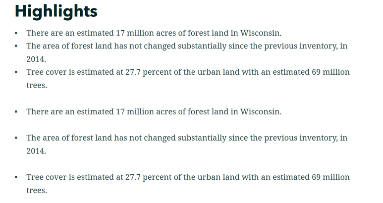
Here is an example of what I am talking about. The first three bullets are creating as one text block hitting return after each item. The next three are created by adding a new text block for each item. Visually this looks more appealing.
- « Previous
-
- 1
- 2
- Next »
@Anonymous User -- Thanks for posting this suggestion. We have discussed adding spacing adjustments as options in theme builder, but we don't have this in our plans at the moment.
I'll move this thread to the ideas space so others can vote on it so that will help us figure out where this request goes in our list of priorities.
to further augment the idea of a timeline, the spacing options should include a time-related spacing option for dates. e.g. 1.1.21 - 1.3.21 - 1.9.21- 1.12.21 should be spaces according to the time passed between the events: 1.1.21 -- 1.3.21 - - - - -- 1.9.21--- 1.12.21 (here: each dash represents a month; a dash could also represent xxx years (for historic, geological events), year, day, hour, minute, seconds). in the storymap the storymap should be space or bullets between events.
I would like this, and it seems logic to set a property in the theme. But I would like to be able to use "compact lists" as the first tree in the example above together with lists with more space as the last ones in the same story map.
I thought the introduction of "single-spaced text using Shift+Enter" in the january release maybe could solve this by allowing a shift+enter linebreak within lists. It looks like it works that way in the edit-mode, but when publishing thoose spaces disapears.

@OwenGeodo you think it would be possible to allow theese shift+enter linebreaks between bullets? as well as changing default spacing in the theme?
@MattiasEkström -- The extra spacing typically only looks better when the bullet text is long and wraps to multiple lines, as it does in your case. For shorter, one-line bullets that extra space could look odd (but this is also somewhat of a personal preference). Shorter bullets are the most common use case that we see, so I don't think we'd change the default.
But we'll take a look at why things are looking different in builder and viewer. That sounds like a bug. You should be able to insert extra lines if you want them.
@OwenGeo I agree that for most list with just one line, you often don't want that extra space. But in cases with long multiline lists as in this case it would be great if I could add the extra space/line with shift+Enter.
And of course we want the edit mode to look as much like the result as possible, so however blank shift+Enter lines is handled it should be the same in edit mode as in viewing mode.
@MattiasEkström -- I just did some testing and I believe I was able to create the look you are going for simply by treating each bullet item as its own list.
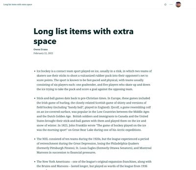
At the end of each list item, I hit ENTER twice at the end of one list item to end that block and start a new block, then I started a new list block for the next item. Is this what you're looking for? This is a screenshot from viewing the story.
@MattiasEkström -- Do you have a link to your story that you can share that shows the issue you are seeing with a difference between builder and viewer (or a test story that recreates the issue)? I don't seem to be able to recreate the issue with the removed lines, but would like to understand how that is happening.
@OwenGeo-- I did some more testing and this is a story map with my test:
Test bullet lists (arcgis.com)
I'm usually pasting text from a word document and then it wasn't as easy as just hitting ENTER twice to create new blocks to make it seperate list. But if I copy one item at a time I can achieve this with new blocks for each item. But then I do end up with not one list, but many list with one item each and it looks visually good, but my concern is that this solution is inappropriate from an accessibility point of view.
@MattiasEkström -- Agree that is not an ideal solution for accessibility. Thanks for the test story -- we will look into the disappearing spaces.
You must be a registered user to add a comment. If you've already registered, sign in. Otherwise, register and sign in.

