- Home
- :
- All Communities
- :
- Developers
- :
- ArcGIS Pro SDK
- :
- ArcGIS Pro SDK Questions
- :
- Re: Default ArcPro Fonts
- Subscribe to RSS Feed
- Mark Topic as New
- Mark Topic as Read
- Float this Topic for Current User
- Bookmark
- Subscribe
- Mute
- Printer Friendly Page
- Mark as New
- Bookmark
- Subscribe
- Mute
- Subscribe to RSS Feed
- Permalink
Hi,
I'm trying to make my ArcPro customizations fit into the look and feel of ArcPro. Is there a document anywhere that outlines what fonts and type of styles are used throughout different elements of the GUI??
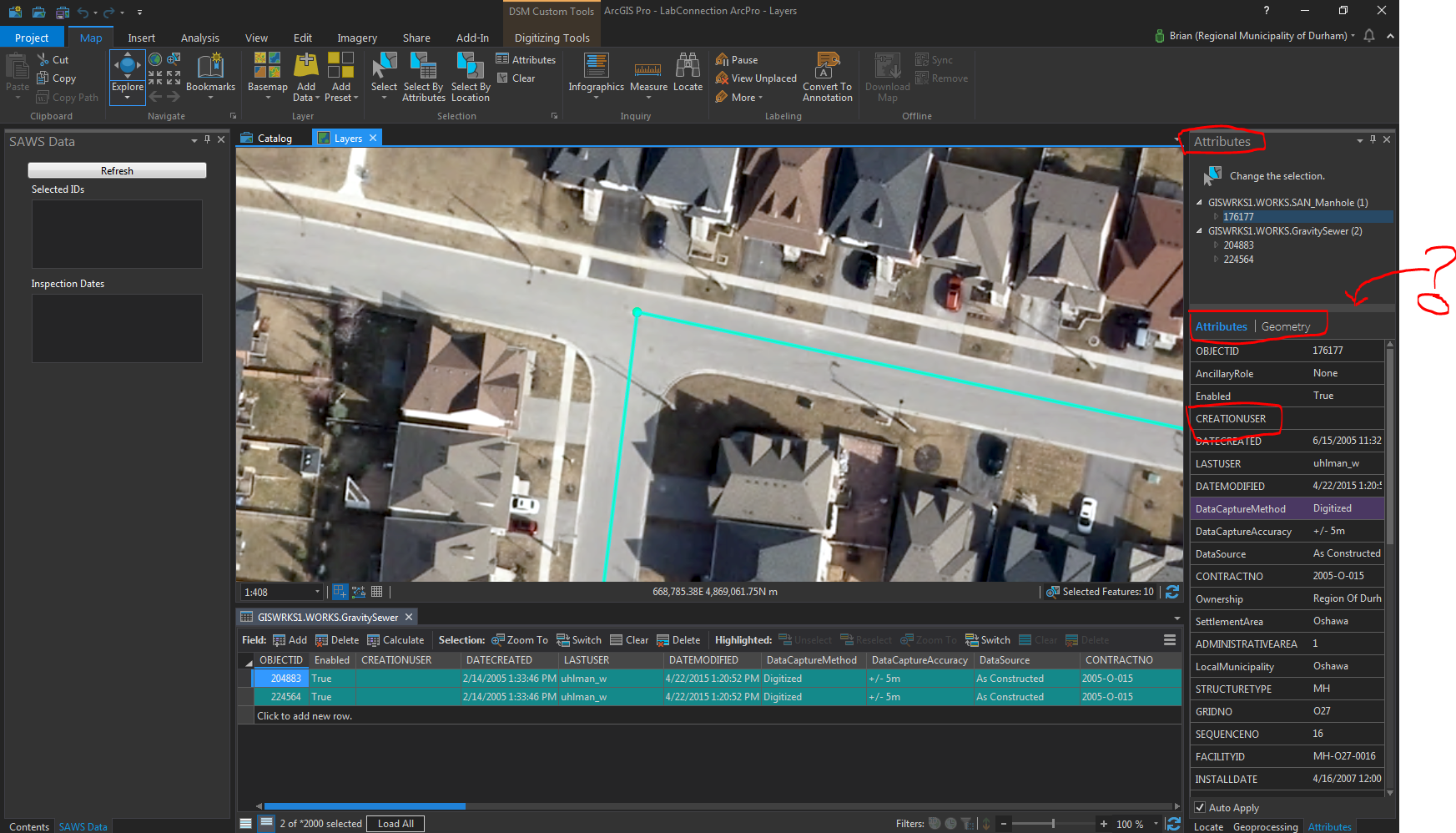
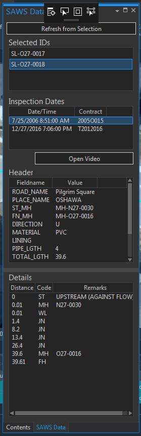
See my screenshot below:
For instance, I would like to get my dockpane (still a WIP) on the left to look more similar to the one on the right in terms of fonts and overall styling. See the circled text for the elements I am most interested in emulating.
Also, on the right I have drawn an arrow to a WPF control that slides up and down, adjusting the size of the panel (??). Can anyone tell me what type of WPF control this is??
Also is there a way to make a Button control look more like an ESRI button control. I'm pretty sure a presenter briefly talked about this at the recent Dev Summit, but I don't quite remember or maybe misunderstood what they were saying.
Sorry, I am new to WPF. 🙂
Thanks!
Solved! Go to Solution.
Accepted Solutions
- Mark as New
- Bookmark
- Subscribe
- Mute
- Subscribe to RSS Feed
- Permalink
You can start looking at this style guide for the look and feel:
https://github.com/esri/arcgis-pro-sdk/wiki/proguide-style-guide
- Mark as New
- Bookmark
- Subscribe
- Mute
- Subscribe to RSS Feed
- Permalink
You can start looking at this style guide for the look and feel:
https://github.com/esri/arcgis-pro-sdk/wiki/proguide-style-guide
- Mark as New
- Bookmark
- Subscribe
- Mute
- Subscribe to RSS Feed
- Permalink
Great...thanks Wolfgang!! My Dockpane is looking very esri now.
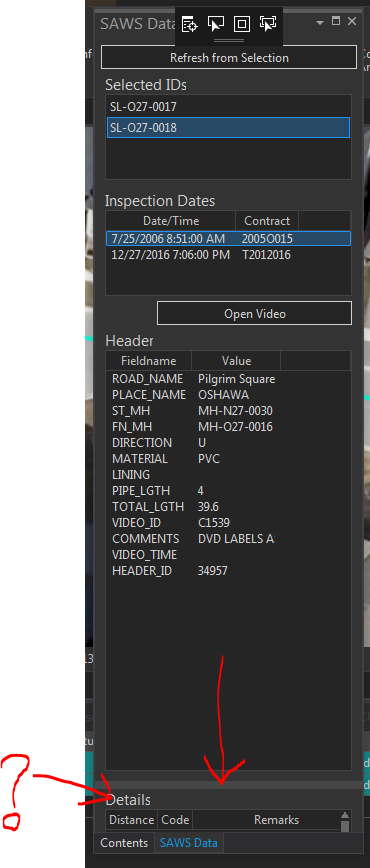
One issue I am having trouble with is getting a ListView control with an embedded Grid (for columns) to show in the esri style. If I apply
ItemContainerStyle="{DynamicResource Esri_ListBoxItemHighlightBrush}"
to the ListView it messes with the data in the control. Is there something I am doing wrong?? See image at bottom.
<ListView x:Name="lstDetails" ItemContainerStyle="{DynamicResource Esri_ListBoxItemHighlightBrush}" Grid.Row="4" Margin="10,28,10,10" SelectionChanged="lstSurveyDate_SelectionChanged_1">
<ListView.View>
<GridView>
<GridViewColumn Header="Distance" DisplayMemberBinding="{Binding distance}"/>
<GridViewColumn Header="Code" DisplayMemberBinding="{Binding code}"/>
<GridViewColumn Header="Remarks" DisplayMemberBinding="{Binding remarks}"/>
</GridView>
</ListView.View>
</ListView>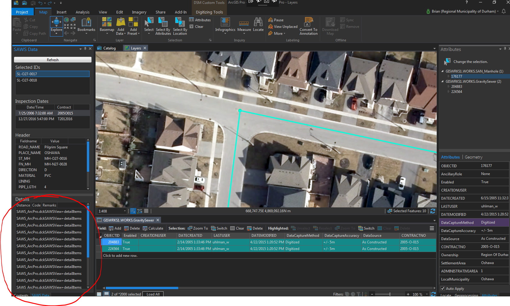
- Mark as New
- Bookmark
- Subscribe
- Mute
- Subscribe to RSS Feed
- Permalink
OK, I'm getting closer, but still have some setting not set quite right. Any advice on what the exact settings are to get the same highlighting style to match the Esri_ListBoxItemHighlightBrush?? I've tried a few different settings for "Background" but can never quite get it to match. This is what it looks like with the following:
<ListView x:Name="lstDetails" Grid.Row="4" Margin="10,28,10,10">
<ListView.View>
<GridView>
<GridViewColumn Header="Distance" DisplayMemberBinding="{Binding distance}"/>
<GridViewColumn Header="Code" DisplayMemberBinding="{Binding code}"/>
<GridViewColumn Header="Remarks" DisplayMemberBinding="{Binding remarks}"/>
</GridView>
</ListView.View>
<ListView.ItemContainerStyle>
<Style TargetType="ListViewItem">
<Style.Triggers>
<Trigger Property="IsSelected" Value="True">
<Setter Property="Background" Value="{DynamicResource Esri_ListBoxItemHighlightBrush}" />
</Trigger>
</Style.Triggers>
</Style>
</ListView.ItemContainerStyle>
</ListView>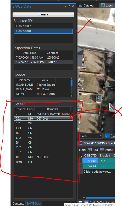
- Mark as New
- Bookmark
- Subscribe
- Mute
- Subscribe to RSS Feed
- Permalink
Brian, what happens if you specify no style at all? That is, you simply delete your entire
<ListView.ItemContainerStyle>section and delete any Style attribute you may have added to your <ListView> parent element.
- Mark as New
- Bookmark
- Subscribe
- Mute
- Subscribe to RSS Feed
- Permalink
Brian,
Technically the correct styling for a listView / ListViewItem in Pro looks like this
(you can see ListViews styled this way on the Licensing page in the backstage)
This can be achieved by the following
<ListView Grid.Row="1" Margin="5" ItemsSource="{Binding MyItems}" ItemContainerStyle="{StaticResource {x:Type ListViewItem}}"
SelectedItem="{Binding SelectedItem}" HorizontalContentAlignment="Stretch" IsSynchronizedWithCurrentItem="True"></ListView>
Or as Charlie mentioned - not specifying an ItemContainerStyle at all.
You can of course style the ListView to look like a ListBox (with the blue border brush) if you want. The following is one way of doing it. It is a little more complicated and involves using a ControlTemplate for the ListViewItem which is necessary to ensure the 'flat / matte' background color.
<ListView.ItemContainerStyle>
<Style TargetType="ListViewItem">
<Setter Property="Template">
<Setter.Value>
<ControlTemplate TargetType="{x:Type ListViewItem}">
<Grid>
<Border x:Name="innerBorder"
Background="{TemplateBinding Background}"
BorderThickness="1"
CornerRadius="1"
Padding="{TemplateBinding Padding}"
SnapsToDevicePixels="true" />
<GridViewRowPresenter VerticalAlignment="{TemplateBinding VerticalContentAlignment}"
SnapsToDevicePixels="{TemplateBinding SnapsToDevicePixels}" />
</Grid>
<ControlTemplate.Triggers>
<Trigger Property="IsMouseOver" Value="true">
<Setter TargetName="innerBorder" Property="Background" Value="{DynamicResource Esri_BackgroundHoverBrush}" />
<Setter TargetName="innerBorder" Property="BorderBrush" Value="{DynamicResource Esri_BorderSelectedBrush}" />
</Trigger>
<Trigger Property="IsSelected" Value="true">
<Setter TargetName="innerBorder" Property="Background" Value="{DynamicResource Esri_BackgroundSelectedBrush}" />
<Setter TargetName="innerBorder" Property="BorderBrush" Value="{DynamicResource Esri_BorderSelectedBrush}" />
</Trigger>
</ControlTemplate.Triggers>
</ControlTemplate>
</Setter.Value>
</Setter>
</Style>
</ListView.ItemContainerStyle>
Narelle
- Mark as New
- Bookmark
- Subscribe
- Mute
- Subscribe to RSS Feed
- Permalink
Thanks Narelle,
That works perfectly. It's now looking very esri. 🙂
- Mark as New
- Bookmark
- Subscribe
- Mute
- Subscribe to RSS Feed
- Permalink
Hi,
Just one more question....
I pretty much have it all working as I want, but when I use the GridSplitter (which separates the bottom two listboxes), I can actually push the bottom listbox entirely out of view....which is not what I want (see images below).
Within the dockpane I have everything in a grid that has 5 rows, and in the bottom row I have set a MinHeight so I think what might be happening is that the GridSplitter is actually increasing the size of the UserControl. Is there a way to 'lock down' the height of the UserControl to match the height of the DockPane that it sits in??
Before using the GridSplitter:
After using the GridSplitter:
- Mark as New
- Bookmark
- Subscribe
- Mute
- Subscribe to RSS Feed
- Permalink
OK, so I figured this out and thought i would post for anyone who might stumble upon this one day. Basically, you need to change the MaxHeight of the row above the GridSplitter dynamically as the GridSplitter gets moved. Here are the 3 events that need to run in my solution (I'm sure there are other ways to do this):
private void GridSplitter_MouseEnter(object sender, MouseEventArgs e)
{
R3.MaxHeight = dockpaneGrid.ActualHeight - (R0.ActualHeight + R1.ActualHeight + R2.ActualHeight + R4.ActualHeight + R5.MinHeight);
}
private void GridSplitter_DragCompleted(object sender, System.Windows.Controls.Primitives.DragCompletedEventArgs e)
{
//Compares the current GridHeight to the height when starting the drag
//If the grid has gotten bigger, then the MaxHeight of row 3 is changed so controls don't get pushed off the screen
if (dockpaneGrid.ActualHeight > gridHeight)
{
R3.MaxHeight = gridHeight - (R0.ActualHeight + R1.ActualHeight + R2.ActualHeight + R4.ActualHeight + R5.MinHeight);
}
}
private void GridSplitter_DragStarted(object sender, System.Windows.Controls.Primitives.DragStartedEventArgs e)
{
//Gets the current total height of the grid, before starting to drag the splitter
gridHeight = dockpaneGrid.ActualHeight;
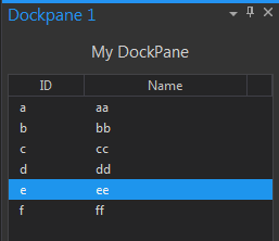
}Here is what the final dockpane looks like:
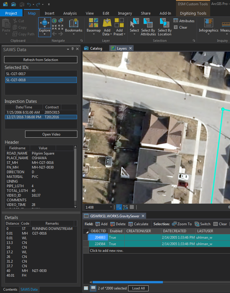
Both the Header and Details section will grow/shrink as the GridSplitter gets dragged, but the Details will never get dragged off of the page by setting a MaxHeight on the Header section (R3).