Turn on suggestions
Auto-suggest helps you quickly narrow down your search results by suggesting possible matches as you type.
Cancel
- Home
- :
- All Communities
- :
- Products
- :
- ArcGIS Pro
- :
- ArcGIS Pro Questions
- :
- Re: Where is the classification histogram?
Options
- Subscribe to RSS Feed
- Mark Topic as New
- Mark Topic as Read
- Float this Topic for Current User
- Bookmark
- Subscribe
- Mute
- Printer Friendly Page
Where is the classification histogram?
Subscribe
4834
1
10-16-2015 10:16 AM
10-16-2015
10:16 AM
- Mark as New
- Bookmark
- Subscribe
- Mute
- Subscribe to RSS Feed
- Permalink
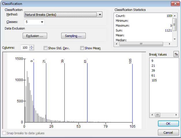
I need to be able to see the data distribution in a histogram in order to make decisions on how to represent my data. In ArcMap, this was done by clicking on the 'Classify' button of the Symbology tab in a Layer's properties (see image below).
Where can I find the equivalent in ArcPro?
1 Reply
10-16-2015
11:37 AM
- Mark as New
- Bookmark
- Subscribe
- Mute
- Subscribe to RSS Feed
- Permalink
interesting
from a while ago ArcGIS Pro - histograms within graduated colour symbology
so the hunt begins