- Home
- :
- All Communities
- :
- Products
- :
- ArcGIS Pro
- :
- ArcGIS Pro Questions
- :
- Use Arcade Expression to get the values of a relat...
- Subscribe to RSS Feed
- Mark Topic as New
- Mark Topic as Read
- Float this Topic for Current User
- Bookmark
- Subscribe
- Mute
- Printer Friendly Page
Use Arcade Expression to get the values of a related table to use later in a Chart within Pop-ups
- Mark as New
- Bookmark
- Subscribe
- Mute
- Subscribe to RSS Feed
- Permalink
- Report Inappropriate Content
Hi All
I was wondering if someone could help me with this. I am trying to use a similar approach that have been suggested by Xander Bakker to use the Filter function to get an array to use later in a chart. I have a hosted Feature Layer (Points) with the location of some wells. And I have an additional Table which has the "well" field (string field) in common with the hosted feature layer. From this table I was looking to pull out a couple of fields (oil production and date) to produce a Chart and add this chart to the Pop-up. The code in Arcade that I have is this one (from one previous post):
// first read out the well field of the Well layer var well_name = $feature.well; // access the table Monthly Production var tbl = FeatureSetByName($map,"FL_SA_PEPS_DATA - MonthlyProduction"); // create a sql expression to query on well var sql = "well = '" + well_name + "'"; // filter the table using the sql expression var related_data = Filter(tbl, sql); // count the resulting records var cnt = Count(related_data); // initiate a variable to hold the result var result = "Related records: " + cnt;; // check if there are related records found for the current ID if (cnt > 0) { // loop through related records for (var row in related_data) { // read some data and create the line you want //add the line to the result result += TextFormatting.NewLine + row.oil__m3_; } } // return the result return result;
With that code, I am able to get the list of dates or oil production and display those in the pop-up as text. Is it possible to use this as an array or sort of field to use them for the chart creation?. I can't see the result as an input for the chart. I tried with this variant from other post:
// initiate a variable to hold the result
var result = 0;

// check if there are related records found for the current ID
if (cnt > 0) {
    // loop through related records
    for (var row in related_data) {
       //add the line to the result
       result += row.oil__m3_;
    }
}
In this case, I got a single number, which then I can see as an input to create the chart, but is only a single number and not an array or table. Not sure what approach should I do?. Is something possible to do?. I am working in Portal for ArcGIS 10.7. Any help would be much appreciated.
Thanks,
Andres
Solved! Go to Solution.
Accepted Solutions
- Mark as New
- Bookmark
- Subscribe
- Mute
- Subscribe to RSS Feed
- Permalink
- Report Inappropriate Content
Hi Andres Echeverri ,
I just did some testing and although Arcade can return an array or a featureset, to create a diagram in the pop-up you will need to return a number. However, a single number does not make much sense for creating a diagram. When I returned a featureset or an array it did not recognize the result and it could not be used to create a diagram.
- Mark as New
- Bookmark
- Subscribe
- Mute
- Subscribe to RSS Feed
- Permalink
- Report Inappropriate Content
Thanks for you answer Xander Bakker. Would be nice to have that functionality in the future!!.
- Mark as New
- Bookmark
- Subscribe
- Mute
- Subscribe to RSS Feed
- Permalink
- Report Inappropriate Content
Hi andres.echeverri@beachenergy.com.au ,
I would indeed be nice and I voted your idea up...
- Mark as New
- Bookmark
- Subscribe
- Mute
- Subscribe to RSS Feed
- Permalink
- Report Inappropriate Content
XanderBakker,
I wasn't sure how to contact you, but I see your names all over Arcade related posts, so I am hoping you can help. I have a script where all I am trying to do is pass a value through from a related table to a related point feature. I just want the pop-up to show the parentobjectID from the related table. I have written the call like this:
var portal = FeatureSetByName($map,"service_01dd723bd96e4f19bd214978066544dd - report_photos")
var ParentID = $feature["globalid_1614018009466"]
if
(ParentID == portal) {
return portal;
} else {
return portal;
}
It returns the results shown in the attached image.
It seems like what I want is simple, the pop-up in the parent record to display a custom attribute that is the exact value shown in the child record as the attribute "parentglobalid". I am hoping it is simple and I am just messing up the code? Thanks!
- Mark as New
- Bookmark
- Subscribe
- Mute
- Subscribe to RSS Feed
- Permalink
- Report Inappropriate Content
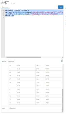
Hi @XanderBakker ! I am also working through trying to do this similar work flow (layer and table). I can return the featureset, and I'm wondering if this is still a hault point or have there been advancements in the last couple years that lets me do this now? Trying to enable a way for a user to click on a road and see a line chart of the counts over the years from a table associated with the roads SEQUENCE_N.
var Road = $feature.SEQUENCE_N
var Table = FeatureSetByName($map,"Historic Annual Average Daily Traffic in Olmsted", ['SEQUENCE_N','DATA_YEAR','AADT'])
var AADT = OrderBy(Filter(Table, 'SEQUENCE_N = @Road'), 'DATA_YEAR')
return AADT (feature set)
Olmsted County GIS Specialist
- Mark as New
- Bookmark
- Subscribe
- Mute
- Subscribe to RSS Feed
- Permalink
- Report Inappropriate Content
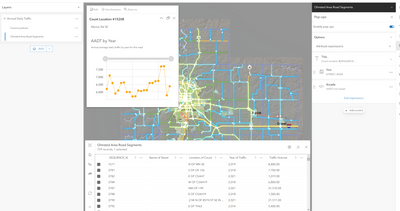
Ope! Figured it out with the Arcade option using Chart Template! https://www.esri.com/arcgis-blog/products/arcgis-online/mapping/part-2-introducing-arcade-pop-up-con...
var Road = $feature.SEQUENCE_N
var Table = FeatureSetByName($map,"Historic Annual Average Daily Traffic in Olmsted", ['SEQUENCE_N','DATA_YEAR','AADT'])
var AADT = OrderBy(Filter(Table, 'SEQUENCE_N = @Road'), 'DATA_YEAR ASC')
var chartValues = {}
var chartNames = []
for (var f in AADT) {
        chartValues[Text(f.DATA_YEAR,'0000')] = Text(f.AADT,'###,###')
        Push(chartNames, f.DATA_YEAR)
    }

return {
    type: 'media',
    title : 'AADT by Year',
    description : 'Annual average daily traffic by year for this road',
    attributes : chartValues,  // replace this dictionary with your own key-value pairs,
    mediaInfos: [{
        type : 'linechart', //linechart | barchart | piechart | columnchart
        //title : '',
        //caption : '',
        altText : 'line chart showing traffic counts by year', //altText will be read by screen readers
        value : {
          fields: chartNames,  // choose what attributes to use in the chart
          //normalizeField : '',  // the name of the attribute to normalize by or value
        }
      }]
}Olmsted County GIS Specialist
- Mark as New
- Bookmark
- Subscribe
- Mute
- Subscribe to RSS Feed
- Permalink
- Report Inappropriate Content
I realize this is an old post, and hope this reply is allowed. I am seriously stuck on configuring a pop-up with similar AADT data, Teresa, and if you can provide any guidance, any and all will be appreciated! I followed your code to almost a T, but am getting a blank graph as a result.
var Road = $feature.ROADNAME
var Table = FeatureSetByName($map, "ADT_Data_Merge", ['Mean_ADT','Year','Road_Name'])
var AADT = OrderBy(Filter(Table, 'Road_Name = @Road'), 'Year ASC')
var chartValues = {}
var chartNames = []
for (var f in AADT) {
        chartValues[Text(f.Year,'0000')] = Text(f.Mean_ADT,'###,###')
        Push(chartNames, f.Year)
    }

return {
    type: 'media',
    title : 'AADT by Year',
    description : 'Annual average daily traffic by year for this road',
    attributes : chartValues,  // replace this dictionary with your own key-value pairs,
    mediaInfos: [{
        type : 'linechart', //linechart | barchart | piechart | columnchart
        //title : '',
        //caption : '',
        altText : 'line chart showing traffic counts by year', //altText will be read by screen readers
        value : {
          fields: chartNames,  // choose what attributes to use in the chart
          //normalizeField : '',  // the name of the attribute to normalize by or value
        }
      }]
  }
- Mark as New
- Bookmark
- Subscribe
- Mute
- Subscribe to RSS Feed
- Permalink
- Report Inappropriate Content
I've sent you a direct message! This is how my map is set up:
Olmsted County GIS Specialist
- Mark as New
- Bookmark
- Subscribe
- Mute
- Subscribe to RSS Feed
- Permalink
- Report Inappropriate Content
With assistance from Teresa I was able to get my code up and running. Posting this comment/code with hopes of helping someone else. Background: I wanted to create a chart which shows ADT data by year to an associated road (MRNLINKID). I created a relationship class on Pro between the ADT Data Table (ADT_Data_Merge) and my Road layer, which was exported to AGO and inserted on new map viewer. Here is the code:
var Road = $feature.MRNLINKID
var Table = FeatureSetByRelationshipName($feature, "ADT_Data_Merge", ['Mean_ADT', 'Year'], false)
var AADT = OrderBy(Filter(Table, 'StationID = @Road'), 'Year')
var chartValues = {}
var chartNames = []
for (var f in AADT) {
        chartValues[Text(f.Year,'0000')] = Text(f.Mean_ADT,'###,###')
        Push(chartNames, f.Year)
    }
return {
    type: 'media',
    title : 'AADT by Year',
    description : 'Annual average daily traffic by year for this road',
    attributes : chartValues,  // replace this dictionary with your own key-value pairs,
    mediaInfos: [{
        type : 'linechart', //linechart | barchart | piechart | columnchart
        //title : '',
        //caption : '',
        altText : 'line chart showing traffic counts by year', //altText will be read by screen readers
        value : {
          fields: chartNames,  // choose what attributes to use in the chart
          //normalizeField : '',  // the name of the attribute to normalize by or value
        }
      }]
  }

