- Home
- :
- All Communities
- :
- Products
- :
- ArcGIS Pro
- :
- ArcGIS Pro Questions
- :
- Re: Significantly different colors between Pro and...
- Subscribe to RSS Feed
- Mark Topic as New
- Mark Topic as Read
- Float this Topic for Current User
- Bookmark
- Subscribe
- Mute
- Printer Friendly Page
Significantly different colors between Pro and Desktop
- Mark as New
- Bookmark
- Subscribe
- Mute
- Subscribe to RSS Feed
- Permalink
Hello,
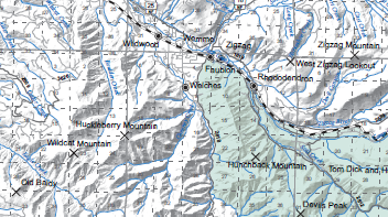
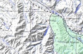
I have a bunch of maps that were previously made in Desktop that I've transitioned to Pro. After importing the mxds as a layout everything seems to work out but I've noticed that the Desktop produces a PDF that has much higher contrast. Was wondering if there was a way around this, I've messed with the color profiles / color management to no avail. As you can see the text is much more readable from Desktop and the green is much deeper. They have the same RGB levels in the documents.
Desktop:
Pro:
- Mark as New
- Bookmark
- Subscribe
- Mute
- Subscribe to RSS Feed
- Permalink
Could you attach the two PDFs, just so other users can take a look at them?
I had a situation once where my PDFs were exporting differently, and I could have sworn Pro was doing something. And it was, but not what I was expecting. It turned out that my Adobe PDF reader had certain accessibility settings turned on that the PDF exported from Pro was actually compatible with, whereas PDFs exported elsewhere were not.
Kendall County GIS
- Mark as New
- Bookmark
- Subscribe
- Mute
- Subscribe to RSS Feed
- Permalink
They have been added, the map I had pictures of was far too large to attach but this smaller one is doing the same thing. I will print them both out on our little printer and see if there is an issue there.
- Mark as New
- Bookmark
- Subscribe
- Mute
- Subscribe to RSS Feed
- Permalink
Printed them out on our office printer and the differences are much more noticeable in Adobe than in print. Hopefully that holds true when they get to the print shop. The main thing I was concerned with was the text not displaying the same and it does.
Think its a slight difference that we will just need to live with.


