- Home
- :
- All Communities
- :
- Products
- :
- ArcGIS Pro
- :
- ArcGIS Pro Questions
- :
- Re: Creating a slope map from a DEM
- Subscribe to RSS Feed
- Mark Topic as New
- Mark Topic as Read
- Float this Topic for Current User
- Bookmark
- Subscribe
- Mute
- Printer Friendly Page
- Mark as New
- Bookmark
- Subscribe
- Mute
- Subscribe to RSS Feed
- Permalink
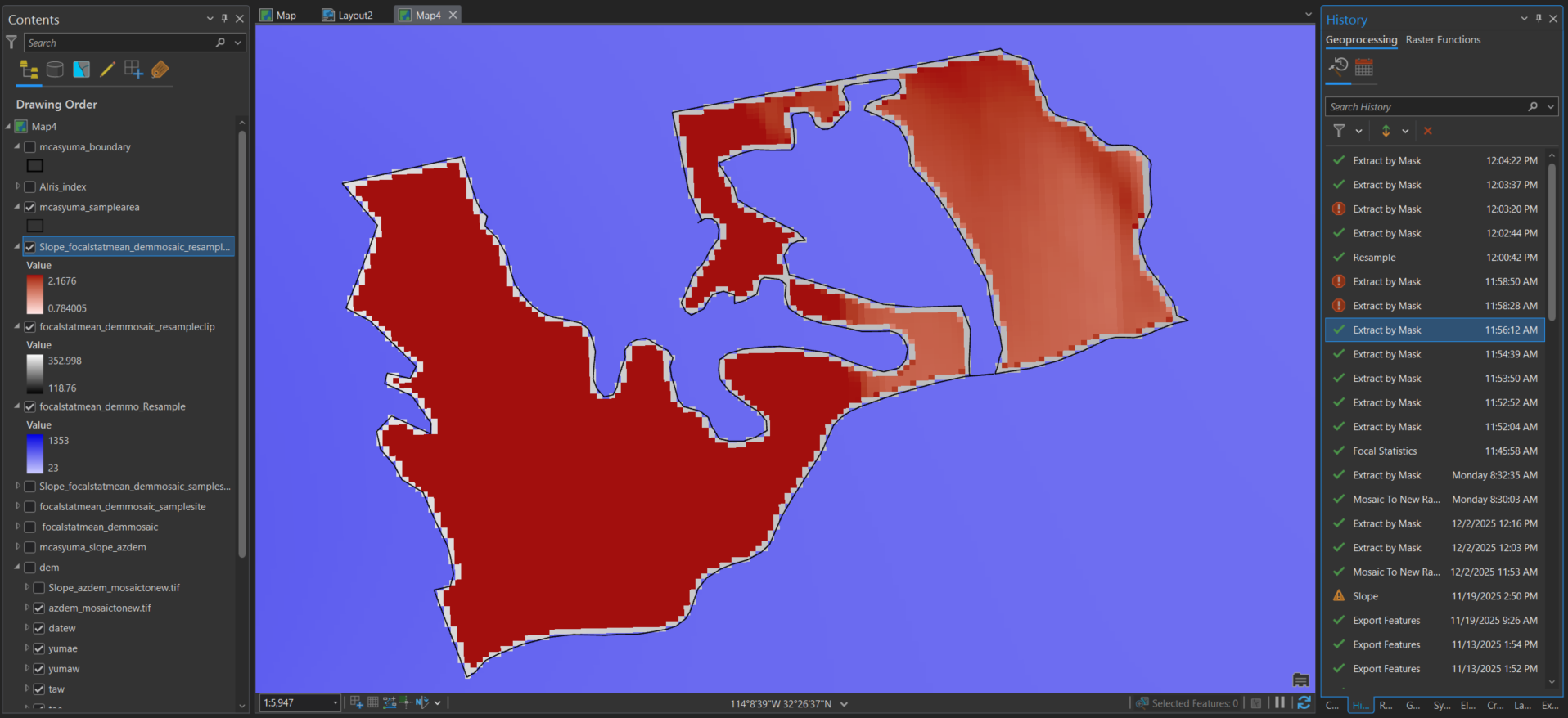
I am trying to create a slope map from a DEM resource. image 0 - this is where I used the slope raster function on the DEM without a focal stat ran. image 1 - the purple is the original DEM after a focal statistic was run on it, then I used "Extract by Mask" to clip the DEM to the sample areas I'm trying to look at, which is the grey, then the red area is where I ran the slope raster function on the clipped DEM. They keep getting smaller. image 2 - I then resampled the cell size from 30x30 to 10x10 and followed the above steps again, it looks better but there are still missing edges around the sample site. I cant figure out how to make sure that the entire sample site is clipped.
Solved! Go to Solution.
Accepted Solutions
- Mark as New
- Bookmark
- Subscribe
- Mute
- Subscribe to RSS Feed
- Permalink
not sure what you mean since it appears that all the cell centers are within the bounds of the polyline/polygon. Cells are square, you can't trim off portions that bleed over a line or fill in gaps to the line. Using a much smaller cell size might help as would a really thick polygon boundary, but none of this will change the underlying geometry association between vector data and raster data representations.
... sort of retired...
- Mark as New
- Bookmark
- Subscribe
- Mute
- Subscribe to RSS Feed
- Permalink
okay that helps thank you, i was hoping to chop the cells in half where they meet the edge of the polygon but if that's not possible it makes this easier
- Mark as New
- Bookmark
- Subscribe
- Mute
- Subscribe to RSS Feed
- Permalink
you could also contour your raster
Contour (Spatial Analyst)—ArcGIS Pro | Documentation
perhaps clipping the result will give you the visual you need
... sort of retired...
- Mark as New
- Bookmark
- Subscribe
- Mute
- Subscribe to RSS Feed
- Permalink
You could run the Raster to Polygon (Conversion)—ArcGIS Pro | Documentation and create a polygon feature class from your raster dataset. Then run the Clip (Analysis)—ArcGIS Pro | Documentation by a area of interest polygon so it's clipped precisely at the boundary.
- Mark as New
- Bookmark
- Subscribe
- Mute
- Subscribe to RSS Feed
- Permalink
unfortunately, the raster i am using is not the correct type for the Raster to Polygon tool, the work around i tried (using Int then raster to poly) doesn't keep my slope values and if i do it before my slope is ran I have to convert it back to a raster which then is giving me the format type error again. I just resampled the cell size and got as close at i could to the edge
- Mark as New
- Bookmark
- Subscribe
- Mute
- Subscribe to RSS Feed
- Permalink
Hi @SydneyHeathcott
Think of raster data as a point value with no inherent size, and then a definition of how large an area the point value covers. If you look at a text based raster DEM, the data is in some form of X Y Z or corner coordinate + cell size + value grid.
When displaying the data in a map, a symbol/colour patch is placed that represents the extent of each point value.
No matter what process you follow to clip the raster, the result will always be the point values inside your shape, and when their square patches are displayed, you will get raggedy edges. You can use different resampling methods to display the data in a map (Cubic, etc), but that doesn't affect the underlying data.
How do you work around it?
Raster to polygon is an option if you want categorised/classified increments (e.g. 1°-5°, 5°-10°, etc) but also is a one-way street so every time you want to change a raster process parameter value you have to run the conversion again. Depending on the various parameters you may still end up with anomalies at the edges - be careful to not have No Data applied to these gaps as that will confuse someone at some point.
Subsampling can help too but but the gaps will remain.
Note:
The Raster to Polygon tool has a smoothing/simplifying parameter. YMMV but I'd suggest staying away from it. You can't tweak its influence nor is it properly documented. I find it often gives wildly weird outputs.
As example - if you want to calculate the percentage of area over and under a certain slope, having the output 'simplified' can greatly skew the stats depending on the variability and spatial distribution of your input raster. It works better to keep tweaking your process to get an input raster that gives a better result, than using Simplify.

In some cases running the Contour geoprocessing tool may be a better option. Having a contour stop just before the AOI edge is less jarring than a weird squiggle. Showing slope with contour polygons work well. It also gives you footprints that you can extract areas from, etc.
Use the Contour raster function to get an idea of what the contours could look like bore running the GP tool

My go-to, when the displayed raster needs to cover the entire area of interest polygon, is to use a raster function to create dynamic layers. The highlighted tools are the ones you should start with.

This means you don't export a new raster after each step but use dynamic layers as the input for each next step.

When you start with your main DEM, then do a clip, use the clip layer as input to slope, etc., you will find that the functions get chained as you go.
Once you've made your chain by adding the result of each step as the input to the next one you will end up with something like this (other steps not shown but just think of a long series of steps, similar to ModelBuilder:

Apply a clip layer that is somewhat larger then your AOI (bit more than the input data cell-size so you can be sure that the final exported raster will cover and display for the entire AOI.
Yes, you can build a function chain from scratch without using the raster functions separately to create individual output layers, but doing multiple steps allows you to see what the result of each step is.
Once you are happy, you should save the final chain as something that you can re-use again.
You can export the final raster layer to have a static version of the process. (Pro likes to forget where the input of a function chain is, relative path bug..., so having the chain saved allows you to recreate things quickly)
Because the export will be larger than the AOI to make sure you have full visual coverage, when you map it you can use a new Clip raster function or even a clipping layer in the map to make it fit the boundaries perfectly.
If you need to run other statistics on the output raster or final raster function chain, remember to add a clip function using exact AOI so that the stats only use the point values that are within the real AOI.
This is a mental trip-up.
If you can see gaps does it mean your extracted stats don't represent the real AOI? 😀
Balance effort to create the perfect dataset with the quality of the input DEM.
Near enough is good enough if the input is SRTM. Spend a few hours more if the stats need to represent the grade AAA+++ surveyed model.....
Key points
Using function chains allows you to run multiple iterations and tests without creating a pile of derivative datasets. Finding a way to name each scenario and derivative gets unfunny quickly when you run the 15th chain to filter out a small rock next to a pond on the edge of an erosion gully....
Save your symbology to a lyrx file once you've found one you like. Every time you re-run a function chain to change a parameter you will have to re-apply the symbology, and also once every waxing crescent, full moon, waning gibbous because Pro reasons.