- Home
- :
- All Communities
- :
- Products
- :
- ArcGIS Pro
- :
- ArcGIS Pro Ideas
- :
- Separate 'Clear Selection' and 'Delete Selection' ...
- Subscribe to RSS Feed
- Mark as New
- Mark as Read
- Bookmark
- Follow this Idea
- Printer Friendly Page
Separate 'Clear Selection' and 'Delete Selection' buttons in ArcGIS Pro's UI
- Mark as New
- Bookmark
- Subscribe
- Mute
- Subscribe to RSS Feed
- Permalink
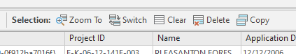
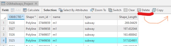
This has been bugging me about the ArcGIS Pro UI. The Clear Selection and Delete Selection buttons are right next to each other in the Attribute Table (first screenshot) as well as the Attribute Editor context menu. It seems too easy to click the wrong one (I have done it, luckily I realized quickly and could rebuild the missing data). I'm using feature services so there is no option to discard edits later. I worry this is even more confusing for less experiences users.
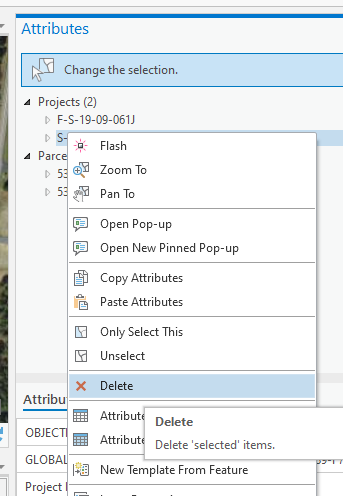
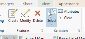
Separating the buttons would help, at least making it harder to accidentally click the wrong one. I like the larger X icon from the attribute menu & ribbon, vs the less distinguishable icon in the table editor. The arrangement in the ribbon is also better where the delete button is removed from the selection tab. I never feel I'll accidentally click delete here.
Thanks for submitting the idea, Jimmy. It is reviewed and open for voting.
Re: "I'm using feature services so there is no option to discard edits later."
“Undo” Feature Service Edits in ArcGIS Pro will be implemented in ArcGIS Pro 2.5, coming soon.

Hi Jake,
There is not a process to escalate an idea. The site is designed to allow the user community to vote on new or changed features/functionality that they would like to see - and then product teams use this information to inform development priorities.
That said, since the concern is about data integrity (I don't want to unintentionally delete records), the original use case about working with hosted feature services that did not support undo/redo, should be improved/resolved now in Pro 2.5.
If the ability to undo an unintentional delete is not enough, there will be an added level of protection coming in 2.6 where users will be able to require an explicit start of an edit session, so instead of having Clear and Delete both active, you will see this (I haven't started editing, so Delete is not enabled):
If there is a business justification that makes this a high priority, an issue could be logged through Technical Support at which point there would be avenues to escalate it.
I hope this helps!
On the Attribute table view, It is too easy to accidentally press the Delete button, silently deleting a Data record. This is due to the button is inexplicably nestled between two frequently used record selection buttons (Clear and Copy).
Suggested Fix: Move the Delete Button to the right, adding it to a new subgroup (similar to the labels for Field: and Selection:) called "Record(s):" or "Modify:" to the right of the Copy Button. This change would put it out of the danger zone.
In addition to this, possibly look into the standardization of what Delete buttons look like, and where they are put in the UI. It is different everywhere, between ribbons like the Edit Ribbon) and small tables like this. In my opinion, the most logical way it's done in ArcGIS is what is seen on the Symbology panel for clauses of a Display Filter...where it's at the end of each line, separate from data entry fields.
Yes! This is particularly an issue with Enterprise GDBs where edits seems to be committed immediately without starting an edit session (I think there was an "Ideas" post about that).
I agree with this and @Luke_Pinner makes a good point - when editing nonversioned data this can be deadly as there is no "undo" or "Stop Editing" and then choose not to save like you could do in the ArcMap days. I've been bit by this a few times.
While there is no current plan to change the order or location of buttons in the UI, in ArcGIS Pro 2.9 (scheduled for release in Q4 2021) there will be a prompt that will allow the user to confirm the delete.
For workspaces that allow Undo, the user will still be able to Discard the edit, even after clicking Yes to confirm the delete. For workspaces that do not allow Undo, as mentioned in some of the comments, this will be a safeguard to protect users from inadvertently deleting data that cannot be recovered, which seems to be the primary concern with this idea.
Preview:

This is what that option looks like in ArcGIS Pro 2.9:

@Luke_Pinner and @Andrew-Bowne
Regrading your comments about unversioned enterprise edits not having a discard edits option:
It looks like that functionality is planned in a future version of ArcGIS Pro:
ArcGIS Pro Roadmap - July 2022
Near-Term (next release or two)
Discard for non-versioned editing –support of workflows similar to those implemented in ArcMap for editing non-versioned data. When implemented, edits against non-versioned data will not be written directly to the database, giving the user the ability to discard edits before committing.
Related: Pro Roadmap - Non-versioned Editing: “Ability to undo and/or discard edits before committing”
You must be a registered user to add a comment. If you've already registered, sign in. Otherwise, register and sign in.