- Home
- :
- All Communities
- :
- Products
- :
- ArcGIS Pro
- :
- ArcGIS Pro Ideas
- :
- Provide Table Summary Options without graphical co...
- Subscribe to RSS Feed
- Mark as New
- Mark as Read
- Bookmark
- Follow this Idea
- Printer Friendly Page
- Mark as New
- Bookmark
- Subscribe
- Mute
- Subscribe to RSS Feed
- Permalink
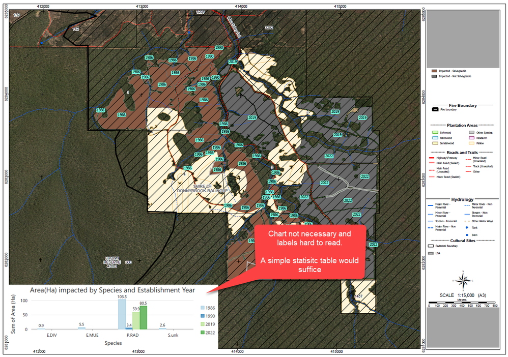
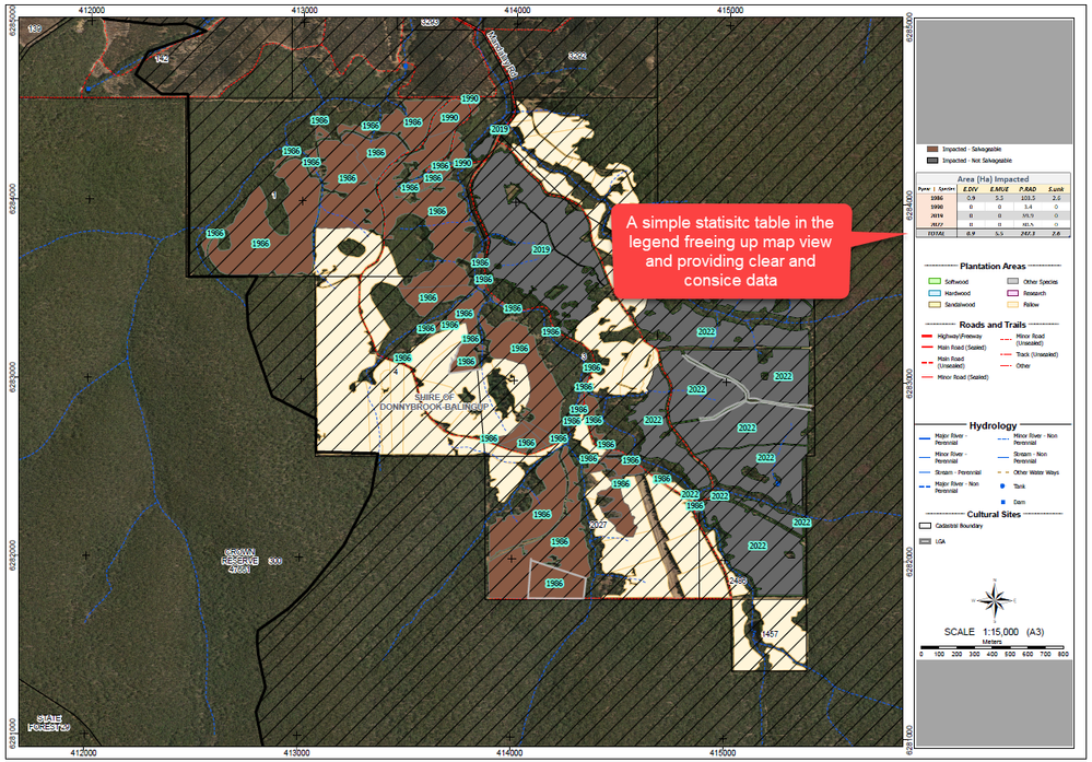
We have many map layouts where we display summarised data from layers within the maps (usually summaries of area by tree species or planting year for example). Currently we have to include these stats as bar charts, and while this works, a lot of the time, the chart part of the solution is unnecessary. We would much prefer a dynamic table summary where we select a category for the rows and/or columns and a calculated total for a numeric field is displayed (essentially like building pivot tables in Excel). These charts could save a lot of real estate on layouts that have a lot going on and where a whole chart is unnecessary. Some examples below:
Current Map Layout:
Desired Layout option:
what is the underlying database? File GDB? SQL server? Oracle?
Also, does the pivot table show aggregated results for the entire layer/dataset or only for selected features or features from the current extent?
In my use cases, the data is usually either a feature class in a GDB or feature service from ArcGIS Online. We would want it to show either all features present in a layer (restricted by a def query) or features in the current extent. Filtering by selection would be nice for data review, but being a mainly layout element, would be of less use. Though I would anticipate it being built in the same vein as charts, but just in table form instead of graphical.
what kind of database? Oracle? SQL Server? you have any sample data you think you can share with me? if so, I will see if I can give you a workaround at least for GDB case...
I might not be able to give any for agol feature services.
Most cases would be feature services these days, but those that aren't would be a feature class in a File Geodatabase on our server.
If you were to create a database view that had exactly the data and column names you require, would you be able to bring that view into your map layout? If so, would it be dynamic?
Obviously, creating a view just for this one small requirement wouldn’t be ideal.
Related:
- Aggregation Layers — File and mobile geodatabases
- SQL for reporting and analysis on file geodatabases
@Bud I don't think this is what we're looking for. Especially because most of our data is hosted in ArcGIS Online these days.
You must be a registered user to add a comment. If you've already registered, sign in. Otherwise, register and sign in.

