Turn on suggestions
Auto-suggest helps you quickly narrow down your search results by suggesting possible matches as you type.
Cancel
- Home
- :
- All Communities
- :
- Developers
- :
- ArcGIS Online Developers
- :
- ArcGIS Online Developers Questions
- :
- Arcade Popup Chart axes labels & styling
Options
- Subscribe to RSS Feed
- Mark Topic as New
- Mark Topic as Read
- Float this Topic for Current User
- Bookmark
- Subscribe
- Mute
- Printer Friendly Page
Arcade Popup Chart axes labels & styling
Subscribe
2093
2
11-01-2022 07:27 AM
11-01-2022
07:27 AM
- Mark as New
- Bookmark
- Subscribe
- Mute
- Subscribe to RSS Feed
- Permalink
Hi All,
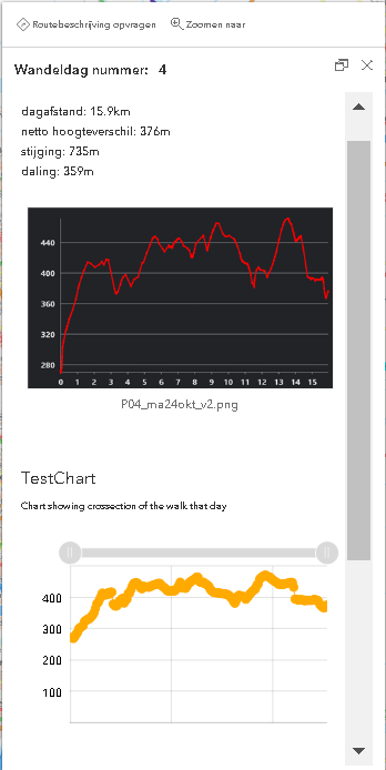
Trying to compose a popup with a linechart. Using the samples I managed to produce a chart Not really happy with the result...
Below is my code and a screenshot of my popup containing a ArcGis-Pro chart (picture as attachement) and the arcade media chart. I'd like to alter the arcade-chart so it looks more like the Pro-chart.
Specific questions:
A Can I add x-axes labels?
B Can I style the grapg line?
var relsel = OrderBy(FeatureSetByRelationshipName($feature,"FeatureVerticesToP_v4", ['*']),"POINT_M");
var firstR = First(relsel)
var chartValues = {}
var chartNames = []
for (var f in relsel) {
        chartValues[Text(f.POINT_M, '#,#')] = f.POINT_Z
        Push(chartNames, Text(f.POINT_M, '#,#'))
    }

return {
    type: 'media',
    title : 'TestChart',
    description : 'Chart showing crossection of the walk that day',
    attributes : chartValues,  // replace this dictionary with your own key-value pairs,
    mediaInfos: [{
        type : 'linechart', //linechart | barchart | piechart | columnchart
        //title : '',
        //caption : '',
        altText : 'profile graph showing crossection of the days walk', //altText will be read by screen readers
        value : {
          fields: chartNames,  // choose what attributes to use in the chart
          //normalizeField : '',  // the name of the attribute to normalize by or value
        }
      }]
  }
2 Replies
05-30-2023
12:29 AM
- Mark as New
- Bookmark
- Subscribe
- Mute
- Subscribe to RSS Feed
- Permalink
I had the same problem with the axes labelling. A quick and dirty workaround was to add css to your application...
To add a y axis label use:
.esri-feature-media__container:before{
display:block;
font-size: 10px;
max-width: 50px;
padding:20% 0 0 0;
content:"Y axis title here";
}
To centre the x axis caption label you can use:
.esri-feature-media__item-caption{
display:flex;
font-size: 10px;
justify-content: center;
}
To centre the x axis title label you can use:
.esri-feature-media__item-title{
display:flex;
font-size: 10px;
justify-content: center;
}
