- Home
- :
- All Communities
- :
- Products
- :
- ArcGIS Network Analyst
- :
- ArcGIS Network Analyst Questions
- :
- ArcGIS Pro 2.5: Running “Location-Allocation” mode...
- Subscribe to RSS Feed
- Mark Topic as New
- Mark Topic as Read
- Float this Topic for Current User
- Bookmark
- Subscribe
- Mute
- Printer Friendly Page
ArcGIS Pro 2.5: Running “Location-Allocation” model leaves two demands points with no potential facility destinations,
- Mark as New
- Bookmark
- Subscribe
- Mute
- Subscribe to RSS Feed
- Permalink
ArcGIS Pro 2.5: Running “Location-Allocation” model leaves two demands points with no potential facility destinations,
Despite the fact that running “Location-Allocation” model in ArcMap manages to allocate potential destination for each demand point, Pro leaves two of these demands with no such potential destination knowing that all the assumptions are identical in both ArcMap and Pro
What could be the issue here?


Jamal Numan
Geomolg Geoportal for Spatial Information
Ramallah, West Bank, Palestine
- Mark as New
- Bookmark
- Subscribe
- Mute
- Subscribe to RSS Feed
- Permalink
It could be few different reasons. The first is that the settings are not identical. They appear to be. But most likely the network dataset settings such as restrictions could be different. Pro works with a travel mode (custom in your case) and ArcMap works on some defaults if they are set. So check these settings in Pro. Another is that Pro has a slightly different snapping model. So the locations could be snapped to a different edge if there are restrictions present in that area. You could open the attribute table of the demand points and look at the network location fields (e.g. SourceOID) and see if they are the same between ArcMap and Pro, assuming you are using the same network dataset.
Jay Sandhu
- Mark as New
- Bookmark
- Subscribe
- Mute
- Subscribe to RSS Feed
- Permalink
Thank you guys for the input
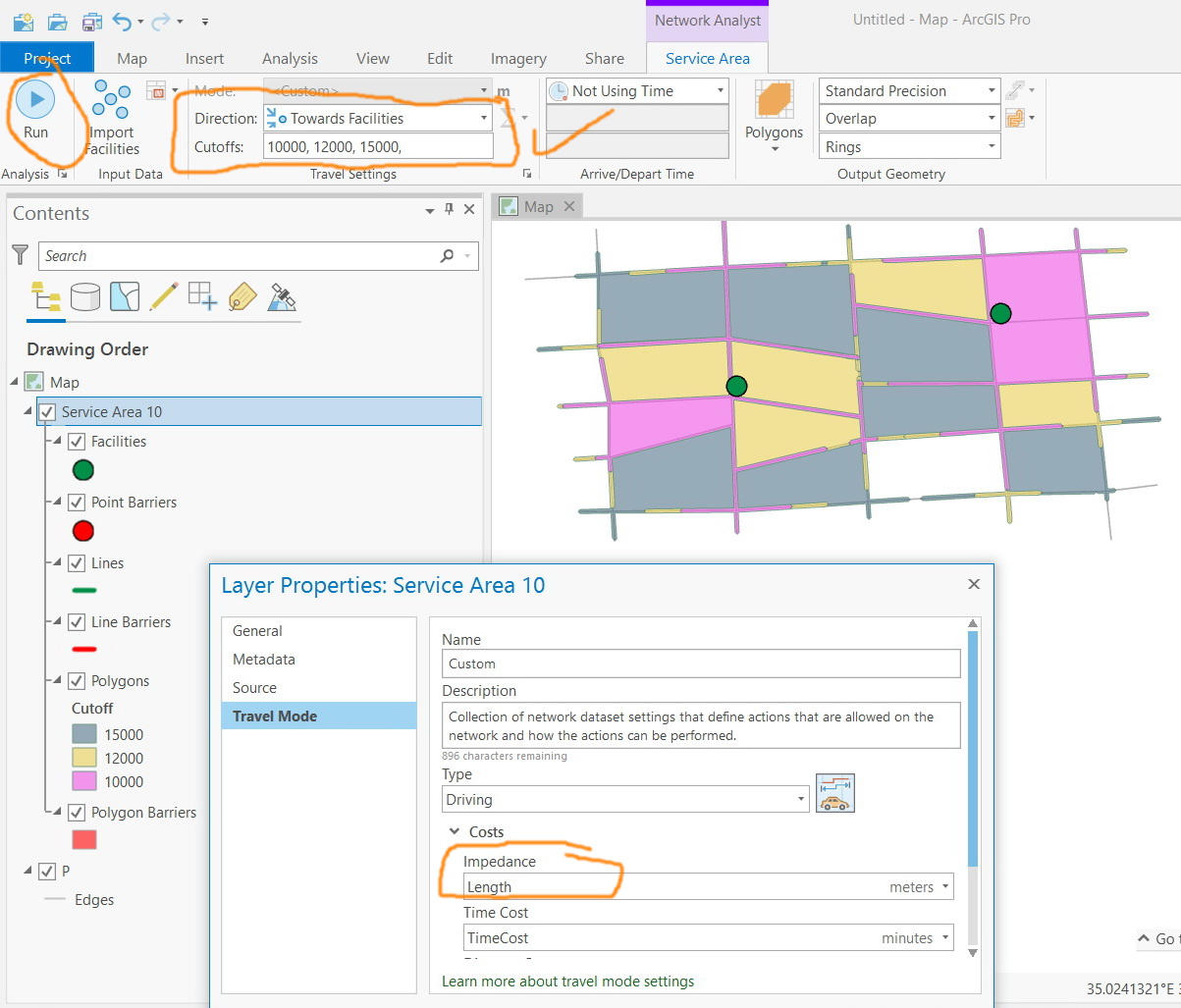
I’m getting the same issue when analyzing another network with “service area”. The results in ArcMap is different from those in Pro despite the fact that the settings are identical.
The impedance is “length”
The cutoff: 10000, 12000, 15000
The data is attached

Jamal Numan
Geomolg Geoportal for Spatial Information
Ramallah, West Bank, Palestine
- Mark as New
- Bookmark
- Subscribe
- Mute
- Subscribe to RSS Feed
- Permalink
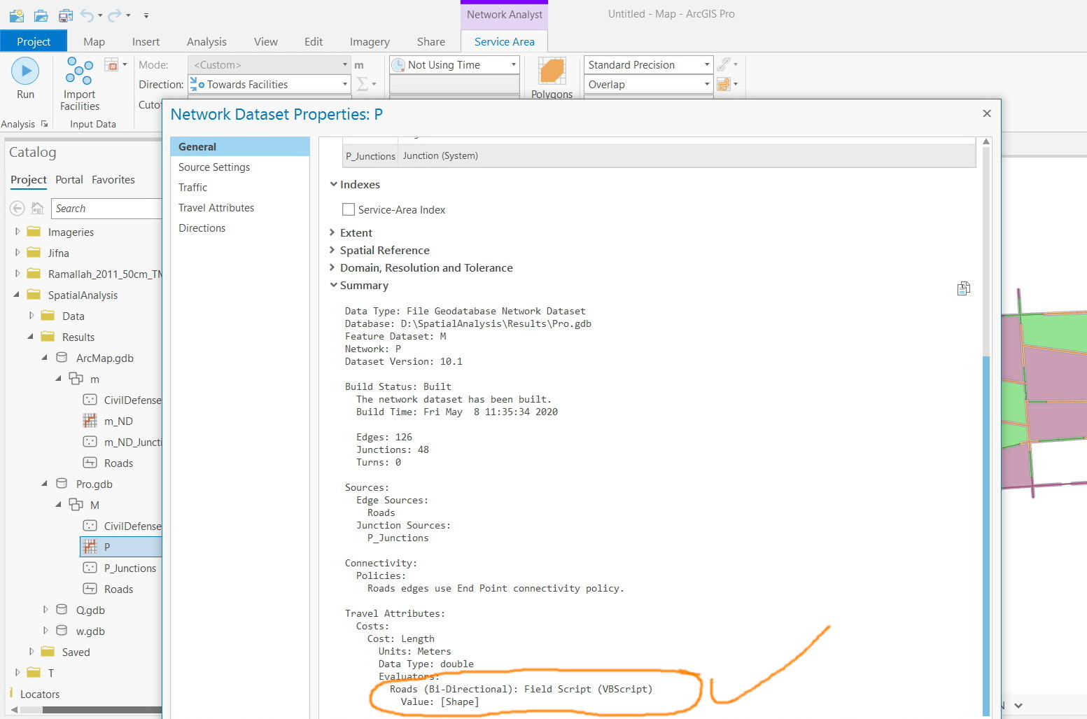
Thanks David
I double checked the direction configuration and found out that both in ArcMap and Pro are bidirectional as in the screenshots below
What other issues should I consider?

Jamal Numan
Geomolg Geoportal for Spatial Information
Ramallah, West Bank, Palestine
- Mark as New
- Bookmark
- Subscribe
- Mute
- Subscribe to RSS Feed
- Permalink
Neither “dissolve” nor “split” gets the “service area” matched with the result in ArcMap


Jamal Numan
Geomolg Geoportal for Spatial Information
Ramallah, West Bank, Palestine
- Mark as New
- Bookmark
- Subscribe
- Mute
- Subscribe to RSS Feed
- Permalink
Service Area in ArcGIS Pro uses a different polygon generation algorithm than ArcMap, so the results are not expected to look identical. The new polygon generation algorithm creates service areas that look more "bubbly" or more like clean buffers around streets, and it avoids the strange spikes you would occasionally see in ArcMap.
- Mark as New
- Bookmark
- Subscribe
- Mute
- Subscribe to RSS Feed
- Permalink
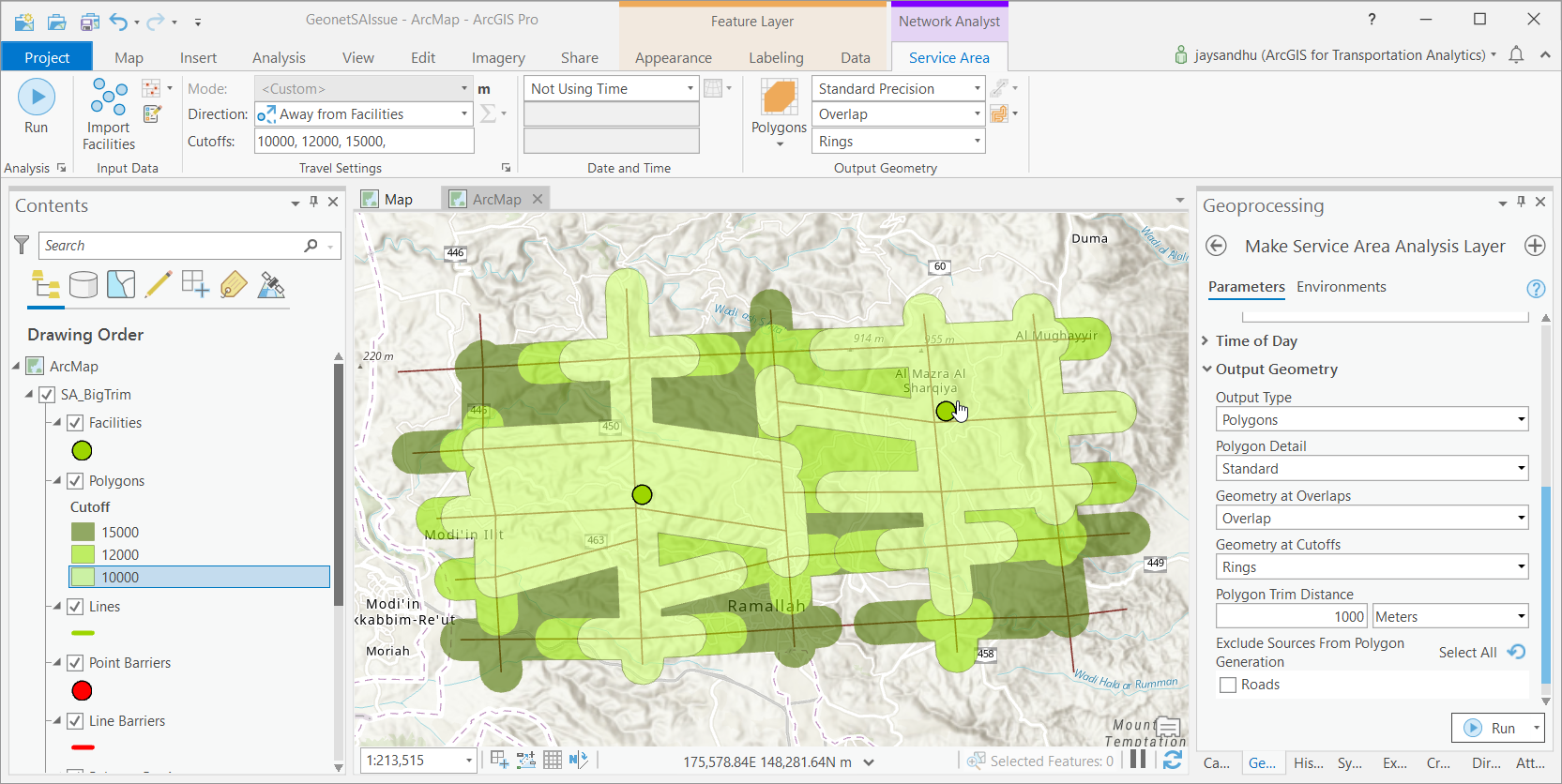
Thanks for including the data. So the issue is that Service Area polygon generation code was improved quite a bit both in performance as well as output polygon quality some years ago. To enable this new behavior, you need to turn on the service area index and rebuild the network. In ArcMap, this is on the network dataset property page under the optimizations tab. If you do this, then ArcMap will generate the same polygons you are seeing in Pro.
In Pro, we enabled these optimizations by default. So even if the network dataset does not have the service area index built, it will build it on the fly and use it. That is why you are seeing different results from ArcMap and Pro.
Now, in your screen shot, the quality of the output polygons does not look nice in Pro (and will not look nice in ArcMap after the index is added). This is because by default the polygon trim is set to 100 meters and you have service area breaks in much larger numbers like 10000 meters. So in ArcMap, change the trim to 1000 meter and solve it again. You will get better and more realistic output. In Pro, the trim can be set when you first make the layer (it is not in the UI yet). So use the GP tool Make Service Area Analysis Layer and set the trim to 1000 meters in the output geometry section (you can see it in the screenshot below with the updated polygon output).
Jay Sandhu