- Home
- :
- All Communities
- :
- Products
- :
- ArcGIS Living Atlas of the World
- :
- Living Atlas Blog
- :
- Towards an Accessible Basemap
Towards an Accessible Basemap
- Subscribe to RSS Feed
- Mark as New
- Mark as Read
- Bookmark
- Subscribe
- Printer Friendly Page
This was originally posted to the Esri blog page by Andy Skinner.
Recently, users have asked us about basemaps that are accessible and/or color-blind-safe. In particular they have asked for maps that comply with WCAG (Web Content Accessibility Guidelines) standards, and the US Federal ‘Section 508’ equivalent. This presents a few challenges. A map can be a complex structure that relies on a well-developed hierarchy, and a basemap is an extreme example of that. Imposing a new set of rules on top can be a daunting prospect!
What follows is an attempt to get to grips with the graphic aspects and to present you with some alternatives.
What are the standards?
This is a difficult question, at least in how these standards relate to maps. The graphic requirements tend to concentrate on legibility of text (WCAG-AA standards call for a contrast ratio of at least 4.5 between text and background). It suggests that for many of our maps we could meet this requirement simply by changing labels to black, placing a halo behind them to act as the ‘background’, and leaving the rest of the content alone. A map is much more than just its labels though, and we want to improve the accessibility of the map content as well.
What is different about a basemap?
John Nelson has talked about ‘BASE-maps’ versus ‘base-MAPS’. A BASE-map is a deliberately subdued background map used as an underpinning for your information (think ‘Light/Dark Gray’ or ‘Topographic’). This is challenging if it is an accessible map, where contrast between symbols is important. A ‘base-MAP’ is a stronger reference map (think ‘National Geographic Style’), where your information is added to the overall picture. That makes accessibility easier to build-in. Either way there needs to be some room in the map hierarchy for the user’s information.
How can we approach this?
We need to find a balance between accessibility and functionality.
So, we can use a color-blind-safe palette and increase contrast between map features, to make the map work for a broader audience. This means that the map will use at least some strong colors and tones. We can avoid ‘fussy’ fonts that might be difficult to pick out of the background. And we can increase the size of labels (but carefully – we don’t want to swamp the basemap with words!). Haloes help with the legibility of labels, but they can be destructive to the rest of the map information.
Ultimately, we may have to consider cutting some of the content of the map.
The Results
I have created a map design that tries to walk a line between accessibility, and functionality as a basemap. It is more of ‘base-MAP’, but I’ve tried not to go overboard with it.
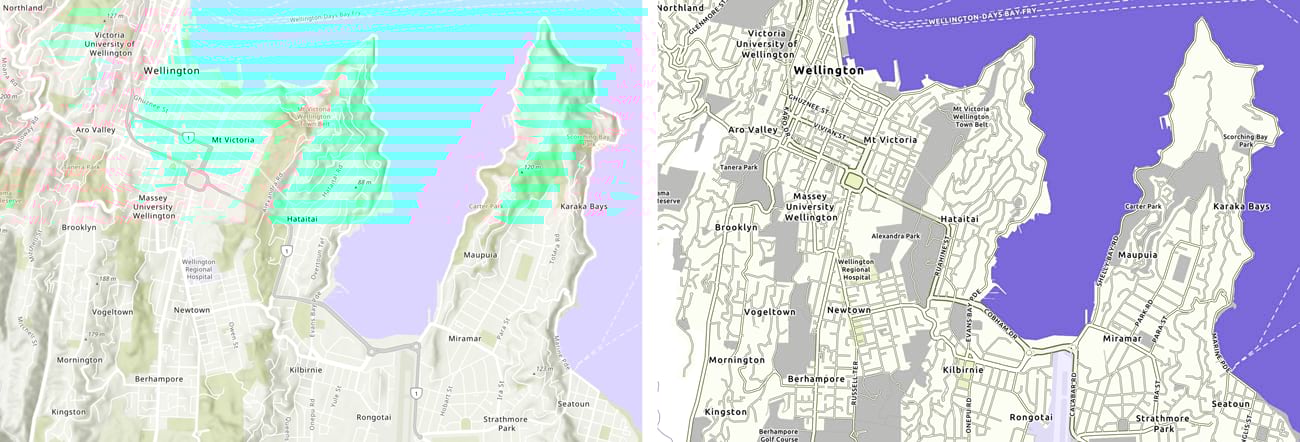
The Topographic Basemap and the new ‘Accessible’ design
Two versions of the map are available:
This one is a single layer basemap that sits below your information.
This one breaks-out the city and boundary information into a separate reference layer. This is placed over a base layer with the rest of the map content.
Here are the details:
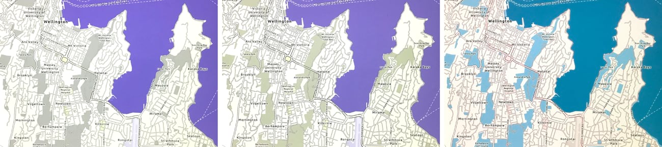
- Some content is removed, mainly at large scales, and some of the remaining categories have been amalgamated.
- Scale ranges are adjusted, so that some features (for example, road shields) appear later as you zoom in. This simplifies the content at smaller scales.
- Contrast is increased between those features remaining.
- Specifically, a strong color is applied to water areas so that they help to define the geography of the map.
- The palette is designed to be color-blind safe. Some colors may merge, but I have tried to restrict that to features that are otherwise distinctive, or that operate at different scales
- I have chosen Ubuntu as the font to use throughout the map. It has some character to it, but it is clear and legible.
- All labels are in black or white.
- Smaller labels are increased in size, but not to the point at which they take over the map. I use capitalization for some features (such as road/street names) to create a contrast with other labels.
- All labels have haloes, but in most cases, I’ve tried to soften the impact of them by blurring the edges and adding a touch of transparency.

Using the basemaps
These basemap layers will be available for you to use at the URLs linked above for the foreseeable future. The map content is updated with our regular basemap data updates. I may make periodic changes to these map styles as needed based on your feedback and our experience using the maps.
If they prove popular, we’ll consider incorporating them into the core basemap set. We’ll try to give you plenty of warning if we decide to shut these URLs down and replace them.
I would appreciate any feedback you care to provide, either via the comments section below, or directly at askinner@esri.com.
Thanks! Andy Skinner
Color-blindness suitability was assessed using ‘Color Oracle‘. Color contrast was assessed using contrast-ratio.com. Thanks to Mark Harrower and Emily Meriam for their input.
You must be a registered user to add a comment. If you've already registered, sign in. Otherwise, register and sign in.