- Home
- :
- All Communities
- :
- Products
- :
- ArcGIS Living Atlas of the World
- :
- Living Atlas Blog
- :
- Learning about the Thomas Fire using ArcGIS Online...
Learning about the Thomas Fire using ArcGIS Online and Living Atlas
- Subscribe to RSS Feed
- Mark as New
- Mark as Read
- Bookmark
- Subscribe
- Printer Friendly Page
by Bern Szukalski
The Thomas Fire
The Thomas Fire was a devastating wildfire of historic proportions that burned through parts of California’s Ventura and Santa Barbara Counties. The fire started on December 4, 2017, north of Santa Paula and near the Thomas Aquinas College, the fire’s namesake. Driven by strong Santa Ana winds that persisted for nearly two weeks, and a large amount of available fuel, the fire grew rapidly. By it’s official end on January 12, 2018, the fire had become the largest in California history (since superceded by the Mendocino Complex Fire).
The fire destroyed over a thousand structures, with hundreds more damaged. It generated over $2.18 billion in damages, injuring one firefighter and claiming the life of another, along with one resident who died in an auto accident while fleeing the area. The destruction didn’t stop with the fire, as post-fire rains created massive mud flows that claimed 21 lives, destroyed 129 residences, and damaged over 300 more. See the Thomas Fire on Wikipediafor more information.
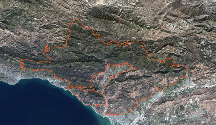
The Thomas Fire map
In this tutorial you will learn more about the fire using ArcGIS analysis tools and content available from the ArcGIS Living Atlas of the World to author a map showing the fire perimeter, learn more about the population and demographics of the impacted area, and view satellite imagery before, during, and after the fire.
You will use the following steps:
- Find the fire location
- Add and save the fire perimeter
- Geoenrich the perimeter, adding population and other demographic information
- Add Sentinel-2 imagery for dates prior to the fire, during the fire, and after the fire was fully contained.
- Adjust the imagery to reveal specific details
Find the fire location
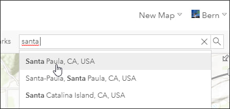
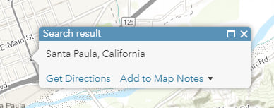
Step 1 – Use Search to find the location.
The first step in making the map is to navigate to the fire location. Open a new web map, use search and enter Santa Paula, California. You can also use Thomas Aquinas College, Santa Barbara County, or Ventura County as the search string.
Add the Thomas Fire perimeter
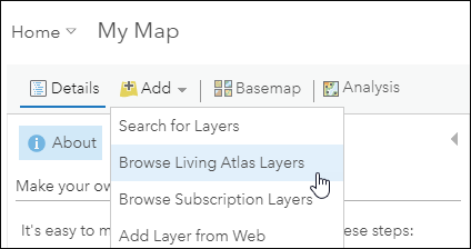
The USA Wildfire Activity layer from the Living Atlas displays current and inactive fire locations and perimeters. From your web map, Browse the Living Atlas to find the USA Wildfire Activity layer, then add it to your map.
Step 1 – Click Add, then Browse Living Atlas Layers.
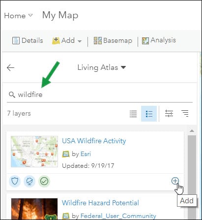
Step 2 – Search for “wildfire” to locate USA Wildfire Activity, then click + to add the layer to your map.
Step 3 – Display the Thomas Fire perimeter.
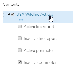
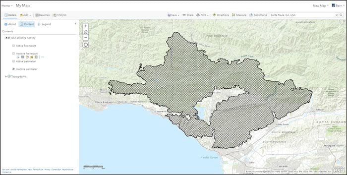
By default, the USA Wildfire Activity layer has the active fires locations and perimeters toggled on. Since the Thomas Fire is no longer active, you will turn the default active fire sublayers off, and turn the inactive perimeters on. Click the layer title to reveal the sublayers, and toggle the layers as shown below.
Zooming out, you can view the extent of the Thomas Fire.
Create a copy of the perimeter
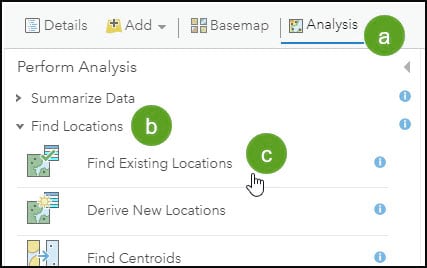
Inactive fire locations and perimeters are eventually phased out from the service, so you will create a copy of the perimeter to ensure it will always be available in your map. You will use the Analysis tools to create a new feature layer from the existing Thomas Fire perimeter.
Step 1a – Open the Analysis tools.
Step 1b – Open the Find Locations group.
Step 1c – Click Find Existing Locations.
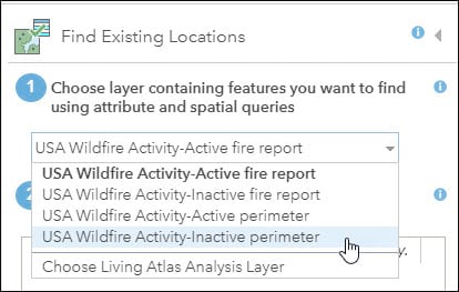
Step 2 – Complete the tool steps (numbered in blue) as follows.
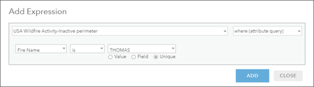
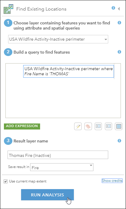
In tool step 1, choose the USA Wildfire Activity-Inactive Perimeter sublayer.
Step 3 – In tool step 2, construct the attribute query expression to find the Thomas Fire perimeter. The expression looks like this:
Step 4 – Complete the tool inputs for Find Existing Locations by entering a Result layer name in tool step 3, then click Run Analysis.
Enrich the fire perimeter polygon
How may people lived in the burn area? How many households were impacted? What is the population like? These questions can be answered by using geoenrichment tools that tap into Living Atlas data to add attributes describing these characteristics. These data are added based upon the area of the polygon using apportionment, the full details of the implementation and methodology can be viewed in the Data Apportionment documentation.
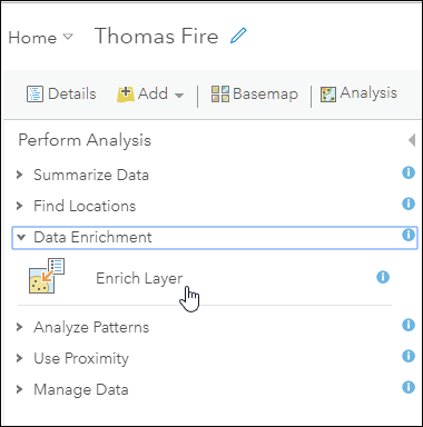
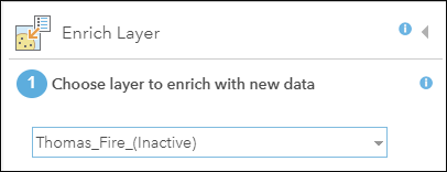
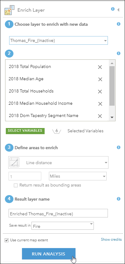
Step 1 – Open the Analysis tools, and choose Enrich Layer.
Step 2 – Complete the tool steps in the Enrich Layer tool. First, select the layer you created in Step 8 in tool step 1.
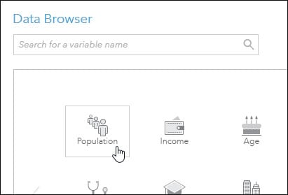
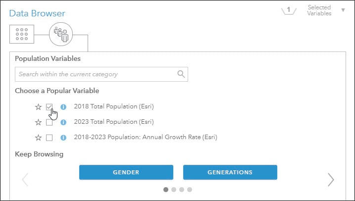
Step 3 – In tool step 2, click Select Variables to open the Data Browser.

Step 3 – Choose the following attributes to enrich the fire perimeter:
- 2018 Total Population (Esri)
- 2018 Total Households (Esri)
- 2018 Median Household Income (Esri)
- 2018 Dominant Tapestry Segment Name (Esri)
Begin by selecting a category:
Then choose the attributes.
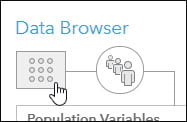
To go back to the categories, click the category box in the upper left:
Step 4 – After selecting the attributes, complete the tool steps as shown below, then click Run Analysis.
Add Sentinel-2 imagery
Sentinel-2 is multispectral, multitemporal global imagery obtained via two satellites placed in the same orbit by the European Space Agency, and phased 180 degrees from each other. Every location on the planet is revisited every 5 days. This Living Atlas imagery layer pulls content directly from the source Sentinel-2 archive on Amazon Web Services (AWS), and is updated daily. The layer can be easily added to web maps (and scenes), and rendered in different ways to highlight specific characteristics. In addition, the imagery can be filtered by date.
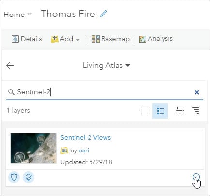
Step 1 – Add the Sentinel-2 imagery layer from the Living Atlas.
This is similar to what you did in Step 3, but search for Sentinel-2 instead.
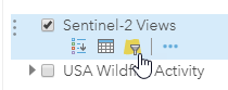
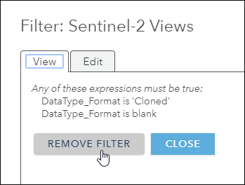
Step 2 – Remove the default filter on Sentinel-2.
The default filter on the Sentinel-2 layer will display the most recent and clearest imagery available. You will want to search for all imagery around the dates of the fire, even smoke-filled imagery, so remove the filter so all imagery will be available. After adding the layer, click the Filter icon to display the current filter, and remove it.
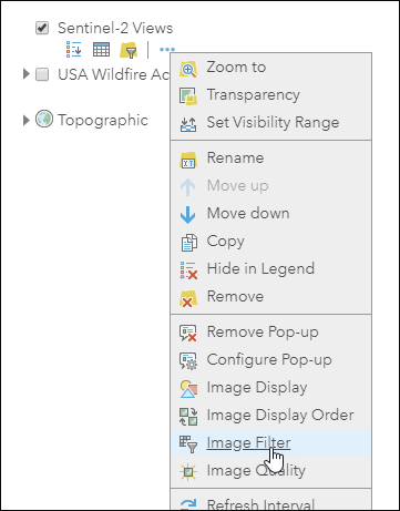
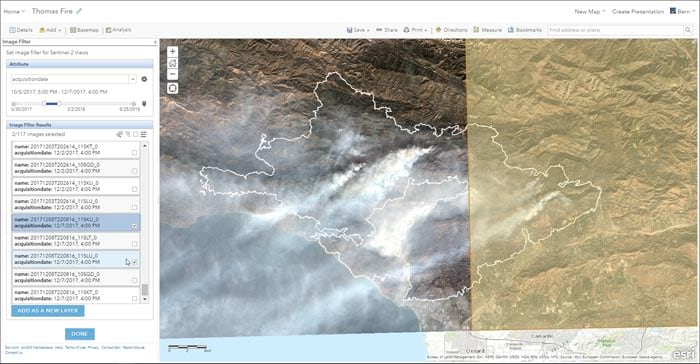
Step 3 – Click More Options (…) and choose the Image Filter.
You will use this filter to search for available imagery around the dates of the fire.
Step 4 – Select the imagery at the desired dates.
Adjust the time slider around the dates of the fire. The available imagery will be listed. Hover over each to display the coverage footprint in yellow on the map. Identify the date, then select the images that cover the fire perimeter. Repeat the process to create layers for before, during, and afterwards. Note that to cover the entire fire perimeter you will have to select two images, then click Add To Map combining both into one layer.
When moving on to the next date, remember to uncheck the previously selected layers.
The fire started December 4, 2017, and officially ended January 12, 2018. Using the image filter to add Sentinel-2 imagery for the following dates:
- October 23, 2017 (before the fire began)
- December 7, 2017 (during the fire)
- January 16, 2018 (after the fire)
Adjust the imagery display
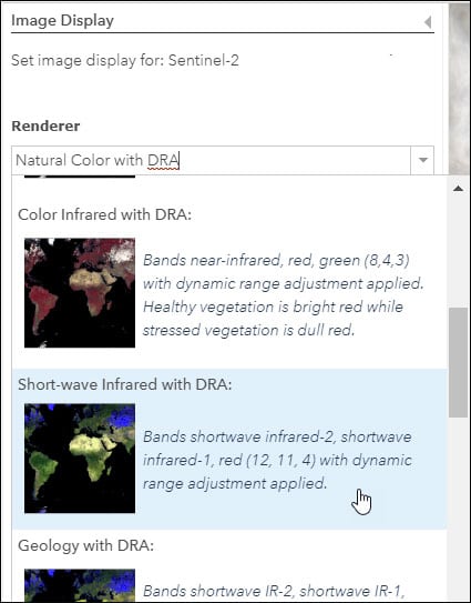
To glean more information from multispectral imagery like Sentinel-2, you can choose a renderer that highlights specific characteristics of the imagery. For example, you can choose renderers that highlight healthy vegetation, geology, moist areas, and more.
The default renderer is Natural Color with DRA (Dynamic Range Adjustment). In this section you will apply the following renderers to the imagery layers you have added to your map:
- October 23, 2017 (before the fire began) – use the default Natural Color with DRA.
- December 7, 2017 (during the fire) – use Short-wave Infrared to highlight actively burning areas and hotspots.
- January 16, 2018 (after the fire) – use Normalized Burn Ratio to highlight the burned areas.
Step 1 – From the layer options, choose Image Display.
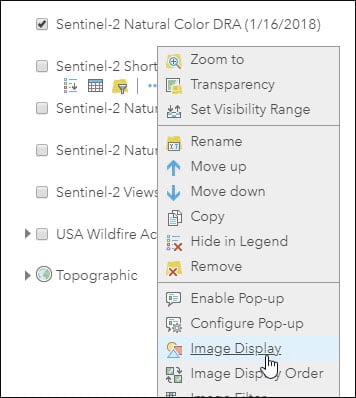
Step 2 – From the list of renderers, choose the one that you want, then click Apply.
Repeat the steps for the other layer, and save your map when finished.
Summary and results
Using content from the ArcGIS Living Atlas of the World and ArcGIS capabilities, you have authored a map that delivers enhanced information about the Thomas Fire. Demographic attributes have been added to the fire perimeter delivering information about the impacted households and enabling us to learn more about those that lived there. Sentinel-2 layers of different vintages have been added, and specific spectral characteristics of the imagery have been rendered to highlight active burn areas, and post-fire impacts. These are reviewed below.
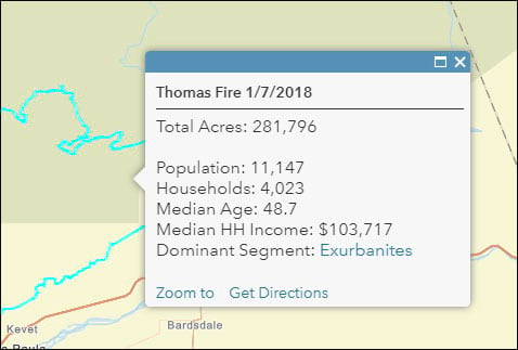
Geoenriched fire perimeter
After configuring the layer pop-up, clicking the perimeter provides more information about the population. The total number of acres was in the original perimeter, but geoenrichment has added the population, number of households, median age, median household income, and dominant Tapestry segment (Exurbanites). The dominant segment is a link that opens detailed documentation about Exurbanites, helping us learn more about the characteristics of the impacted residents.
Pre-fire Sentinal-2 imagery December 23, 2017
Using the default Natural Color DRA renderer, this image show the normal conditions and appearance for the burn area.
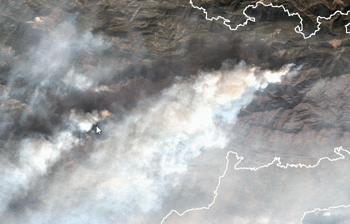
During-fire Sentinel-2 imagery December 7, 2017
Captured a few days after the fire started, and using the Short-wave Infrared renderer, this layer allows us to peer through the smoke and clearly see the active burn areas.
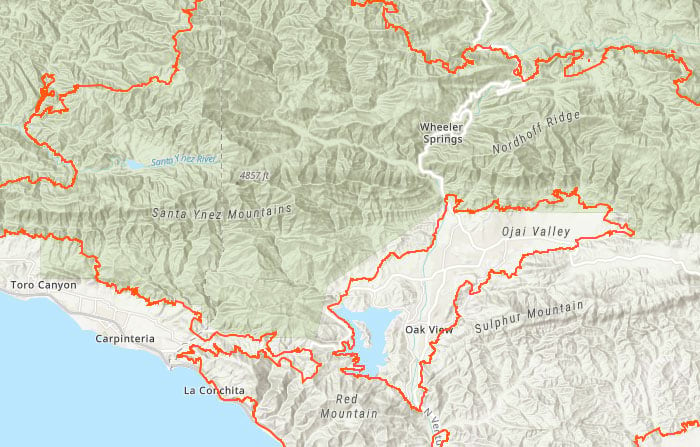
Post-fire Sentinal-2 imagery January 16, 2018
This layer uses the Normalized Burn Area renderer to highlight the burned areas in black.
View the map
Click the image below to view the map authored via this tutorial. Since the map contains subscription content, you will be prompted to sign in when the map is opened.
More information
For more information, see the following:
You must be a registered user to add a comment. If you've already registered, sign in. Otherwise, register and sign in.