Turn on suggestions
Auto-suggest helps you quickly narrow down your search results by suggesting possible matches as you type.
Cancel
- Home
- :
- All Communities
- :
- Developers
- :
- JavaScript Maps SDK
- :
- JavaScript Maps SDK Questions
- :
- New Bing map styles
Options
- Subscribe to RSS Feed
- Mark Topic as New
- Mark Topic as Read
- Float this Topic for Current User
- Bookmark
- Subscribe
- Mute
- Printer Friendly Page
New Bing map styles
Subscribe
6145
23
04-07-2011 05:13 PM
04-07-2011
05:13 PM
- Mark as New
- Bookmark
- Subscribe
- Mute
- Subscribe to RSS Feed
- Permalink
Hi all,
Not sure if this has been covered somewhere else but I couldn't find any posts on it. Is it possible to access the new Bing Maps styles from the JavaScript API? Using the following:
http://help.arcgis.com/en/webapi/javascript/arcgis/demos/ve/ve_layer.html
it's the still old tiles in Sydney, Australia. Also, related question - does anyone know if it's possible to style the Bing tiles like you can in the Google Maps API?
Thanks for any assistance.
Ed
23 Replies
07-07-2011
08:55 AM
- Mark as New
- Bookmark
- Subscribe
- Mute
- Subscribe to RSS Feed
- Permalink
I'll admit the forced opt-in with no possible test period was a bit of an odd implementation, but I'm not sure how that was all handled...whether that was the role of Bing or Esri. However, since the new basemaps had been up on Bing Maps itself for quite some time, I would imagine the color scheming issues could have been anticipated.
And I'll speak up and say that I like the new basemap. The old road map was absolutely heinous with those yellow state borders, this is much more clean and professional. And the labelling in the hybrid basemap seems fine to me.
I wouldn't suspect there's a way of switching to the old version since Bing rolled this out via an opt-in phase first, then the stage we're now in, in which this is the "only style served up through all Bing Maps outlets".
07-07-2011
01:26 PM
- Mark as New
- Bookmark
- Subscribe
- Mute
- Subscribe to RSS Feed
- Permalink
Mark,
You're right, I should have tested this against Bing.com so I can't really complain.
Here are some examples of (IMO) poor cartographic choices in the new Bing maps:

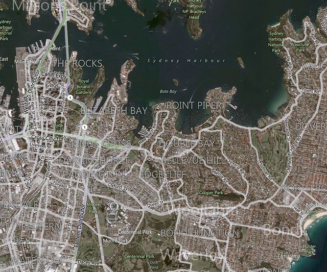
Inconsistent application of suburb labels (Bondi vs BONDI JUNCTION) in a variety of huge fonts, with no apparent reason. These labels are very similar to the roads and easily blend in (look at the WOOLLAHRA label in the lower right of the screenshot). There are far too many suburb labels resulting in clutter.

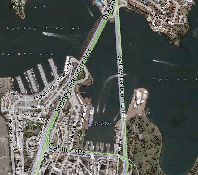
Ridiculously large fonts beside more reasonable fonts. Duplication of labels in close proximity (Sydney Harbour x 3 in just this tiny example). This looks like something out of ArcView 3 - given Microsoft's resources it's quite disappointing.
Personally, I'll be looking around at alternatives to this new map style.
Cheers,
Steve
You're right, I should have tested this against Bing.com so I can't really complain.
Here are some examples of (IMO) poor cartographic choices in the new Bing maps:

Inconsistent application of suburb labels (Bondi vs BONDI JUNCTION) in a variety of huge fonts, with no apparent reason. These labels are very similar to the roads and easily blend in (look at the WOOLLAHRA label in the lower right of the screenshot). There are far too many suburb labels resulting in clutter.

Ridiculously large fonts beside more reasonable fonts. Duplication of labels in close proximity (Sydney Harbour x 3 in just this tiny example). This looks like something out of ArcView 3 - given Microsoft's resources it's quite disappointing.
Personally, I'll be looking around at alternatives to this new map style.
Cheers,
Steve
07-07-2011
01:46 PM
- Mark as New
- Bookmark
- Subscribe
- Mute
- Subscribe to RSS Feed
- Permalink
For whatever reason, the screenshots aren't displaying. Could you post them via some other method?
Though I will note...it does seem a bit different in Australia vs. in the US. For example, Chicago, a city known for its sprawling and numerous suburbs, doesn't suffer from the kind of suburb label bloat that you're describing. Though I do see it if I head over to Bondi Junction in Australia.
Though I will note...it does seem a bit different in Australia vs. in the US. For example, Chicago, a city known for its sprawling and numerous suburbs, doesn't suffer from the kind of suburb label bloat that you're describing. Though I do see it if I head over to Bondi Junction in Australia.
07-07-2011
04:21 PM
- Mark as New
- Bookmark
- Subscribe
- Mute
- Subscribe to RSS Feed
- Permalink
Sorry, try again now - or just fire up ArcView 3 and hit the Label checkbox 🙂
- « Previous
- Next »
- « Previous
- Next »