- Home
- :
- All Communities
- :
- Developers
- :
- JavaScript Maps SDK
- :
- JavaScript Maps SDK Questions
- :
- Re: Geocoder in titlePane gets cut off - need styl...
- Subscribe to RSS Feed
- Mark Topic as New
- Mark Topic as Read
- Float this Topic for Current User
- Bookmark
- Subscribe
- Mute
- Printer Friendly Page
Geocoder in titlePane gets cut off - need style assistance
- Mark as New
- Bookmark
- Subscribe
- Mute
- Subscribe to RSS Feed
- Permalink
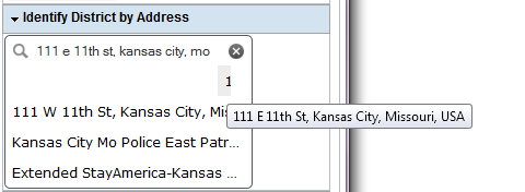
I have all my tools stored in TitlePanes within a ContentPane as a side panel so the users can have more than one set of tools open at a time. I have my geocoder in a titlePane and it looks fine until I start to enter something. The suggestions aren't showing well. You can sort of see them, but mostly there are cut off and the user gets scroll bars to deal with.
It seems like I ought to be able to set a style on the geocoder, but I haven't figured out which style it is. I tried .simpleGeocoder .esriGeocoderResults, which seemed likely, but that didn't fix this. I tried adding a z-index, but that didn't do anything.
 <div id="rightPane" data-dojo-type="dijit/layout/ContentPane"  data-dojo-props="region:'right',splitter:true">
   <div id="tp_geocode" data-dojo-type="dijit/TitlePane" data-dojo-props="title:'Identify District by Address', closable:false, open:true">
   <div id="geocodeDiv"> </div>
</div>
</div>
- Mark as New
- Bookmark
- Subscribe
- Mute
- Subscribe to RSS Feed
- Permalink
Why not use accordion panes instead of the title panes?
As for the Geocoder div if its set in a small title pane that what it does unless you set the CSS position to absolute then it should get that suggestions on top of the title pane.
- Mark as New
- Bookmark
- Subscribe
- Mute
- Subscribe to RSS Feed
- Permalink
Try messing with this .css class tag (assuming you're using the Claro Dojo style):
.claro .esriGeocoder {
  z-index: 800 !important;
}
- Mark as New
- Bookmark
- Subscribe
- Mute
- Subscribe to RSS Feed
- Permalink
There are instances where the user benefits from having more than one pane open at a time. Rather than go with a mix accordion and title, I just always use TitlePanes.
I tried the style change, it didn't help. I feel like that's where the change needs to happen, I just haven't discovered which style I need to set.
- Mark as New
- Bookmark
- Subscribe
- Mute
- Subscribe to RSS Feed
- Permalink
How about .esriGeocoderResults ?
- Mark as New
- Bookmark
- Subscribe
- Mute
- Subscribe to RSS Feed
- Permalink
Nope, that was one I tried before I even posted the question. I'm wondering if I can use a dojo/query to change the height of the titlePane, assuming that 'suggest' is something that I can listen for.
- Mark as New
- Bookmark
- Subscribe
- Mute
- Subscribe to RSS Feed
- Permalink
Playing around with the CSS of the geocoder I came to a solution that might work for you, see Titelpane sizes to geocoder results - JSFiddle
Key is to set:
.simpleGeocoder .esriGeocoderResults {
    position: relative;
}
- Mark as New
- Bookmark
- Subscribe
- Mute
- Subscribe to RSS Feed
- Permalink
Bummer. You're a pretty seasoned veteran of the JS API so I'm not surprised that you already tried my suggestions. Ya never know, though! 
- Mark as New
- Bookmark
- Subscribe
- Mute
- Subscribe to RSS Feed
- Permalink
I'm always open to suggestions, especially when it comes to styling. Most of the time it's the one combination you haven't tried yet that is the answer.
- Mark as New
- Bookmark
- Subscribe
- Mute
- Subscribe to RSS Feed
- Permalink
That's closer, but now it's pushed the top choice all the way over to the right, so that all you see is part of the first address number.