- Home
- :
- All Communities
- :
- Products
- :
- ArcGIS Insights
- :
- ArcGIS Insights Questions
- :
- Presenting data by day of the week
- Subscribe to RSS Feed
- Mark Topic as New
- Mark Topic as Read
- Float this Topic for Current User
- Bookmark
- Subscribe
- Mute
- Printer Friendly Page
Presenting data by day of the week
- Mark as New
- Bookmark
- Subscribe
- Mute
- Subscribe to RSS Feed
- Permalink
Hi guys,
I’d like to know people’s thoughts on presenting data by day of the week (Monday, Tuesday, Wed…) for a month’s worth of data.
Let’s say we have data on car accidents for the month of January. And the minister would like to know which day of the week was the worst?
With Insights, it’s easy to create a histogram of accident counts by day of the week.
But, is there a good way to normalise this data (for example there might be more Mondays than Tuesdays for that month, and hence more accidents)?
I’d just like to know best practices around this sort of analysis.
Thanks,
Gee
- Mark as New
- Bookmark
- Subscribe
- Mute
- Subscribe to RSS Feed
- Permalink
Hello Gee,
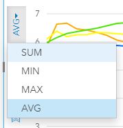
I would normalize the data by dividing the number of accidents by the number of times each day of the week occurred in a month. The easiest way to do this in insights for arcgis would be to use the average function on the y-axis instead of the sum as shown in the image below.
Best,
Michelle