- Home
- :
- All Communities
- :
- Products
- :
- ArcGIS Insights
- :
- ArcGIS Insights Questions
- :
- Re: Can you modify how the Insights time series gr...
- Subscribe to RSS Feed
- Mark Topic as New
- Mark Topic as Read
- Float this Topic for Current User
- Bookmark
- Subscribe
- Mute
- Printer Friendly Page
Can you modify how the Insights time series graph aggregates data?
- Mark as New
- Bookmark
- Subscribe
- Mute
- Subscribe to RSS Feed
- Permalink
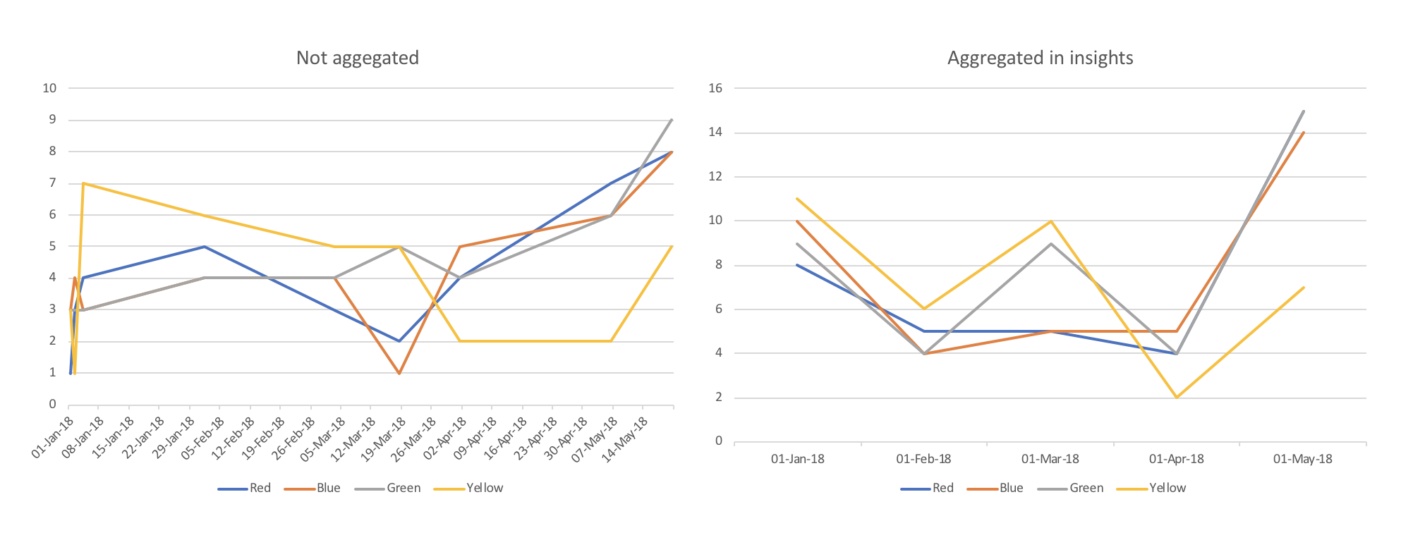
I have a series of observations for 4 catagories taken at random times over a 2 year period that I want to display in Insights. On occasion observations are captured once a week, sometimes once a month for all 4 catagories. The issue I have is that Insights automatically chooses the time periods along the x axis and aggregates the observations during this period into a total for that period Insights selects. I don't want to know the total aggregated during the period I want to maintain the actual count. The graphs below demonstrate this. They look completely different due to the automatic aggregation. Does anyone know how I can overcome this problem?
Solved! Go to Solution.
Accepted Solutions
- Mark as New
- Bookmark
- Subscribe
- Mute
- Subscribe to RSS Feed
- Permalink
Hi,
This is a great question and is a frequent topic on conversation in the team. As yet there is no way to change or modify it. This is something we would like to address in a future release.
- Mark as New
- Bookmark
- Subscribe
- Mute
- Subscribe to RSS Feed
- Permalink
Hi,
This is a great question and is a frequent topic on conversation in the team. As yet there is no way to change or modify it. This is something we would like to address in a future release.
- Mark as New
- Bookmark
- Subscribe
- Mute
- Subscribe to RSS Feed
- Permalink
Hi,
Is there any update on this?
I have a simple table with one record for the first day of each month:

Yet Time Series overlaps the date intervals in some random dates instead of plotting the count in the precise date. This generates spikes that convey the data is incorrect.

A workaround could be to use Line Chart instead of Time Series. However, Time Series can calculate the scale much better the the Line Chart.
In this other example the attribute value is much smaller. The Line Chart displays it correctly but the scale makes it much harder to read the the Time Series:

Is there a way to adjust the Line Chart scale?
- Mark as New
- Bookmark
- Subscribe
- Mute
- Subscribe to RSS Feed
- Permalink
Hi Diego,
Great question.
I'll follow up on this with the team, as I joined well after this question was originally posted, so I'm not sure.
I can understand your frustration with this, though. The timeline is easier to read for this data.
The issue may be due to AGOL architecture/limitations beyond the Insights team's development control. However, we often elevate these requests up the chain, which is to say...
We don't sit back on our laurels! We hear you and advocate for our users. 🙂
I'll check into this early next week to see if there is an update, if no one with more knowledge posts a response on here sooner.
Sorry for the inconvenience, and I hope aside from this, you're finding Insights your go-to tool. Happy to hear any other ideas for improvements or modifications you have. We're ramping up for an awesome 2022!
Have a great weekend, Diego. And thanks for using Insights!
Ian
Ian Muehlenhaus
Location Analytics
- Mark as New
- Bookmark
- Subscribe
- Mute
- Subscribe to RSS Feed
- Permalink
The workaround using line chart that I've suggested end up not being a good solution.
My data rolls over one month every month. So, if I try to represent data from Feb 21 to Jan 22, using the month attribute from the date field, the line chart won't consider the year and the chart will always start from January and end in December.
Maybe adding a sort by another attribute would solve this issue in this particular case, but ideally I would like to use the time series.
Unfortunately I may have to find another tool for this job at this time.
- Mark as New
- Bookmark
- Subscribe
- Mute
- Subscribe to RSS Feed
- Permalink
Hi Diego,
Very sorry to hear this. Understandable, however.
I will escalate this potential fix in our ideas group. Unfortunately, sometimes we are hampered by the framework we are using to create Insights. This may be one such situation. I will look into it further.
Thanks for bringing it to our attention again, however. If we can fix this shortcoming, we will. Hopefully someone else in the community has discovered a workaround. I'm going to keep my eyes on this thread.
Sincerely,
Ian
Ian Muehlenhaus
Location Analytics
- Mark as New
- Bookmark
- Subscribe
- Mute
- Subscribe to RSS Feed
- Permalink
Hello. Is it possible to have multiple times series lines in a time series graph? For example I performed Time Series Clustering in ArcGIS Pro. I exported the resulting chart to a csv file. But when I import the csv file into Insights all of the Time Series Cluster IDs are merged into one field that I can't figure out how to separate.
- Mark as New
- Bookmark
- Subscribe
- Mute
- Subscribe to RSS Feed
- Permalink
Leon,
This is definitely possible within Insights. After adding the Time Series chart, select Group by to determine the field to display.

From your comment though, it seems that your data is being transformed upon import into Insights? I don't think that should be occurring. Is it possible to send a copy of the data?
Scott
- Mark as New
- Bookmark
- Subscribe
- Mute
- Subscribe to RSS Feed
- Permalink
I have 3 variables date/time, sum, and cluster id. Originally all three fields were creating on line graph. Which I think would have allowed me to do the group you mention. But now I get two lines. I'm not sure what to do.

- Mark as New
- Bookmark
- Subscribe
- Mute
- Subscribe to RSS Feed
- Permalink
Each record (row) has 3 fields. Looks something like this. 5 cluster ids per date.
The date and sums form one jagged trend line and date and cluster is form a flat line.
date clusterid sum
1/1/2015 1 32
1/1/2015 2 10
1/1/2015 3 7
1/1/2015 4 22
1/1/2015 5 15
1/29/2015 1 44
........