- Home
- :
- All Communities
- :
- Products
- :
- ArcGIS Hub
- :
- ArcGIS Hub Questions
- :
- Making a COVID-Hub Site more mobile friendly
- Subscribe to RSS Feed
- Mark Topic as New
- Mark Topic as Read
- Float this Topic for Current User
- Bookmark
- Subscribe
- Mute
- Printer Friendly Page
Making a COVID-Hub Site more mobile friendly
- Mark as New
- Bookmark
- Subscribe
- Mute
- Subscribe to RSS Feed
- Permalink
We've got a hub site up and running and have an embedded dashboard.
I viewed the site with a mobile device and notice it's not mobile friendly.
I also viewed a couple neighboring county's Open Data sites and noticed that they are mobile friendly.
I'm curious if anyone has any advice on how to make the site mobile friendly. I'm thinking there probably isn't anything that can be done short of using a different solution but it doesn't hurt to ask the question.
Not that it really matters, but here's the site: lancaster-pa-covid-19-hub
- Mark as New
- Bookmark
- Subscribe
- Mute
- Subscribe to RSS Feed
- Permalink
Keary Larson our best recommendation is to create a "mobile-version" of your dashboard and use the mobile override functionality on the layout cards (like the iframe card) so switch to the more appropriate version.
We've communicated with the Dashboard team the desire to make their applications mobile-friendly; however, it remains a future consideration for them at this time.
A little preview of UC 2020 User Conference, during the Hub presentation I walk through some tips & tricks on getting things down to the small screen. I use a Census COVID-19 Dashboard as an example of how to do the above workflow. Feel free to check it out here...
- Mark as New
- Bookmark
- Subscribe
- Mute
- Subscribe to RSS Feed
- Permalink
Thank you. That's a nice feature to at least prevent a mobile user from getting caught up a small version of the embedded dashboard.
We haven't developed a mobile app and I'm not sure if we're going to at this point.. but I can at least specify the 'hide from mobile' option. I experimented with using just the map from the dashboard on mobile but it's not very effective.. Thanks again!
- Mark as New
- Bookmark
- Subscribe
- Mute
- Subscribe to RSS Feed
- Permalink
I'm working on creating a mobile dashboard and while it's an improvement for sure.. there are some bar charts that do not translate or scale well to mobile
The mobile dashboard is here:
The desktop dashboard does fairly well for effectively communicating the data and I'm hoping to be able to communicate the same data on mobile.
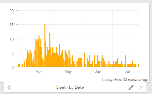
I'm really hitting an issue with two charts in particular. The death by date is ok as it is.... It's not ideal but at least the user can drag their finger on the screen to see popup values.
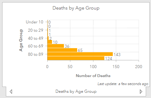
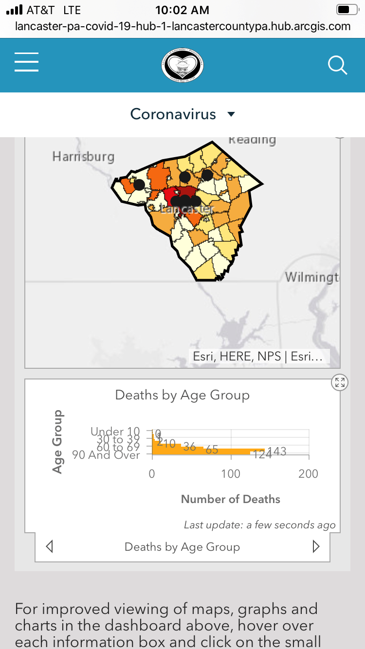
The death by age group chart doesn't work and requires too much screen real estate to have it not scale and eliminate categories. On mobile it only shows a subset of the categories.
I was hoping to be able to change the mobile dashboard to allow for a larger screen area to store the charts than a percentage of the screen real estate since users on mobile are used to scrolling vertically to browse content.
The Death by date chart doesn't scale too well but is a little more usable in the dashboard since users can interact a little easier with the content.
I guess I was wondering if there's possibly a different element I could consider using in the dashboard that will scale better and display totals by all the age ranges and dates.
Here's a preview on mobile and it's pretty apparent:
Feedback on this excellent forum is always appreciated!