- Home
- :
- All Communities
- :
- Products
- :
- ArcGIS Hub
- :
- ArcGIS Hub Questions
- :
- Re: Hub Site Custom Header
- Subscribe to RSS Feed
- Mark Topic as New
- Mark Topic as Read
- Float this Topic for Current User
- Bookmark
- Subscribe
- Mute
- Printer Friendly Page
- Mark as New
- Bookmark
- Subscribe
- Mute
- Subscribe to RSS Feed
- Permalink
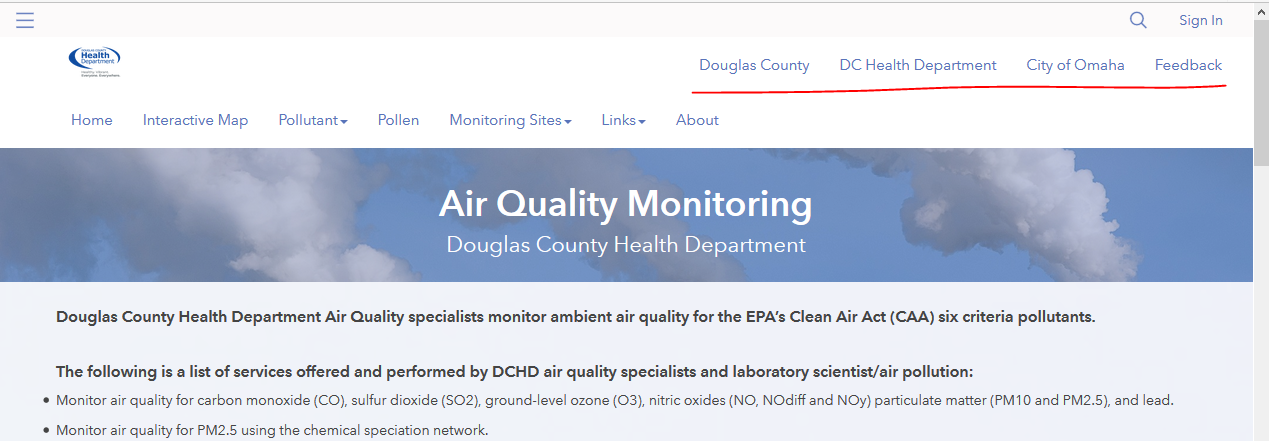
I am working on the Hub Site, in AGO and would like to create a custom header for my site. While what I got so far looks ok. There are a couple things I am struggling with. First it looks like there are two tiers in the header, and I would like the padding between to tiers to be smaller. My over all goal is to make the header section smaller. But I cannot figure out how to accomplish that. Second, if I resize my screen or pull up this site on the mobile device, the header doesn't have a true responsive mode, and the items from the header start running into each other, and behave chaotically.
Below is a link to my site, as well as the html and css for the header.
https://dchd-air-quality-dogis.opendata.arcgis.com
Any help would be greatly appreciated.
HTML
<nav class="navbar navbar-default navbar-static-top first-tier">
<div class="container">
<ul class="nav nav-pills pull-right" role="list">
<li><a href="https://www.douglascounty-ne.gov/" target="_blank">Douglas County</a></li>
<li><a href="https://www.douglascountyhealth.com/" target="_blank">DC Health Department</a></li>
<li><a href="https://www.cityofomaha.org/" target="_blank">City of Omaha</a></li>
<li><a href="https://gis.douglascounty-ne.gov/contact-us" target="_blank">Feedback</a></li>
</ul>
</div>
</nav>
<nav class="navbar navbar-inverse navbar-static-top second-tier" role="navigation">
<div class="container">
<img class = "text pull-left" src="https://s3.amazonaws.com/dcgis_photos/Air_Quality_Monitors/Web-DCHD-Logo-Tagline-Type_Color.png" alt="logo" width="25%" height="15%">
<div class = "text pull-left"> <h1 style="text-align: left;"><strong>Air Quality Monitoring</strong></h1><p style="text-align: left; "></p><h4 style="text-align: left;">Douglas County Health Department</h4><p></p>
<br>
<div class="btn-group">
<a button="" class="btn btn-default" type="button" id="dropdownMenu1" aria-haspopup="true" aria-expanded="false" href="https://dchd-air-quality-dogis.opendata.arcgis.com">Home</a>
</div>
<div class="btn-group">
<a button="" class="btn btn-default" type="button" id="dropdownMenu2" aria-haspopup="true" aria-expanded="false" href="https://dogis.maps.arcgis.com/apps/opsdashboard/index.html#/8725293d42fa4bcb8887f9e74ff46458" target="_blank">Interactive Map</a>
</div>
<div class="btn-group">
<button class="btn btn-default dropdown-toggle" type="button" id="dropdownMenu4" data-toggle="dropdown" aria-haspopup="true" aria-expanded="false">
Pollutants
<span class="caret"></span>
</button>
<ul class="dropdown-menu" aria-labelledby="dropdownMenu4">
<li><a href="https://dchd-air-quality-dogis.opendata.arcgis.com/pages/carbon-monoxide" target="_blank">Carbone Monoxide</a></li>
<li><a href="https://dchd-air-quality-dogis.opendata.arcgis.com/pages/nitrogen-oxides" target="_blank">Nitrogen Oxides</a></li>
<li><a href="https://dchd-air-quality-dogis.opendata.arcgis.com/pages/ozone" target="_blank">Ozone</a></li>
<li><a href=" https://dchd-air-quality-dogis.opendata.arcgis.com/pages/sulfur-dioxides" target="_blank">Sulfur Dioxides</a></li>
<li><a href="https://dchd-air-quality-dogis.opendata.arcgis.com/pages/particulate-matter" target="_blank">Particulate Matter</a></li>
<li><a href="https://dchd-air-quality-dogis.opendata.arcgis.com/pages/lead" target="_blank">Lead</a></li>
<li role="separator" class="divider"></li>
<li><a href="#">Other Pollutants</a></li>
</ul>
</div>
<div class="btn-group">
<a button="" class="btn btn-default" type="button" id="dropdownMenu2" aria-haspopup="true" aria-expanded="false" href="https://dchd-air-quality-dogis.opendata.arcgis.com/pages/pollen" target="_blank">Pollen</a>
</div>
<div class="btn-group">
<button class="btn btn-default dropdown-toggle" type="button" id="dropdownMenu4" data-toggle="dropdown" aria-haspopup="true" aria-expanded="false">
Monitoring Sites
<span class="caret"></span>
</button>
<ul class="dropdown-menu" aria-labelledby="dropdownMenu4">
<li><a href="https://dchd-air-quality-dogis.opendata.arcgis.com/pages/site-bellevue" target="_blank">Bellevue</a></li>
<li><a href="https://dchd-air-quality-dogis.opendata.arcgis.com/pages/site-blair" target="_blank">Blair</a></li>
<li><a href="https://dchd-air-quality-dogis.opendata.arcgis.com/pages/site-creighton-no-downtown" target="_blank">Creighton/North Omaha Downtown</a></li>
<li><a href="https://dchd-air-quality-dogis.opendata.arcgis.com/pages/site-central" target="_blank">Central Omaha</a></li>
<li><a href="https://dchd-air-quality-dogis.opendata.arcgis.com/pages/site-ncore" target="_blank">NCORE (Health Dept Campus)</a></li>
<li><a href="https://dchd-air-quality-dogis.opendata.arcgis.com/pages/site-ne-omaha1" target="_blank">Northeast Omaha 1</a></li>
<li><a href="https://dchd-air-quality-dogis.opendata.arcgis.com/pages/site-ne-omaha2" target="_blank">Northeast Omaha 2</a></li>
<li><a href="https://dchd-air-quality-dogis.opendata.arcgis.com/pages/site-ralston" target="_blank">Ralston</a></li>
<li><a href="https://dchd-air-quality-dogis.opendata.arcgis.com/pages/site-south-omaha" target="_blank">South Omaha</a></li>
</ul>
</div>
<div class="btn-group">
<button class="btn btn-default dropdown-toggle" type="button" id="dropdownMenu5" data-toggle="dropdown" aria-haspopup="true" aria-expanded="false">
Links
<span class="caret"></span>
</button>
<ul class="dropdown-menu" aria-labelledby="dropdownMenu4">
<li><a href="#EPA">EPA</a></li>
<li><a href="#NOAA" target="_blank">NOAA</a></li>
<li><a href="#AirVision" target="_blank">AirVision</a></li>
<li role="separator" class="divider"></li>
<li><a href="#">Other Documents</a></li>
</ul>
</div>
<div class="btn-group">
<a button="" class="btn btn-default" type="button" id="dropdownMenu2" aria-haspopup="true" aria-expanded="false" href="https://dchd-air-quality-dogis.opendata.arcgis.com/pages/about-air-quality-dchd" target="_blank">About</a>
</div>
</div>
</div>
<br>
</nav>
CSS
.first-tier {
height: 0px;
margin-bottom: 0px;
background-color: #ffffff;
}
.first-tier .nav>li>a {
margin-top: 5px;
padding: 3px 6px;
color: #5974ba;
}
.first-tier .nav>li>a:focus,
.first-tier .nav>li>a:hover {
background-color: #136fbf;
color: #5974ba;
}
.first-tier .site-logo img {
vertical-align: middle;
}
.first-tier h1 {
display: inline;
font-size: 25px;
}
.second-tier {
margin-bottom: 0px;
background-color: #fff;
color: #5974ba;
}
.site-header .navbar-header img {
vertical-align: middle;
height: 50px;
padding: 5px;
}
.header-container {
top: 80px;
margin: 0 auto;
max-width: 1440px;
position: absolute;
width: 100%;
transform: translateX(-50%);
left: 50%;
z-index: 10;
transition: max-width 250ms linear;
}
.header-container .navbar .container-fluid {
display: flex;
}
.header-container .navbar.navbar-default {
background-color: #fff;
border-color: transparent !important;
border-radius: 0;
}
.header-container .navbar.navbar-default .navbar-collapse.collapse {
display: flex !important;
flex: 1;
padding-right: 0;
}
.header-container .navbar.navbar-default .navbar-brand {
color: #333;
height: auto;
padding: 1rem;
}
.header-container .navbar.navbar-default .navbar-brand-img {
display: inline-block;
}
.header-container .navbar.navbar-default .navbar-nav {
flex: 2;
align-items: center;
justify-content: center;
margin: auto;
float: none;
}
.header-container .navbar.navbar-default .navbar-nav>li {
float: none;
display: inline-block;
}
.header-container .navbar.navbar-default .navbar-nav>li>a {
background: transparent;
color: #333;
font-size: 15px;
transition: all 250ms linear;
}
.header-container .navbar.navbar-default .navbar-nav>li>a:focus,
.header-container .navbar.navbar-default .navbar-nav>li>a:hover {
background: #3276AE;
color: #fff;
}
.header-container .navbar.navbar-default .navbar-right {
margin-right: 0;
flex: 1;
text-align: right;
}
.is-sticky {
position: relative;
z-index: 10;
}
.is-sticky .header-container {
max-width: 100%;
}
@media screen and (max-width: 768px) {
.header-container .navbar-header {
width: 100%;
}
.header-container .navbar-default .navbar-toggle {
margin-top: 18px;
}
.header-container .navbar .container-fluid {
display: block !important;
}
.header-container .navbar.navbar-default .navbar-collapse.collapse {
overflow: hidden;
display: none !important;
}
.header-container .navbar.navbar-default .navbar-collapse.collapse.in {
display: block !important;
}
.header-container .navbar.navbar-default .navbar-nav {
display: inherit;
padding: 0 0 1rem 0;
}
.header-container .navbar.navbar-default .navbar-nav > li {
display: block;
}
}
/* Editor adjustment for absolute positioned header */
header ~ .body-editor section:first-child { padding-top: 100px;}
Solved! Go to Solution.
Accepted Solutions
- Mark as New
- Bookmark
- Subscribe
- Mute
- Subscribe to RSS Feed
- Permalink
Hi Nataliya,
Ah. Okay, so because we took off the float, it looks like your custom navbar is picking up the ul styles from the global-nav element, which controls mobile views of our other headers. I'm going to report it as a bug since you need your ul not to use flex in order for Bootstrap to work on its own. I tried to find a work-around for you, but nothing I tried seems to work in conjunction with dropdown menus
Here are a couple other snippets that might be of assistance later:
.site-header .navbar-header img {
display: none; /* If you want to avoid having your logo show up twice. */
}
If you hide the logo and want your burger menu to line up with ours:
.site-header .navbar-toggle {
float: left;
padding: 5px 10px;
margin-left: 10px;
margin-right: 0px;
}
- Mark as New
- Bookmark
- Subscribe
- Mute
- Subscribe to RSS Feed
- Permalink
Hi Nataliya,
I'm going to start with your padding question first. It's not actually an issue of padding. You can use Chrome Dev Tools to inspect (right-click the element on the page, then click Inspect from the dropdown menu) the two navbars you have in your header. Highlighting a portion of the code will show you want element is being controlled on the web page. In the Styles section of the Dev Tools, you can then scroll the CSS rules being applied to this element and toggle the checkboxes on and off until you find what attribute is the culprit. In this case, the padding is not padding and it actually comes from a min-height that is set on this element from Bootstrap and is therefore part of our codebase.

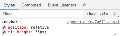
I think you were trying to fix it by using .first-tier {height: 0;}, but that wouldn't work because height and min-height don't negate one another. To fix the space between your headers, you would want to add this line of CSS to your code.
.site-header .custom-header .navbar {
min-height: auto;
}
As for your issue with a responsive state, your have a couple different factors at play.
1) You do have media queries, which is good, as those are what will help you control your custom header at different sizes. But they are used on classes that don't exist in your code at all. It looks like you're trying to hide navigation links at smaller sizes, but when I shrink your header down, I don't see any classes that do the hiding (eg. .header-container .navbar.navbar-default .navbar-collapse.collapse). If the classes aren't there in your HTML, then your CSS and media queries won't work and that's why your links are wrapping and overflowing the header instead of collapsing into a mobile menu.
2) Based on the classes you have in your CSS, I think you were trying to use https://getbootstrap.com/docs/3.4/components/#navbar to handle the responsive state for you. If that's the case, you need to base your HTML on that example. We use Bootstrap 3, but in order to have Bootstrap handle the responsive behavior for you, you need to format your HTML following their guidelines. You are currently missing the part that generates the burger menu and contains the data-target that ties it to the matching ID on your nav-collapse div.
<nav class="navbar navbar-default">
<div class="container-fluid">
<!-- This is what generates your burger menu icon on mobile -->
<div class="navbar-header">
<button type="button" class="navbar-toggle collapsed" data-toggle="collapse" data-target="#bs-example-navbar-collapse-1" aria-expanded="false">
<span class="sr-only">Toggle navigation</span>
<span class="icon-bar"></span>
<span class="icon-bar"></span>
<span class="icon-bar"></span>
</button>
<a class="navbar-brand" href="#">Brand</a><!-- This is optional and can be removed. -->
</div>
<!-- This is what gets hidden behind the burger menu icon -->
<div class="collapse navbar-collapse" id="bs-example-navbar-collapse-1">
<ul class="nav navbar-nav">
<li><a href="#">Link A</a></li>
<li><a href="#">Link B</a></li>
<li class="dropdown">
<a href="#" class="dropdown-toggle" data-toggle="dropdown" role="button" aria-haspopup="true" aria-expanded="false">Link C (Dropdown)<span class="caret"></span></a>
<ul class="dropdown-menu">
<li><a href="#">Dropdown Link 1</a></li>
<li><a href="#">Dropdown Link 2</a></li>
<li><a href="#">Dropdown Link 3</a></li>
</ul>
</li>
</ul>
<ul class="nav navbar-nav navbar-right">
<li><a href="#">Link</a></li>
<li class="dropdown">
<a href="#" class="dropdown-toggle" data-toggle="dropdown" role="button" aria-haspopup="true" aria-expanded="false">Right-aligned Dropdown<span class="caret"></span></a>
<ul class="dropdown-menu">
<li><a href="#">Dropdown Link 1</a></li>
<li><a href="#">Dropdown Link 2</a></li>
<li><a href="#">Dropdown Link 3</a></li>
</ul>
</li>
</ul>
</div><!-- /.navbar-collapse -->
</div><!-- /.container-fluid -->
</nav>
So you have two options for a more responsive header, you can either format your HTML to follow the Bootstrap specification, which will handle responsiveness for you or you can tie media queries to the actual classes you have in your HTML. Although, if you do the latter, I recommend you add more unique classes to your btn-group divs, so that you can associate a media query to something less generic.
- Mark as New
- Bookmark
- Subscribe
- Mute
- Subscribe to RSS Feed
- Permalink
Klara,
Thank you very much for your help. It worked perfect. I was able to restructure my header and got a responsive design working.
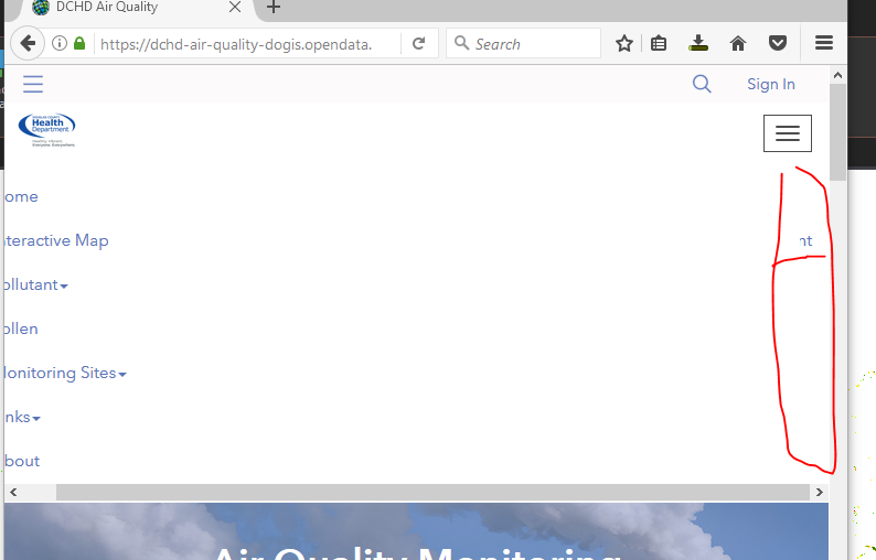
I do have one more issue left with this. I would like my right menu to be on the top, and pulled to the right, just like in screenshot below.
However, when I am in the mobile view the top (right) menu is getting hidden behind my second menu, and I cannot figure out how to adjust the width so both menus are displayed. I am sure it's something easy that I am missing?
Thank you so much for your help.
Nataliya
- Mark as New
- Bookmark
- Subscribe
- Mute
- Subscribe to RSS Feed
- Permalink
You're in luck! It is something easy to fix. So the .navbar-right menu is positioned on the right by a float, when you switch it to mobile, you are still getting stuck with the float because it has a !important on it (not the best practice, and I'll make note because I think it's a holdover from an old bug) and because it's a float element, the other content is sitting on top. It looks like if you add:
@media (max-width: 767px) {
.navbar-right {
float: none !important;
}
}
to your CSS, you can override the float and have both menus show up normally. Although, it's worth noting that your menu may not appear 100% visible because the menu currently scrolls. It has a max-height: 350px on it. If you extend that to 470px, you should have your links all visible and scrolling as necessary. I was tempted to take out the max-height all together and set a padding on the bottom of the container, but it seemed tied to the scroll functionality and I didn't want you to loose that for small device screens.
.navbar-fixed-top .navbar-collapse {
max-height: 470px;
}
Lastly, as a small caveat, I didn't cross browser test this code. It should be fine. None of it involves properties that are unsupported within IE or Edge, but for your awareness, I only looked at it in Chrome.
- Mark as New
- Bookmark
- Subscribe
- Mute
- Subscribe to RSS Feed
- Permalink
That definitely helped with the float. Thank you. However if the screen is too small (like on my phone), the vertical scroll list turns into horizontal menu with the scroll bar. Is there a way to avoid that? It behave same way to if i resize Chrome or Firefox window, and on my phone.

Thanks,
- Mark as New
- Bookmark
- Subscribe
- Mute
- Subscribe to RSS Feed
- Permalink
Hi Nataliya,
Ah. Okay, so because we took off the float, it looks like your custom navbar is picking up the ul styles from the global-nav element, which controls mobile views of our other headers. I'm going to report it as a bug since you need your ul not to use flex in order for Bootstrap to work on its own. I tried to find a work-around for you, but nothing I tried seems to work in conjunction with dropdown menus
Here are a couple other snippets that might be of assistance later:
.site-header .navbar-header img {
display: none; /* If you want to avoid having your logo show up twice. */
}
If you hide the logo and want your burger menu to line up with ours:
.site-header .navbar-toggle {
float: left;
padding: 5px 10px;
margin-left: 10px;
margin-right: 0px;
}
- Mark as New
- Bookmark
- Subscribe
- Mute
- Subscribe to RSS Feed
- Permalink
Klara,
Is there a way for me to monitor if/when the bug will get resolved?
Thanks,
- Mark as New
- Bookmark
- Subscribe
- Mute
- Subscribe to RSS Feed
- Permalink
Nataliya Lys it should be resolved as of about 20 minutes ago. Thanks for bringing it to our attention.
- Mark as New
- Bookmark
- Subscribe
- Mute
- Subscribe to RSS Feed
- Permalink
Awesome! Thank you for the update Brian Rollison.
- Mark as New
- Bookmark
- Subscribe
- Mute
- Subscribe to RSS Feed
- Permalink
Nataliya Lys - Hello! I saw this post and looked at your website. I work for the City of Columbus, Ohio and am trying to create a similar custom header for one of our Hub sites. Is there any chance you could please post the final html and css you used for your custom header? Thank you!