- Home
- :
- All Communities
- :
- Products
- :
- ArcGIS Hub
- :
- ArcGIS Hub Questions
- :
- Re: How to get image cards side by side in html
- Subscribe to RSS Feed
- Mark Topic as New
- Mark Topic as Read
- Float this Topic for Current User
- Bookmark
- Subscribe
- Mute
- Printer Friendly Page
- Mark as New
- Bookmark
- Subscribe
- Mute
- Subscribe to RSS Feed
- Permalink
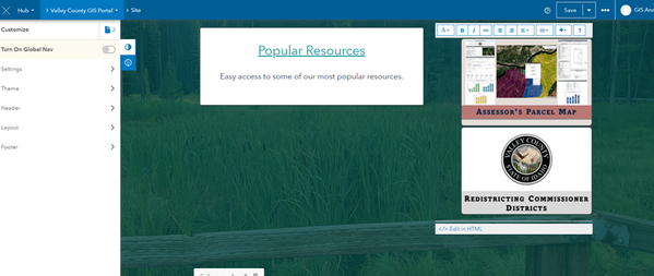
How do I get these images that link to applications to sit horizontally instead of vertically in HUB? I want them to all be in the same row, 2 columns, but just the small picture image. My html is pasted below the image.
<div style="text-align: right;"><a href="https://experience.arcgis.com/experience/948002caf8c64d76918b146cbcb730e2/"><img src="https://valleycounty.maps.arcgis.com/sharing/rest/content/items/f9492c34c048478b870af474affa2942/dat..." alt="Assessor's Parcel Map" style="background-color: initial; color: currentcolor; height: 250px; border-radius: 10px; border-style: solid; border-color: #314949; border-width: 3px; box-shadow: 5px 5px 5px #3A3E3E"></a>
</div> <div style="text-align: right;"><a href="https://storymaps.arcgis.com/stories/6c4224c70c6c48b8a53e74768fdbedc2"><img src="https://valleycounty.maps.arcgis.com/sharing/rest/content/items/ce0be3569e5b44669110d8a93996545b/dat..." alt="Redistricting Commissioner Districts StoryMap" style="background-color: initial; color: currentcolor; height: 250px; border-radius: 10px; border-style: solid; border-color: #314949; border-width: 3px; box-shadow: 5px 5px 5px #3A3E3E"></a></div>
Solved! Go to Solution.
Accepted Solutions
- Mark as New
- Bookmark
- Subscribe
- Mute
- Subscribe to RSS Feed
- Permalink
Hello,
The reason your images are stacked is because the cards in the layout editor span a 12-column grid system and it looks like your Text Card is maybe 4 columns wide. You can use the left arrow button that appears on hover to expand the width of the Text card until your images are side-by-side or you can change the width of the images by using an inline width attribute similar to how you have your height attribute. (You'll likely have to change your height value if you use a smaller width value though.)
- Mark as New
- Bookmark
- Subscribe
- Mute
- Subscribe to RSS Feed
- Permalink
Hi Klara, thanks for the response. Your suggestion is the first thing I tried yesterday prior to submitting the question to the community and it didn't work:
- Mark as New
- Bookmark
- Subscribe
- Mute
- Subscribe to RSS Feed
- Permalink
Hmm. My next guess is that these are rendering as block-level elements, rather than inline as I would've expected on images. I missed the fact you had divs wrapped around the images. <div> elements are generally display:block by default. You could try pulling the div off and putting the .text-align class on the <a> element instead and if that doesn't work, try display: inline on the actual image styles.
- Mark as New
- Bookmark
- Subscribe
- Mute
- Subscribe to RSS Feed
- Permalink
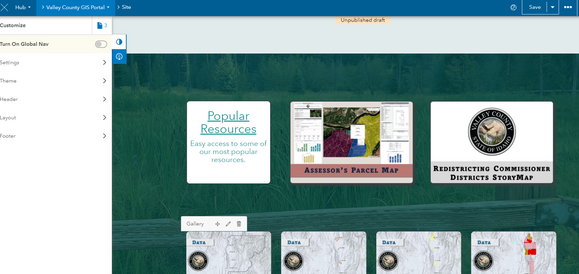
Thanks, Klara. That worked to get them in the same row, but now I am having issues getting the cards to align with the text card to the left of them. I made sure all their heights were the same and I took out any reference to padding. They look good on the editing site (first image below), but when I view the published site, the top of the text card on the left is lower than the top of the image cards on the right (bottom image):
TEXT CARD HTML:
<div style="border:2px; border-style:solid; border-color:#314949; border-radius:10px; height: 250px; background:#FFFFFF"><h1 style="text-align: center; color: #149898;"><u>Popular Resources</u></h1><h6 style="text-align: center;color: #149898"><span style="color: inherit; font-family: var(--fontsHeadingFamily),Avenir Next; font-size: var(--font-size-h5);">Easy access to some of our most popular resources.</span></h6></div>
IMAGE CARDS HTML:
<a style="text-align: right;" href="https://experience.arcgis.com/experience/948002caf8c64d76918b146cbcb730e2/"><img src="https://valleycounty.maps.arcgis.com/sharing/rest/content/items/f9492c34c048478b870af474affa2942/dat..." alt="Assessor's Parcel Map" style="background-color: initial; color: currentcolor; height: 250px; border-radius: 10px; border-style: solid; border-color: #314949; border-width: 3px; box-shadow: 5px 5px 5px #3A3E3E"></a> <a style="text-align: right;" href="https://storymaps.arcgis.com/stories/6c4224c70c6c48b8a53e74768fdbedc2"><img src="https://valleycounty.maps.arcgis.com/sharing/rest/content/items/ce0be3569e5b44669110d8a93996545b/dat..." alt="Redistricting Commissioner Districts StoryMap" style="background-color: initial; color: currentcolor; height: 250px; border-radius: 10px; border-style: solid; border-color: #314949; border-width: 3px; box-shadow: 5px 5px 5px #3A3E3E"></a>
- Mark as New
- Bookmark
- Subscribe
- Mute
- Subscribe to RSS Feed
- Permalink
Do you have a url to the live view of your actual site? It'd be easier for me to determine the issue.
- Mark as New
- Bookmark
- Subscribe
- Mute
- Subscribe to RSS Feed
- Permalink
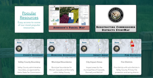
I got it to work! they are aligned vertically. One thing I would love to do is make the second image card in the second column right justified so it lines up with the gallery below it. Then I wouldn't know how to adjust the first image card to make spacing equal between it and the cards on either side of it.
- Mark as New
- Bookmark
- Subscribe
- Mute
- Subscribe to RSS Feed
- Permalink
Do you have any advice on the alignment scenario that I'm looking to try and create?
- Mark as New
- Bookmark
- Subscribe
- Mute
- Subscribe to RSS Feed
- Permalink
All my quick solutions would result in unbalanced middle spacing. You could consider is placing resources in the same Text Card as the images. Then you could use display: flex; justify-content: space-between; to even out the spacing. However, the caveat with flexbox is that you'll probably want to use some media-queries with it so you can set flex-wrap: wrap at certain breakpoints to control how you want the layout handled on smaller devices. Another alternative if you want our grid to take care of the resizing and spacing would be to put each image in its own Text Card and perhaps add the class .pull-right to the a tag containing the end-most image.
- Mark as New
- Bookmark
- Subscribe
- Mute
- Subscribe to RSS Feed
- Permalink
Thanks for looking into this for me! I think I will leave it as it is for now and just call it good. I can mini-adjust spaces and colors to death.
You are really great, thanks for all you do, Klara.


