- Home
- :
- All Communities
- :
- Products
- :
- ArcGIS Hub
- :
- ArcGIS Hub Questions
- :
- Dynamically positioning a card button based on the...
- Subscribe to RSS Feed
- Mark Topic as New
- Mark Topic as Read
- Float this Topic for Current User
- Bookmark
- Subscribe
- Mute
- Printer Friendly Page
Dynamically positioning a card button based on the card height
- Mark as New
- Bookmark
- Subscribe
- Mute
- Subscribe to RSS Feed
- Permalink
Good afternoon,
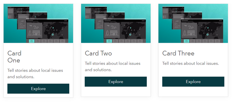
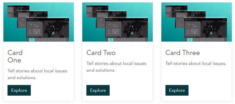
I am running into a problem where I set a fixed height for a number of cards displayed in a row (to accommodate different text block lengths or headings that run over two lines), but the button doesn't shift downwards with the bottom edge of the card when its length is changed.
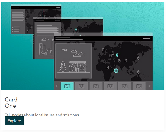
I can get the button to sit at the bottom of the card by modifying the card and button elements via CSS properties, but this interferes with the button itself (changing its width and aligning it to the cards left edge), and the button will either overlap or abut the card text when the viewport is collapsed.
This isn't great, and I was hoping there is a method for shifting the button to the bottom of the card without having to fix it in place - an option to keep the button position responsive, so it automatically adjusts/flows with the rest of the card content when the card is resized.
Ideally (if at all possible), the button position would adjust to the bottom of the card dynamically whenever the card height value is changed (which may be often depending on updated card content length).
The HTML I'm using when trying to get this to work is attached for reference.
Hopefully someone's run into this problem before or is able to shed some light - any assistance would be greatly appreciated.
Kind regards,
Shaun
<style>
  .card-base {
    /*position: relative;*/
    min-height: 350px;
  }

  .btn-card {
    /*position: absolute;*/
    /*bottom: 20px;*/
    background-color: #083A42;
    border-color: #083A42;
    color: #ffffff;
    height: 38px;

  .btn-card:hover,
  .btn-card:focus {
    background-color: #214e55;
    border-color: #214e55;
    color: #ffffff;
  }

</style>

<div class="row row-one">

  <!--Card One-->
  <div class="col-xs-12 col-sm-6 col-md-3">
    <div class="calcite-web">
      <div class="card-base">
        <div class="card-image-wrap">
          <img class="card-image" src="https://s3.amazonaws.com/geohub-assets/templates/sites/defaultSite/resources/story-map-editor.jpg" alt="Story Maps Cascade">
        </div>
        <div class="card-content">
          <h4>Card<br>One</h4>
          <p style="min-height: 50px">Tell stories about local issues and solutions.</p>
          <a style="text-decoration: none;" href="#" class="btn btn-card btn-primary" role="button">Explore</a>
        </div>
        <div style="clear: both;"></div> <!-- added to clear any floats -->
      </div>
    </div>
  </div>

  <!--Card Two-->
  <div class="col-xs-12 col-sm-6 col-md-3">
    <div class="calcite-web">
      <div class="card-base">
        <div class="card-image-wrap">
          <img class="card-image" src="https://s3.amazonaws.com/geohub-assets/templates/sites/defaultSite/resources/story-map-editor.jpg" alt="Story Maps Cascade">
        </div>
        <div class="card-content">
          <h4>Card Two</h4>
          <p style="min-height: 50px">Tell stories about local issues and solutions.</p>
          <a style="text-decoration: none;" href="#" class="btn btn-card btn-primary" role="button">Explore</a>
        </div>
        <div style="clear: both;"></div> <!-- added to clear any floats -->
      </div>
    </div>
  </div>

    <!--Card Three-->
  <div class="col-xs-12 col-sm-6 col-md-3">
    <div class="calcite-web">
      <div class="card-base">
        <div class="card-image-wrap">
          <img class="card-image" src="https://s3.amazonaws.com/geohub-assets/templates/sites/defaultSite/resources/story-map-editor.jpg" alt="Story Maps Cascade">
        </div>
        <div class="card-content">
          <h4>Card Three</h4>
          <p style="min-height: 50px">Tell stories about local issues.</p>
          <a style="text-decoration: none;" href="#" class="btn btn-card btn-primary" role="button">Explore</a>
        </div>
        <div style="clear: both;"></div> <!-- added to clear any floats -->
      </div>
    </div>
  </div>

</div><!--row-one-->
Solved! Go to Solution.
Accepted Solutions
- Mark as New
- Bookmark
- Subscribe
- Mute
- Subscribe to RSS Feed
- Permalink
Hello @ShaunLakeAWE,
I can help you a little bit with keeping the buttons at the bottom of the cards; however, you may still observe some height unbalance at the tablet viewport. Unfortunately, our grid system still relies on floats, so it's difficult to make cards maintain the same height when they are reflowing.
Within the <style> tags, you want to add this:
.card-content {
justify-content: space-between;
}
This will evenly distribute available space between the <h4>, the <p>, and the <a> (button). If you prefer your headings and paragraph text to remain more top aligned, you can choose to wrap the <h4> and <p> tags in a <div> which will change the space distribution to being distributed between two elements: the div container and the button.
Hopefully this gets you a little further in your goals.
- Mark as New
- Bookmark
- Subscribe
- Mute
- Subscribe to RSS Feed
- Permalink
Hi Klara,
This is just what I was after - thank you! I appreciate the quick response as well as the tip about wrapping the headings and paragraphs in a separate div to maintain the standard spacing between them.
Kind regards,
Shaun


