Layout enhancements
We have received many enhancement requests for our layout editor. This includes requests for column layouts, text formatting, undo/redo, and the ability to embed cards in other sites. To lay the foundation for building these features, we are slowly transitioning parts of our application to a different framework (Calcite). While our goal is that this will have limited impact on your existing sites, we will need to tweak a few patterns.
Update to theme
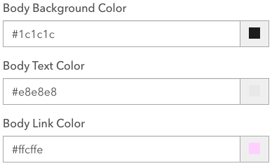
One of these patterns that we will be changing is how theme is applied to buttons. Calcite uses fewer colors than Hub when it comes to calculating button styles. Our initial observations are that this can cause some accessibility contrast violations in transparent and hollow / outline buttons on themes that were previously accessible. To avoid this scenario without requiring customers to review each of their individual site themes, we are going to use the link color and the site (body) background color to generate all styles of buttons. We assume that those who are most concerned about accessible color palates will already have picked a contrast safe option for the link text used with their site background.
 Hub theme builder displaying body background, text, and link color pickers
Moving forward, solid / filled buttons will be using link color for button background and site (body) background for button text. Hollow / outline buttons will be using link color for button border and button text and they will have a transparent background that permits the site (body) background color to come through.
 Filled button displaying link-color as background and two hollow buttons using link-color as border and text
The proposed release date for these changes is 02-22-2023 and at that point we would also be removing the theme pickers for button background color and button text color.
Outline buttons on rows
Please see update posted on 03/02/2023.
As a result of the new framework, outline / hollow buttons will be using a transparent background. This results in the link color / site background combo in most parts of the app. If you've set a unique row color on a Hub site or page, any outline or hollow buttons used within that row will display the row color as the button background. Consider reviewing these patterns for legibility and switching to a solid / filled button if preferred.
 Survey card set to color palette of theme and button style of hollow
Gallery cards
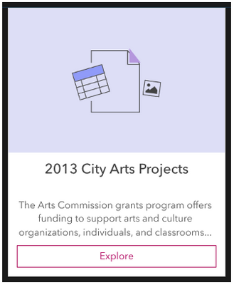
There is one additional pattern where changes may be noticeable. The site Gallery Card has a white background and in themes where the site background is dark, link color is likely to be a light color. A light link colored outline button on a white background becomes illegible. To account for this, we will automatically try to darken the link color for outline buttons when they are present on white backgrounds. The solid button will not be affected by this issue.
 Gallery card displaying darkened pink color for outline button
We’re excited to bring you improvements to the layout editor in the coming months, enabled by our transition to a Calcite framework.