- Home
- :
- All Communities
- :
- Products
- :
- ArcGIS Experience Builder
- :
- ArcGIS Experience Builder Questions
- :
- Text Widget - Font Size Unit: rem vs vw?
- Subscribe to RSS Feed
- Mark Topic as New
- Mark Topic as Read
- Float this Topic for Current User
- Bookmark
- Subscribe
- Mute
- Printer Friendly Page
- Mark as New
- Bookmark
- Subscribe
- Mute
- Subscribe to RSS Feed
- Permalink
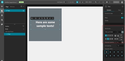
Can someone explain to me what is the expected behavior if I choose "rem" as the font size unit in the text widget? To my understanding, "rem" works in pair with "root html font size", does this mean we can also set the root html font size for my app in the Experience Builder? Or it's a set value by esri and we can not change it?
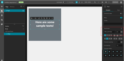
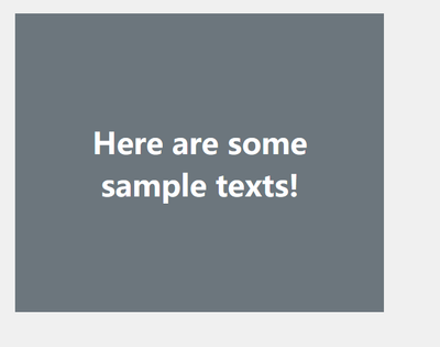
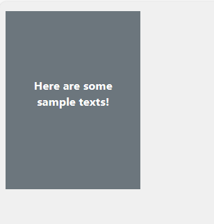
If I'm buidling a responsive webpage, I will use the "vw" as the font size unit since it can autoscale the text size accroding to the browser page size. (As shown below)
So back to the question, what can I achieve if I choose "rem" as the font size unit?
Solved! Go to Solution.
Accepted Solutions
- Mark as New
- Bookmark
- Subscribe
- Mute
- Subscribe to RSS Feed
- Permalink
rem calculates a font size based on the standard font size of the page, where 1rem is the standard font size, 2rem is twice the font size and 0.5rem is half the standard size, etc. So, if the standard size is 16pt, 2rem would be 32pt and 0.5rem would be 8pt. These sizes are not necessarily affected by resizing the screen, but the root value might change if the screen size crossed one of the breakpoint sizes causing the effective size to recalculate. You may be able to change the default size with the font size slider in the theme settings, but this is such a blunt tool that I wouldn't recommend changing this setting at all.
vw stands for visual width. 1vw means that a character will take up 1% of the width of the browser window and this will change anytime the width of the screen is altered. Depending on what you are trying to do, this could be a good thing or a bad thing. If you have some very important text that you want to be the center of attention at all times, using vw could be an excellent option. But in many cases, it is hard to design around the constantly changing size of vw text.
City of Arlington, Texas
- Mark as New
- Bookmark
- Subscribe
- Mute
- Subscribe to RSS Feed
- Permalink
Thank you, this is very thorough.😃


