- Home
- :
- All Communities
- :
- Products
- :
- ArcGIS Experience Builder
- :
- ArcGIS Experience Builder Questions
- :
- Re: Layout Problems
- Subscribe to RSS Feed
- Mark Topic as New
- Mark Topic as Read
- Float this Topic for Current User
- Bookmark
- Subscribe
- Mute
- Printer Friendly Page
- Mark as New
- Bookmark
- Subscribe
- Mute
- Subscribe to RSS Feed
- Permalink
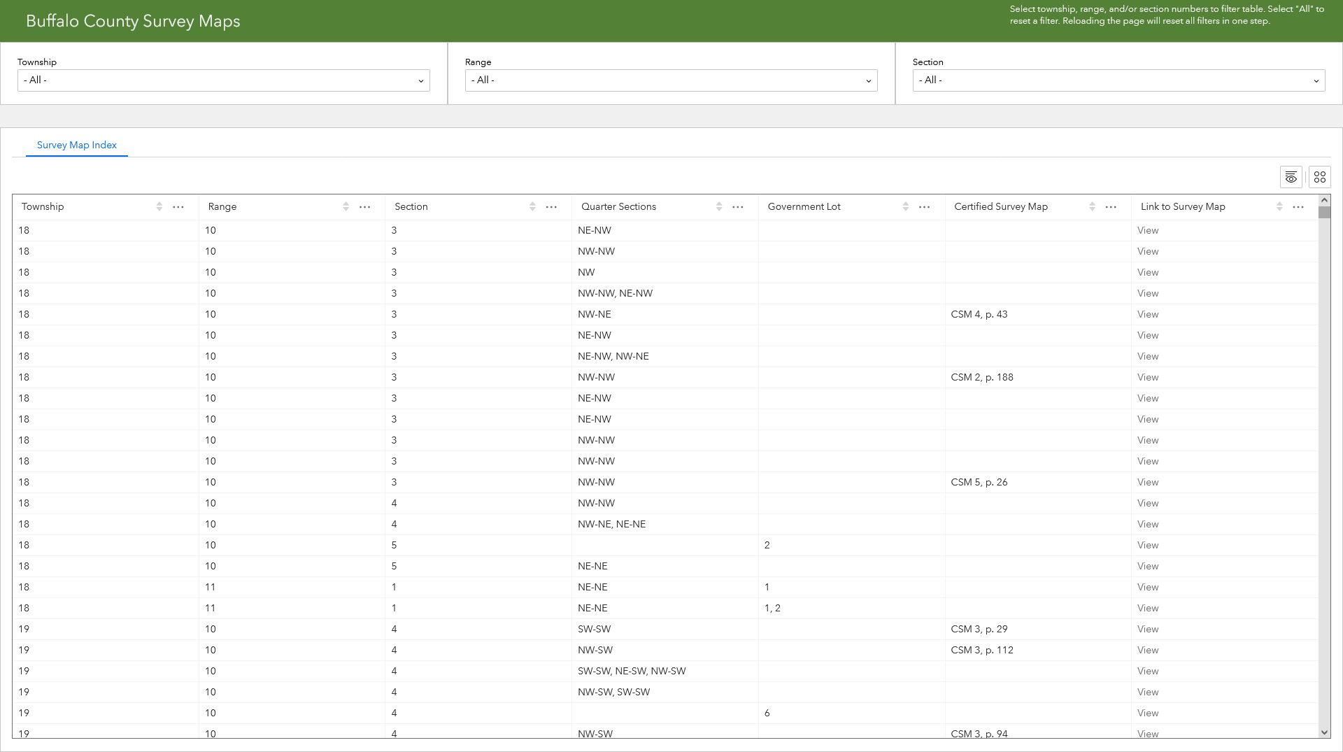
I am trying to display a table of data with filters at the top to narrow down the displayed data. It functions as intended, but the layout has problems. Three Filter widgets are contained in one row at the top (beneath a header), and a "Table" widget is in another row at the bottom. If I adjust the design so the rows are flush, there is a gap in the live page. If I overlap the table by a bit, the live page shows the widgets flush. (See attached screenshots.) I want the rows to remain flush, even when the window is resized.
If the browser window is not maximized, and I reduce the window height, the "Table" widget renders on top of the Filter widgets so they are not usable, and eventually not visible at all. In the design, the row containing the Filter widgets is arranged so they are brought to the front, and the row containing the "Table" widget is sent to the back. That should make the Filter widgets render on top, and the table less visible, which already has a ton of useless whitespace. That is how they would behave in any other software I have used before.
This behavior happens whichever way I configure the design, so for now, I assume end users will maximize their browsers and overlap the rows in the design. I have tried experimenting with various settings and initially laid out the widgets without rows, all to no avail. Is there some way to make the layout do what I want?
Solved! Go to Solution.
Accepted Solutions
- Mark as New
- Bookmark
- Subscribe
- Mute
- Subscribe to RSS Feed
- Permalink
Hi, you can enable custom layout for small screen devices and then adjust the table height accordingly.

- Mark as New
- Bookmark
- Subscribe
- Mute
- Subscribe to RSS Feed
- Permalink
Hi @BuffaloCoWI ,
This is because the filter widget uses an auto height in pixels. Can you try updating the table widget's height to 'Stretch' to see if it resolves the issue?

Regards,
Shengdi
- Mark as New
- Bookmark
- Subscribe
- Mute
- Subscribe to RSS Feed
- Permalink
Both rows were already set to Stretch for height, but with percent instead of pixels. That fixed the gap between the rows, but left a weird behavior with the filters. Reducing the size of the window even a little bit started obscuring them (see 1st screenshot). Changing the height to auto for the row containing the filters fixed that. However, it introduced a new problem. If I reduce the size of the window even smaller, say to the size of a mobile device, it automatically places the filters in a column, so they are all visible, but now the table does go underneath, since it is set at a fixed number of pixels (see 2nd screenshot). I do not anticipate many people would use this app on mobile devices, but it is frustrating to say the least, and not at all intuitive. Few of the layout controls do what is expected, and the "Table" widget wastes lots of space for a sheet title when there is only one sheet, and margins around the actual table.
- Mark as New
- Bookmark
- Subscribe
- Mute
- Subscribe to RSS Feed
- Permalink
Hi, you can enable custom layout for small screen devices and then adjust the table height accordingly.
- Mark as New
- Bookmark
- Subscribe
- Mute
- Subscribe to RSS Feed
- Permalink
Encountering either a bug or a misplaced layout where even if I start altering in Custom Layout view for Tablet or Mobile, it will effect the Desktop view as well. Any ideas?
- Mark as New
- Bookmark
- Subscribe
- Mute
- Subscribe to RSS Feed
- Permalink
Hi @JonnyRogers1, you can set different layouts when enabling custom layout, but the widget settings (on the Content setting panel) will be synchronized across all screen devices.
As a workaround, you can duplicate the widget on Tablet or Mobile, and move the original widget to the pending list.