- Home
- :
- All Communities
- :
- Products
- :
- ArcGIS Experience Builder
- :
- ArcGIS Experience Builder Questions
- :
- Re: Feature Info widget for multiple pop-ups
- Subscribe to RSS Feed
- Mark Topic as New
- Mark Topic as Read
- Float this Topic for Current User
- Bookmark
- Subscribe
- Mute
- Printer Friendly Page
Feature Info widget for multiple pop-ups
- Mark as New
- Bookmark
- Subscribe
- Mute
- Subscribe to RSS Feed
- Permalink
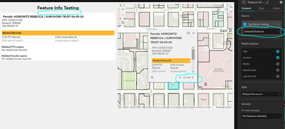
I am having trouble with the Feature Info Widget with stacked features on a map. I would like to be able to disable the map pop-ups and only use the Feature Info Widget. The map is using a parcel polygons which are stacked in many places. For the example map the pop-ups show all 168 features you can easily arrow through when you click on the map.
When I set the Source for the Feature Info Widget to Selected Features only the "top" feature shows in the Feature Info Widget the reset of the stacked parcels are missing. I would like to be able to scroll through all 168 in the Feature Widget.
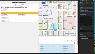
The only work around I have found is to add Select features to the map, change the Selection tool to Point and then click on the point. While this does work. It is highly likely a user/public will skip this step and just click on the map, which will result in missing results. And there will be no indicators to the user they are missing many results.
Is it possible to configure the default action of clicking on the map to give the same results as the above process and mimic the results users are used to in WAB? The map pop-up behaves by showing all pop-ups in a give location.
I have also tried creating a data view but have ran into the same selection problem of one getting a single return and not the full 168.
- Mark as New
- Bookmark
- Subscribe
- Mute
- Subscribe to RSS Feed
- Permalink
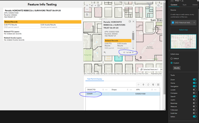
Further testing it seems just clicking on the map has same effect on a table. Only selecting the "top" feature, when there are 168 features stacked at that location.
- Mark as New
- Bookmark
- Subscribe
- Mute
- Subscribe to RSS Feed
- Permalink
I have been struggling some this myself. For now, I don't think there is an OOB solution, other than to maybe configure the query widget so that you only include a spatial selection. Then using the point tool, clicking a stacked parcel and then clicking 'apply' will select all the parcels in the stack. Of course, that's 2 steps for the user so it's not ideal. The results are then presented in the query widget return as a list.
Otherwise, it looks like I have to use the developer edition. I found a video in the experience builder help videos from 2021 dev summit where the presenter does talk about tweaking the feature info widget by adding in the message action from the list widget that selects all the features in a stack:
- Mark as New
- Bookmark
- Subscribe
- Mute
- Subscribe to RSS Feed
- Permalink
Hi @RyanBohan
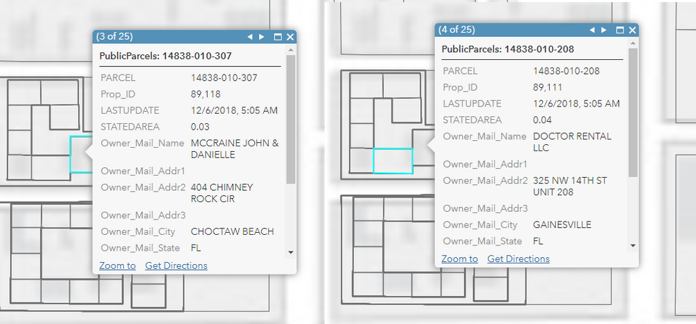
When you see the map popup which includes 168 features, it does not mean all these features are selected. It represents that clicking on a point gives you the adjacent potential results by a certain range, while only one of them - the highlighted one is currently in the selection queue. Notice that if you click the left/right arrow keys, the selection changes one at a time:
This means it only highlights one selected feature. In ExB, we follow this rule and keep all widgets consistent, since clicking on the map only gives you one result (even though pop-up methods display multiple).
In a sense, clicking on the pop-up resembles the behavior of using map select tools (since they both have buffer distance). Thus, the workaround you mentioned above is the solution here.
Hope it clarifies a bit.
- Mark as New
- Bookmark
- Subscribe
- Mute
- Subscribe to RSS Feed
- Permalink
Respectfully, one could argue that the Feature Info widget could and probably should at the least include a message or data action or a data source configuration setting that handles coincident features or allows , same as the 4.x popup.
Otherwise, an out-of-the-box workaround like I posted above makes the users perform too many clicks to find the info they want. As an 'Experience' we all know that's not good. I well recall having to instantiate this behavior at 3.x with the Info Template, and we should be past that for non-developers.
- Mark as New
- Bookmark
- Subscribe
- Mute
- Subscribe to RSS Feed
- Permalink
@DavidColey Yeah, I would say it could provide a better experience for users. Here is another case similar to what you mentioned:
In Map Viewer, if you only click on the map, the behavior follows what I described above; however, if you open the Attribute Table, then click on the map, the selection becomes multi-selection with all 25 results highlighted. It means that the AT here overwrites the popup behavior and then did something extra to handle this case. This could be something we can think about for ENH in the near future.
Thanks for your valuable input.
- Mark as New
- Bookmark
- Subscribe
- Mute
- Subscribe to RSS Feed
- Permalink
Thank you @TonghuiMing I had not thought of it that way before. Your included screen shots explained the behavior perfectly.
Even though the pop-up in your example shows 25 only one is selected at a time. The problem would be if you disable the pop-up on the map because you have the much larger Feature Info Widget.
Users will not easily realize the difference between just clicking on the map (which will show all stacked parcels) verses having to use the selection tool to get the same results in the Feature Info Widget. The different way of clicking on the map will result in very different results.
Perhaps an enhancement could be to be able to configure the map to use the Point Selection tool by default. Then they would easily be able to click the map and see stacked results.
- Mark as New
- Bookmark
- Subscribe
- Mute
- Subscribe to RSS Feed
- Permalink
@RyanBohan Thanks for the suggestion. We will take them into consideration when evaluating the ENH directions and possibilities.
Tonghui
- Mark as New
- Bookmark
- Subscribe
- Mute
- Subscribe to RSS Feed
- Permalink
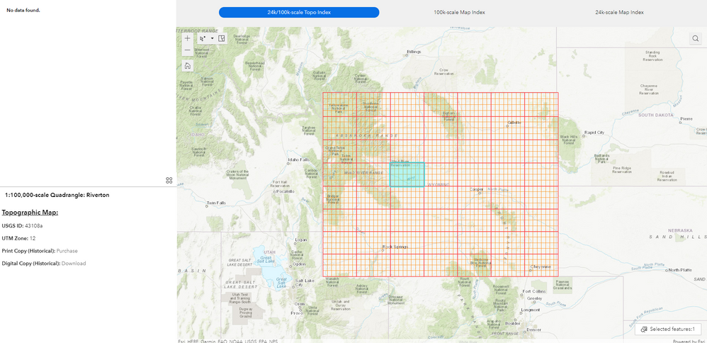
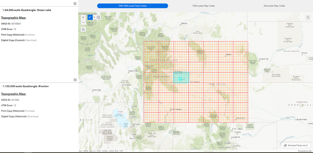
Having a similar issue with creating a 24k and 100k topo index app. The map has 2 layers (24k and 100k). Rather then using a pop up, I thought having 2x Feature Info widgets would be a great idea.. so when a user selects a quadrangle, both the 24k and 100k topo info appears for each scale/layer.
As of now, I can only get the top layer (100k) to appear when clicking on a quadrangle. I also discovered the work around that Ryan mentioned by enabling the Select features option and using the Point tool, but I also agree that the end user will skip this step and not figure out how to access the bottom 24k layer.
Trying to avoid the Developers edition, but it sounds like that's the only workaround for now. Would be great to get this fixed. Cheers
- Mark as New
- Bookmark
- Subscribe
- Mute
- Subscribe to RSS Feed
- Permalink
In thinking about this as I work my mind around the EB, is the fact that the EB is designed, in part if not entirely, to host or contain packaged solutions and focused maps.
That being said, the 4.x web map does a fine job of displaying all 'clicked' layers with a configured popup, and of course that popup can be docked.
So since esri has, out of the box, designed the feature info widget to work with one source - a solution for now can reside in creating a simple page and map widget that's used to 'browse features' where we include a 'browse' type of map with a layer list and legend in a sidebar. Then set a trigger to zoom to same extent in the different focus maps...
