- Home
- :
- All Communities
- :
- Products
- :
- ArcGIS Experience Builder
- :
- ArcGIS Experience Builder Ideas
- :
- Please add a customizable display range in Experie...
- Subscribe to RSS Feed
- Mark as New
- Mark as Read
- Bookmark
- Follow this Idea
- Printer Friendly Page
Please add a customizable display range in Experience Builder's Chart widget
- Mark as New
- Bookmark
- Subscribe
- Mute
- Subscribe to RSS Feed
- Permalink
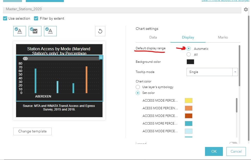
Please add a customizable display range in Experience Builder's Chart widget, similar to what was provided in Web App Builder. In Web App Builder's bar chart widget, under Chart settings, Display, there were two choices for the default display range: "automatic" or "all." Please see below for more information.

Using "automatic" would display data according to the sort and selecting the "all" would display all data. Web App Builder's default display range options allows you to view a large number of data series/individual bars by manipulating a horizontal bar across the top of the chart. In this example, you could view one location or multiple locations land use land cover categories. Please see below for more information.

Hi @ScottHansen__MDP_ ,
Thanks for your feedback! This feature of custom display charting range is in our plan. We are working on it which would probably be available in 2024.
Thanks,
Wei
Hello,
When in 2024 do you anticipate rolling out this feature? We are unable to develop an ExB applications that use bar charts due to the current limitation with the display settings.
Hi @ScottHansen__MDP_ ,
This feature will be available in 2024 June release. Thanks for your patience.
You must be a registered user to add a comment. If you've already registered, sign in. Otherwise, register and sign in.