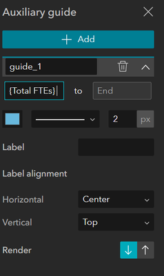
I've been using Experience Builder to create some dynamically populated charts, using selected data from a map. Really glad to see time series has been introduced to line charts in the latest update, but there's still some more customisation which would be great.
For my chart I'd like to add a auxillary guide showing the theoretical maximum value the data could reach, which will be different depending on the selection. I have the value as a field in my data, but there doesn't seem to be an option to populate the Start/End values of the guide line dynamically.
See image for desired outcome.
