- Home
- :
- All Communities
- :
- Products
- :
- ArcGIS Experience Builder
- :
- ArcGIS Experience Builder Ideas
- :
- Don't show scrolling arrows when not needed - adva...
- Subscribe to RSS Feed
- Mark as New
- Mark as Read
- Bookmark
- Follow this Idea
- Printer Friendly Page
Don't show scrolling arrows when not needed - advanced bookmark widget
- Mark as New
- Bookmark
- Subscribe
- Mute
- Subscribe to RSS Feed
- Permalink
I am creating a simple app in experience builder that has a few bookmarks in an advanced template. I want to use the scrolling arrangement, because I want to show all the bookmarks at the bottom instead of end users having to page through them.
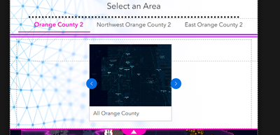
I am making a whole series of experiences and some have many bookmarks, whereas others only have a few. For the experiences that only have a few, the bookmark cards don't fill up the whole space that is allocated to them, so scrolling with arrows is not neccessary because all the bookmarks are displayed by default. Yet the arrows still show up in the widget :
Best case scenario the blue arrows will only appear if I am looking at a screen small enough to require them.
The gallery bookmark template seems to be doing the same thing, the blue arrows are always there.
Also it would be great if the placement of the bookmarks could be customized - I want them to be centered in the middle instead of left aligned.
I was going to put in an idea for this too! I plan to have all the bookmarks display at once, so have no need for the arrows. Annoyingly, no matter if it's horizontal or vertical, the arrows are covering up part of the bookmark! I can see it in your image too. I want the box to be pretty small with one line of text, so I'm afraid it's going to be covering the text.
This is bugging me so much.
I have it at least able to center the bookmarks but the arrows being there even if you have ONE bookmark is ridiculous. Also there if you're using advanced template.
You must be a registered user to add a comment. If you've already registered, sign in. Otherwise, register and sign in.

