- Home
- :
- All Communities
- :
- Products
- :
- ArcGIS Experience Builder
- :
- ArcGIS Experience Builder Blog
- :
- Accessibility best practices for ArcGIS Experience...
Accessibility best practices for ArcGIS Experience Builder
- Subscribe to RSS Feed
- Mark as New
- Mark as Read
- Bookmark
- Subscribe
- Printer Friendly Page
Experience Builder and web accessibility standards
Experience Builder is committed to providing accessible experiences for all users, by following the World Wide Web Consortium (W3C)'s Web Content Accessibility Guidelines (WCAG) and more.
Experience Builder accessibility best practices
We are trying our best to make elements in Experience Builder as accessible as possible, but this does not mean every app created is accessible by default.
First, there are some challenges that web applications and builder platforms are facing, such as map interactions and free drag-and-drops. We will constantly seek solutions for this kind of commonly recognized confinements.
Second, be aware that some configurations need to be controlled by the authors, such as adding alternative texts for images or making sure that the color contrast between the foreground and background colors meets WCAG requirements.
Third, Experience Builder has many aspects, such as frameworks, themes, widgets, components, etc. Support for each widget will be added through incremental releases. Widgets that have supported accessibility include Button, Image, Embed, Menu, Views Navigation, Share, Timeline, Coordinates, Filter, layout widgets, and more.
Here are some basic rules to help you generate accessible apps or websites created by Experience Builder.
Evaluate your layout designs for the app
Three layout types are available in Experience Builder, reflecting on three types of pages - Scrolling, Fullscreen, and Grid. We recommend evaluating your app from the layout design perspective from the beginning when it comes to supporting accessibility.
In scrolling pages, added elements are arranged automatically in twelve-equally-divided blocks, and their tab orders will automatically follow the visual & defined order. Layout widgets like Column and Row also follow the same pattern.
You can also add Fullscreen pages utilizing a fixed layout. This type of layout uses absolute position, and widgets like Fixed Panel, Card, Map, Section views, and List follow this pattern. By default, in a fixed layout, the tab order follows the order widgets/elements are added; however, this could be a problem when configuring Fullscreen apps.
To resolve this, we provide an A11Y option on the setting bar at the bottom-right of the builder. After turning on the ‘Auto-calculate element tab orders in fixed layouts’ option, the order of newly added widgets on the canvas or onto other widgets will be auto-calculated and adjusted based on their position, which will generate an optimal tab order similar to the visual element orders.
Warning: This option will change the vertical order of widgets as well. We do not recommend introducing widget overlays for an accessible app.
We recommend turning on this option from the beginning and then starting to add widgets to create an accessible Fullscreen app. For existing apps, it can also be maneuvered but a bit tricky.
In previously configured apps, turning on this option will not automatically adjust the element orders - you will need to make adjustments on every level of the fixed layout. For example, if you have four widgets spread out in the canvas, resizing any widget will trigger the auto-calculation; if you have a Card widget, moving or resizing buttons inside the Card widget triggers the auto-calculation within; if there are nested Section views with other widgets, it is required to move/change position or size settings at each level to auto-calculate the orders.
We recommend you choose the Fullscreen or Scrolling pages to build your accessible apps for better results.
Provide proper alternative text and labels for elements
Images are commonly used in apps. The image alternative texts are necessary for an accessible app.
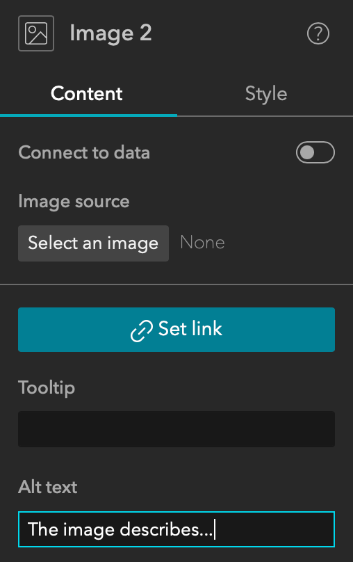
One way to add images is to upload them through the Image widget. In the widget setting, there is an option to configure alt text, which we recommend to be as concise and clear as possible.
For uploaded icons, the alt text is set as empty by default.
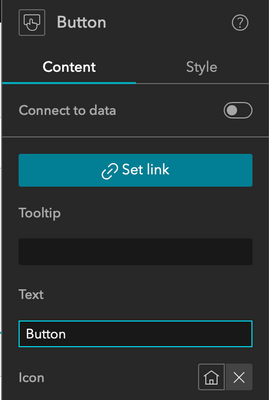
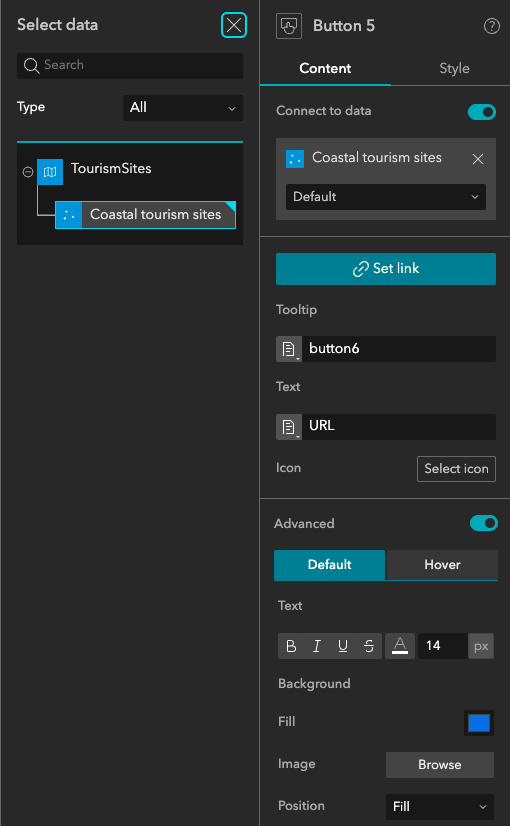
It is also crucial to provide proper labels for certain elements. For instance, you can add Tooltip, Text, or an icon in the Button widget. If provided, the tooltip will be recognized as the aria-label for the button; if not provided, Text will be added; if neither Tooltip nor Text is provided, the icon filename will be used.
Choices on the theme and color
Experience Builder has provided six themes - Default, Dark, Ink, Violet, Vivid, and Organization Shared. You can also customize the themes' color. The built-in themes provided meet the color contrast ratio requirements by default. If you choose to customize the theme colors, make sure it complies with WCAG requirements of 4.5:1 for textual content and 3:1 for images or others.
Other specs
In addition to layouts, alt text & labels, and theme & color, a few highlights are available for a better experience.
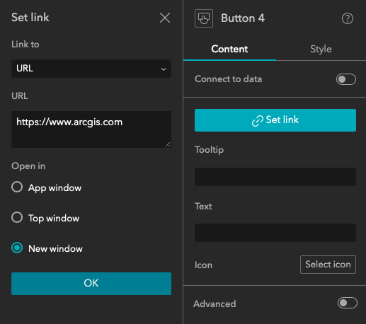
In the Set link configurations, if you choose to open it in the New window, there will be a warning of the new window when the focus is on the link element.
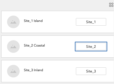
With repetitive elements such as dynamic records populated inside a List widget, it could be a challenge when the record list is long, and you must tab through all elements inside them to focus on the next interactive element. For a better user experience, we provide a skip link mechanism, which is also suggested by WCAG guidelines. When the focus is inside a List widget, using the Esc key allows you to jump out of this widget, and another Tab key will help focus on the next available element on the page.
Check out templates like A Glimpse of the Continents, Topic Report, or City GeoHub for a relatively more optimized experience with accessibility.
Screen readers
We recommend NVDA for web applications in Windows OS (Firefox, Chrome, and other supported), or VoiceOver in MacOS (Safari, Chrome, and other supported browsers) for optimal effects.
Builder accessibility support
To provide a better and more unified experience for app and builder users, we also try to make the builder interface - the authoring tool as accessible as possible.
For example, individual widget aims to support the Content and Style panel settings to ensure that both keyboard navigation tab behavior and screen readers are desired.
Future considerations
While we try our best to make Experience Builder accessible, some aspects may still need to be optimized in the future. For example, widget interactions with the map are limited – such as in Draw, Coordinates, and Swipe widgets, etc. The drag-to-drop actions are also limited to mouse actions for now, when adding widgets to the builder canvas, or reordering list items, for instance.
In addition, there are cases where web pages are composed of different widgets, say a Text widget indicating information and other interactive elements in a Button or List widget below it. Currently, there is no way to provide associated labelings between them.
More resources
Esri provides a variety of resources on accessibility for its products. You can review our Esri Accessibility and Esri Legal Accessibility sites for more details. Do not hesitate to reach out at EsriAccessibility@esri.com with questions and suggestions.
You must be a registered user to add a comment. If you've already registered, sign in. Otherwise, register and sign in.

