- Home
- :
- All Communities
- :
- Products
- :
- ArcGIS Enterprise
- :
- ArcGIS Enterprise Ideas
- :
- User Interface enhancement for ArcGIS Server Manag...
- Subscribe to RSS Feed
- Mark as New
- Mark as Read
- Bookmark
- Follow this Idea
- Printer Friendly Page
User Interface enhancement for ArcGIS Server Manager - Manage Services page
- Mark as New
- Bookmark
- Subscribe
- Mute
- Subscribe to RSS Feed
- Permalink
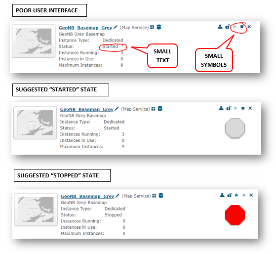
I am tired of squinting at the small text and small icons on the "Manage Services" page (/arcgis/manager/index.html) in ArcGIS Server Manager. I frequently scan this page to identify services that are "stopped" or "started". This would be much easier if there was a big red octagon symbol adjacent to the stopped services:
When was the last time a UI designer looked at this page? It really hasn't changed much in more than a decade.
Thanks for the tip jcarlson but I would rather see Esri make improvements to benefit all ArcGIS Server Manager users. And I don't think that is something I want to attempt.
Bernie.
@berniejconnorsOh, for sure, I agree!
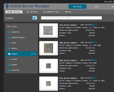
I was tired of everything being in a sea of whites, greys and blues, and configured my own "dark mode" CSS, which I could change without touching any of the "important" files. I guess I'm just not as patient.
Changing the CSS was a great idea 😊!
@RamezRafatVolueThanks! You can use your browser's tools to inspect the page and find the exact lines of the CSS files that define it. Just a few tweaks, and you can have a vastly-improved interface. Those buttons are coming out of a PNG file and their size is clearly defined, so it's a simple matter to adjust those as well.
Improving the visibility of the status of whether a service is started or stopped would be a great enhancement.
You must be a registered user to add a comment. If you've already registered, sign in. Otherwise, register and sign in.

