- Home
- :
- All Communities
- :
- Products
- :
- ArcGIS Dashboards
- :
- ArcGIS Dashboards Questions
- :
- Re: Summary Table, rather than graphics ?
- Subscribe to RSS Feed
- Mark Topic as New
- Mark Topic as Read
- Float this Topic for Current User
- Bookmark
- Subscribe
- Mute
- Printer Friendly Page
Summary Table, rather than graphics ?
- Mark as New
- Bookmark
- Subscribe
- Mute
- Subscribe to RSS Feed
- Permalink
Hello Operations Dahsboard friends!
My customers are asking for summary tables, to be used alongside the charts produced by Operation Dashboard.
What we are looking at is exactly the same data agregation as what is currently done for the Operation Dashboard charts, except that the output is a table, rather than a graph.
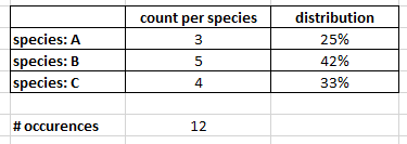
A simplistic instance would be a count (and % distribution) of unique values within an attribute, for instance:
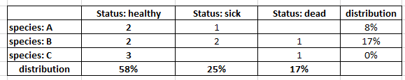
Further along the same line, and just as what Dashboard can already do, we would like to see mulitple attribute analyses. For instance, tracking the health status by species observed:
Insights is not an option we can try ; and after searching for a few hours, I have not found anything within ArcGIS Online/Portal apps and widgets to produce summary tables.
The need is rather basic, I am sure other organizations sahre it. Has anyone heard of custom widgets or tools that would match it?
Many thanks for your ideas and pointers!
With kind regards,
Hélène.
- Mark as New
- Bookmark
- Subscribe
- Mute
- Subscribe to RSS Feed
- Permalink
Hi Hélène,
> Has anyone heard of custom widgets or tools that would match it?
FYI, Operations Dashboard does not support any custom elements/custom functionality. Can you please vote for these enhancements to Ops Dashboard on the ArcGIS Ideas site:
Ability to display a table within a widget
https://community.esri.com/ideas/14911
Hope this helps,
- Mark as New
- Bookmark
- Subscribe
- Mute
- Subscribe to RSS Feed
- Permalink
OK, will do so. Thanks for your reply, Derek!