- Home
- :
- All Communities
- :
- Products
- :
- ArcGIS Dashboards
- :
- ArcGIS Dashboards Questions
- :
- Stacked bar chart changes order of sub groups
- Subscribe to RSS Feed
- Mark Topic as New
- Mark Topic as Read
- Float this Topic for Current User
- Bookmark
- Subscribe
- Mute
- Printer Friendly Page
- Mark as New
- Bookmark
- Subscribe
- Mute
- Subscribe to RSS Feed
- Permalink
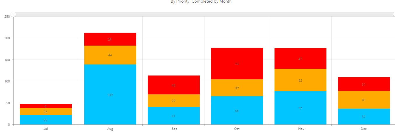
I have a panel in a dashboard showing the total orders completed by month in a bar chart. Each bar is divided into 3 sub categories showing total number of priorities. When I show all months the chart is stacked as
Priority 3 (red)
Priority 2 (orange)
Priority 1 (blue)
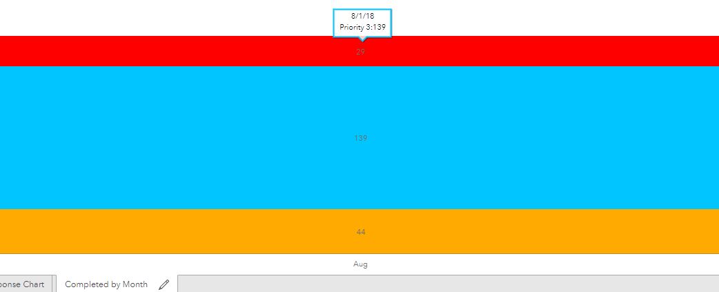
If I change to show a specific month the single bar re-arranges the sub categories seemingly randomly. For August I might get (starting from the top) red, blue, orange. For October it is orange, blue, red. I thought it might be ordering (ascending or descending) by the total number in each category but that is not the case.
Is this a known issue? Is there a way to preserve the order?
Solved! Go to Solution.
Accepted Solutions
- Mark as New
- Bookmark
- Subscribe
- Mute
- Subscribe to RSS Feed
- Permalink
Hi Mike,
This has recently been identified as a bug (# 000122651). Can you please contact Esri Tech Support to share your information - this may help us with resolving the issue.
Hope this helps,
- Mark as New
- Bookmark
- Subscribe
- Mute
- Subscribe to RSS Feed
- Permalink
Hi Mike,
This has recently been identified as a bug (# 000122651). Can you please contact Esri Tech Support to share your information - this may help us with resolving the issue.
Hope this helps,
- Mark as New
- Bookmark
- Subscribe
- Mute
- Subscribe to RSS Feed
- Permalink
Is there any update on when this issue might be fixed? We are still experiencing the random bar re-arranging when a user selects a different time period filter. I checked and couldn't find the bug (# 000122651) report anywhere on ESRI's website.