- Home
- :
- All Communities
- :
- Products
- :
- ArcGIS Dashboards
- :
- ArcGIS Dashboards Questions
- :
- Serial chart - display seasonality
- Subscribe to RSS Feed
- Mark Topic as New
- Mark Topic as Read
- Float this Topic for Current User
- Bookmark
- Subscribe
- Mute
- Printer Friendly Page
Serial chart - display seasonality
- Mark as New
- Bookmark
- Subscribe
- Mute
- Subscribe to RSS Feed
- Permalink
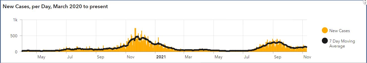
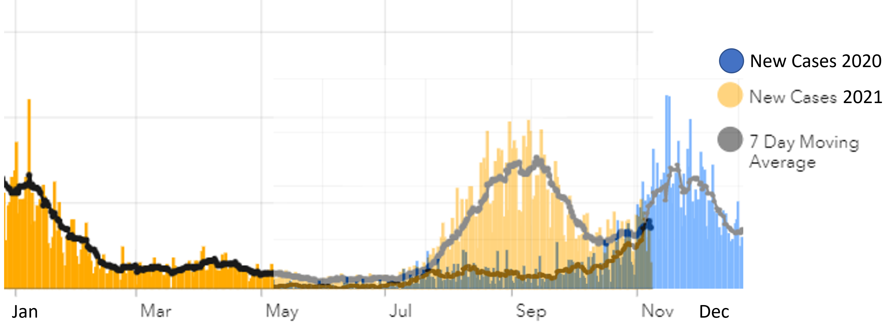
I have a multi-year COVID dataset (# new cases per day). Currently this is displayed as a traditional time series, incrementing on the x-axis by day (see attachment TraditionalTimeSeries.JPG). I've been asked to now show this dataset in a way that allows the user to see potential seasonality, by having the x-axis as months and days (BUT NO YEAR) and the y-axis as the # New Cases per Day, regardless of year. In this way, the chart would show the number of new cases on each calendar day "superimposed" for both 2020 and 2021. I've attached a fairly ugly mock up of the concept (Seasonality.png).
Any ideas on how I might accomplish this in Dashboard?
Washoe County GIS
Solved! Go to Solution.
Accepted Solutions
- Mark as New
- Bookmark
- Subscribe
- Mute
- Subscribe to RSS Feed
- Permalink
While the FeatureSet code suggested by @DominicRobergeIADOT looks promising, I couldn't make it work for me. Instead I created a SQL view that somewhat creatively uses a calculated field "fakeDate" to push all the data into a single arbitrary year (1,000 AD to avoid potential confusion with any "real" datetime) and pushed the COVID New Cases for each year into separate attribute fields. I published this view in a service and using this approach I can show the different years as series on a single chart and "fakeDate" as the Category axis.
SQL View table:

Dashboard Serial Chart:

SQL View definition is shown below:
SELECT ROW_NUMBER() OVER(ORDER BY reportdt ASC) AS OBJECTID, reportdt, NewCases AS NewCases2020, null AS NewCases2021, DATEADD(year, -1020, reportdt) AS fakeDate
FROM COVID_CASESTABLE WHERE
(reportdt BETWEEN '2019-12-31' AND '2021-01-01')
UNION ALL
SELECT ROW_NUMBER() OVER(ORDER BY reportdt ASC) AS OBJECTID, reportdt, null AS NewCases2020, NewCases AS NewCases2021, DATEADD(year, -1021, reportdt) AS fakeDate
FROM COVID_CASESTABLE WHERE
(reportdt BETWEEN '2020-12-31'AND '2022-01-01')
This might get a bit cumbersome if we end up tracking COVID for 10 years, but in the meantime this was a quick, relatively simple workaround, if admittedly involving a bit of smoke and mirrors...
Washoe County GIS
- Mark as New
- Bookmark
- Subscribe
- Mute
- Subscribe to RSS Feed
- Permalink
Hey Jay
you should look at creating a new Data Expression on the Serial Chart settings. You could then create a featureset on the fly , splitting your MONTH/DAY field(s) and get the results you are looking for. (the sample link could give you some good ideas as well)
Hope that can help you. Good luck!
// Write an expression that returns a FeatureSet.
// Documentation: https://arcg.is/3c419TD
// Samples: https://arcg.is/38SEWWz

var fs = FeatureSetByPortalItem(Portal('https://arcgis.com/'), 'YOURITEMID', 0, ["CallDateTime","callYear"], false);
var drFilter = "callYear in (2020,2021) and Agency in('AFD')"
var drSel = Filter(fs,drFilter)

//return count(drSel)

var combinedDict = {
  fields: [
    { name: "CallDateTime", type: "esriFieldTypeString" },
    { name: "callYear", type: "esriFieldTypeString" },
    { name: "callDay", type: "esriFieldTypeString" },
    { name: "callMonth", type: "esriFieldTypeString" },
    { name: "callMonthDay", type: "esriFieldTypeString" },
  ],
  geometryType: "",
  features: [],
};

var i = 0;
for (var d in drSel){
  combinedDict.features[i] = {
    attributes: {
      CallDateTime: d["CallDateTime"],
      callYear: d["callYear"],
      callDay: Day(d["CallDateTime"]),
      callMonth: ISOMonth(d["CallDateTime"]),
      callMonthDay: ISOMonth(d["CallDateTime"])+'-'+Day(d["CallDateTime"])
    },
  };
  i++;
        //return d["CallDateTime"] + " " + ISOMonth(d["CallDateTime"]) + " "+ Day(d["CallDateTime"])
}

//return combinedDict;
return FeatureSet(Text(combinedDict));

- Mark as New
- Bookmark
- Subscribe
- Mute
- Subscribe to RSS Feed
- Permalink
Good suggestion - thanks for the code sample. I'll try this and report back.
Washoe County GIS
- Mark as New
- Bookmark
- Subscribe
- Mute
- Subscribe to RSS Feed
- Permalink
While the FeatureSet code suggested by @DominicRobergeIADOT looks promising, I couldn't make it work for me. Instead I created a SQL view that somewhat creatively uses a calculated field "fakeDate" to push all the data into a single arbitrary year (1,000 AD to avoid potential confusion with any "real" datetime) and pushed the COVID New Cases for each year into separate attribute fields. I published this view in a service and using this approach I can show the different years as series on a single chart and "fakeDate" as the Category axis.
SQL View table:
Dashboard Serial Chart:
SQL View definition is shown below:
SELECT ROW_NUMBER() OVER(ORDER BY reportdt ASC) AS OBJECTID, reportdt, NewCases AS NewCases2020, null AS NewCases2021, DATEADD(year, -1020, reportdt) AS fakeDate
FROM COVID_CASESTABLE WHERE
(reportdt BETWEEN '2019-12-31' AND '2021-01-01')
UNION ALL
SELECT ROW_NUMBER() OVER(ORDER BY reportdt ASC) AS OBJECTID, reportdt, null AS NewCases2020, NewCases AS NewCases2021, DATEADD(year, -1021, reportdt) AS fakeDate
FROM COVID_CASESTABLE WHERE
(reportdt BETWEEN '2020-12-31'AND '2022-01-01')
This might get a bit cumbersome if we end up tracking COVID for 10 years, but in the meantime this was a quick, relatively simple workaround, if admittedly involving a bit of smoke and mirrors...
Washoe County GIS