Hi There,
Does anyone know if there is a way to override the category axis scale in Operations Dashboard?
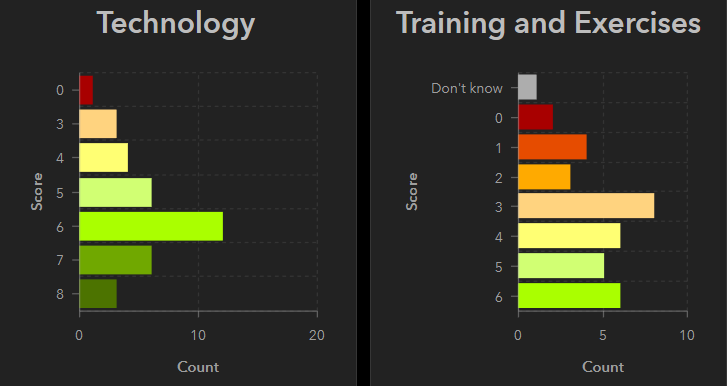
I have a dashboard with many serial bar charts (Operations Dashboard for ArcGIS ) and I want the category axis for each chart to appear the same regardless if a category has any values or not. In the example below each field has a range of possible categories from 0-8 or Don't know, but if those categories haven't yet been selected then the categories will not displace on the y-axis. Tried utilising override function for category axis but to no effect. By default it appears categories with no values will not be shown on the category axis and this can not be changed.
I'm aware an idea has been logged (Operations Dashboard - Scale on serial chart ) and I have voted that up but just wanted to check I am not missing something here?
Cheers
Derek