- Home
- :
- All Communities
- :
- Products
- :
- ArcGIS Dashboards
- :
- ArcGIS Dashboards Questions
- :
- Operations Dashboard; Activate Map with List
- Subscribe to RSS Feed
- Mark Topic as New
- Mark Topic as Read
- Float this Topic for Current User
- Bookmark
- Subscribe
- Mute
- Printer Friendly Page
Operations Dashboard; Activate Map with List
- Mark as New
- Bookmark
- Subscribe
- Mute
- Subscribe to RSS Feed
- Permalink
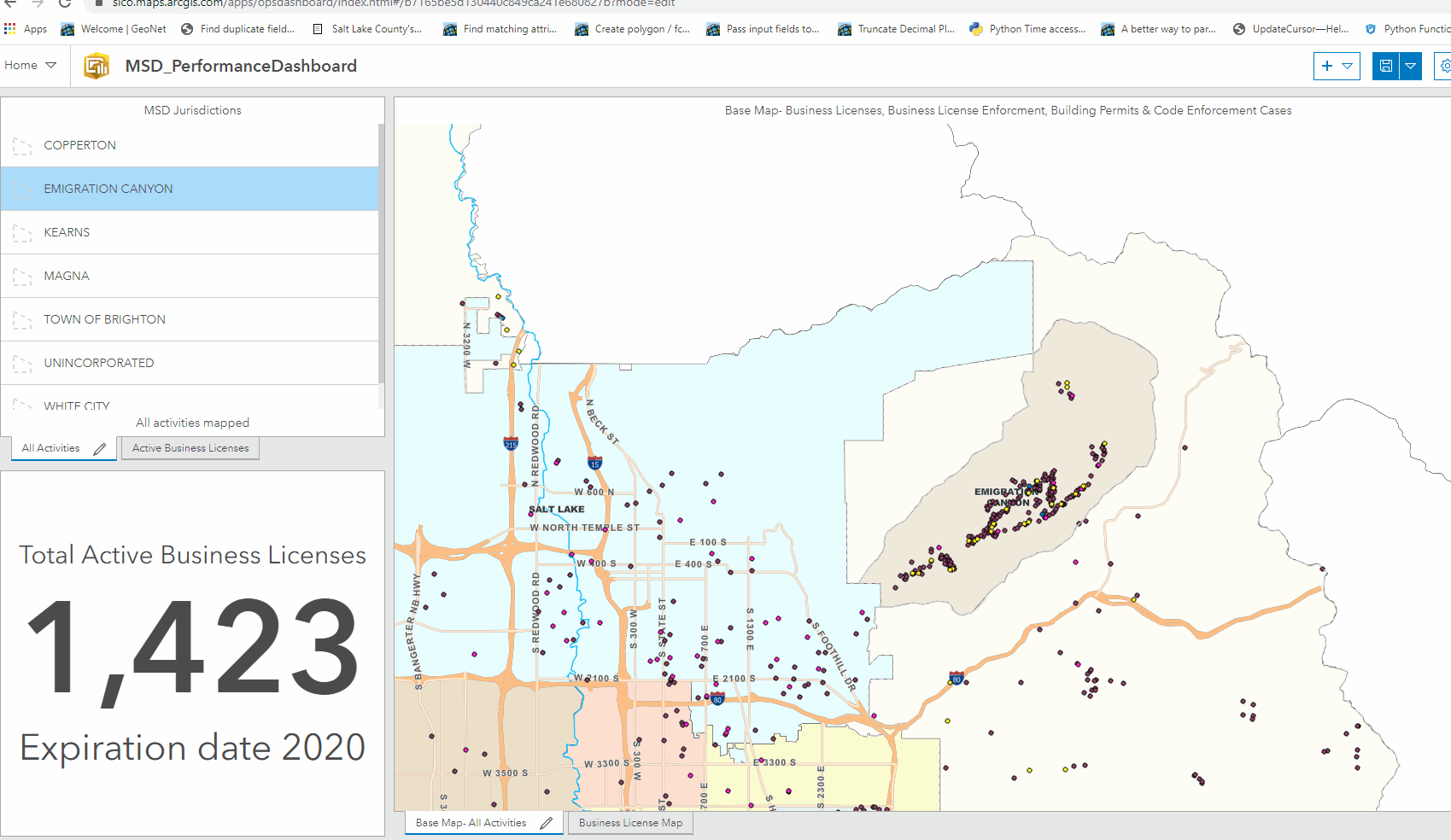
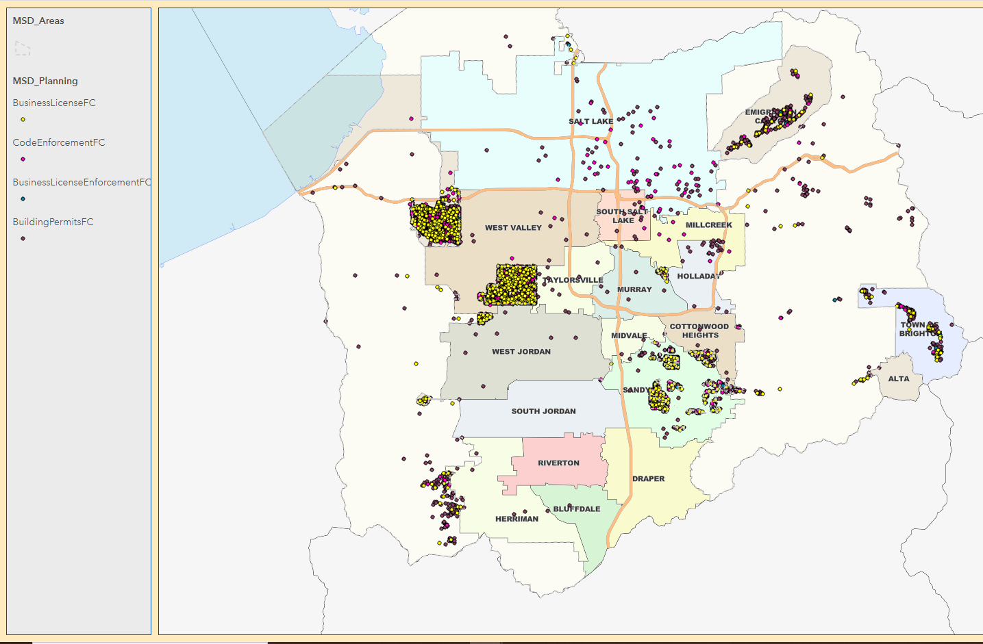
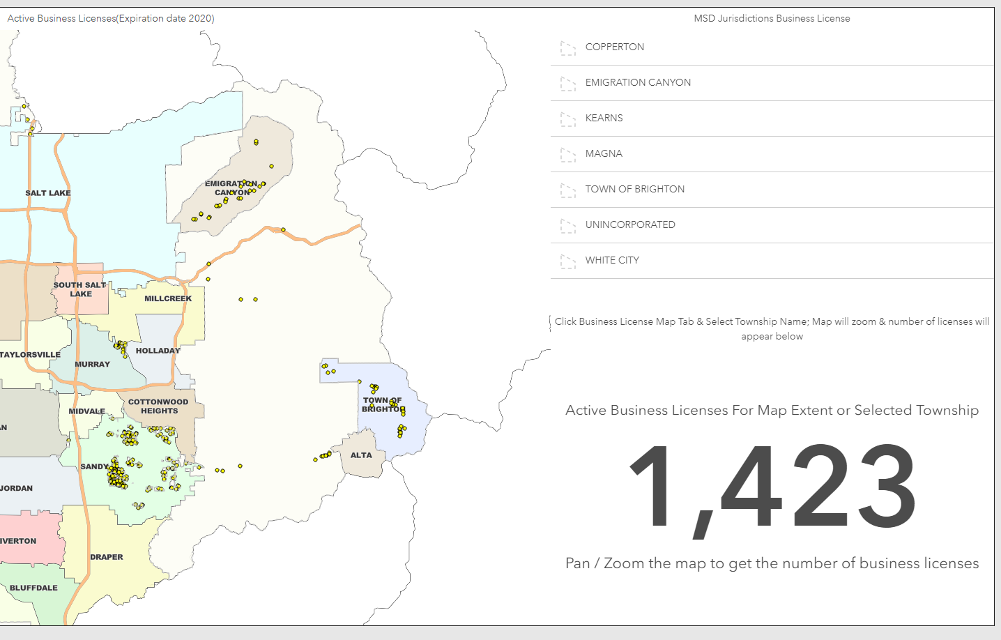
I have a couple lists, and a couple associated maps. The lists are stacked on top of each other as are the maps. Is there a method such that when I activate a given list, that activation will activate the associated map and vice-versa?
- Mark as New
- Bookmark
- Subscribe
- Mute
- Subscribe to RSS Feed
- Permalink
Hi Joe,
I'm not sure if you can do exactly what you are asking - if you can I'm also interested to know how!
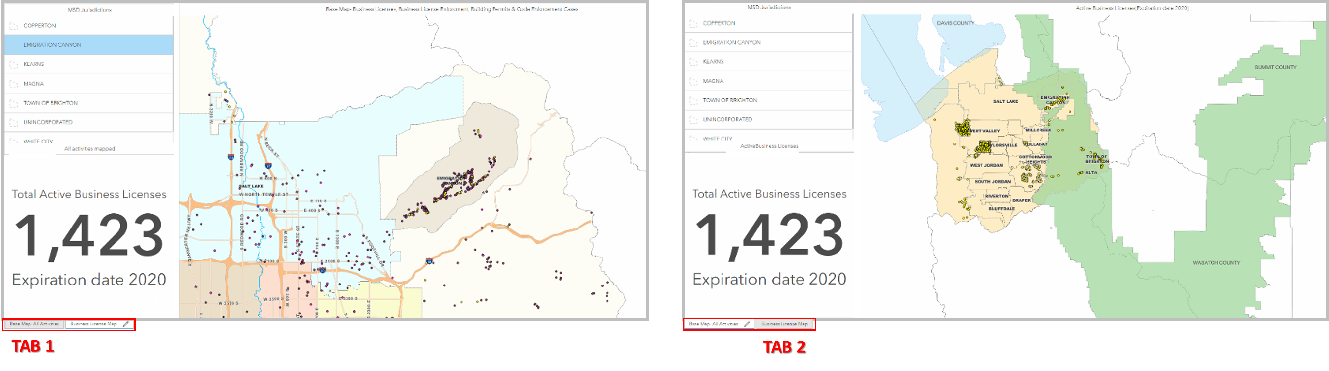
What you could do (in the meantime) is group (hold down Shift when moving) your first lot of List/Map/Indicator and group your second lot of List/Map/Indicator then stack the two groups. That way the list that matches the map is grouped with the map. You will need to duplicate your Indicator for this (to have the same layout for the dashboard). So you end up with two tabs for the dashboard. I have done this for a few dashboards to avoid confusion.
Overview here:
Dashboard layout—Operations Dashboard for ArcGIS | Documentation
If not available, dynamically activating the correct tab (through an Action?) from a List would be a great addition!
Hope this helps. Jamie.
- Mark as New
- Bookmark
- Subscribe
- Mute
- Subscribe to RSS Feed
- Permalink
The group approach is something I've done before but couldn't remember how to do it. Thanks! Look for an ideas post regarding hot-linking two different elements...
- Mark as New
- Bookmark
- Subscribe
- Mute
- Subscribe to RSS Feed
- Permalink
Yea.. grouping like elements is probably your best bet for now. Hot-linking two elements is a great idea though! I'll vote for it.
I would also like to see the ability to use grouped values in a list, not just serial charts and pie charts.
- Mark as New
- Bookmark
- Subscribe
- Mute
- Subscribe to RSS Feed
- Permalink
Once the items are grouped, it seems as though the borders between the elements go away; or am I missing some setting somewhere that will preserve them?
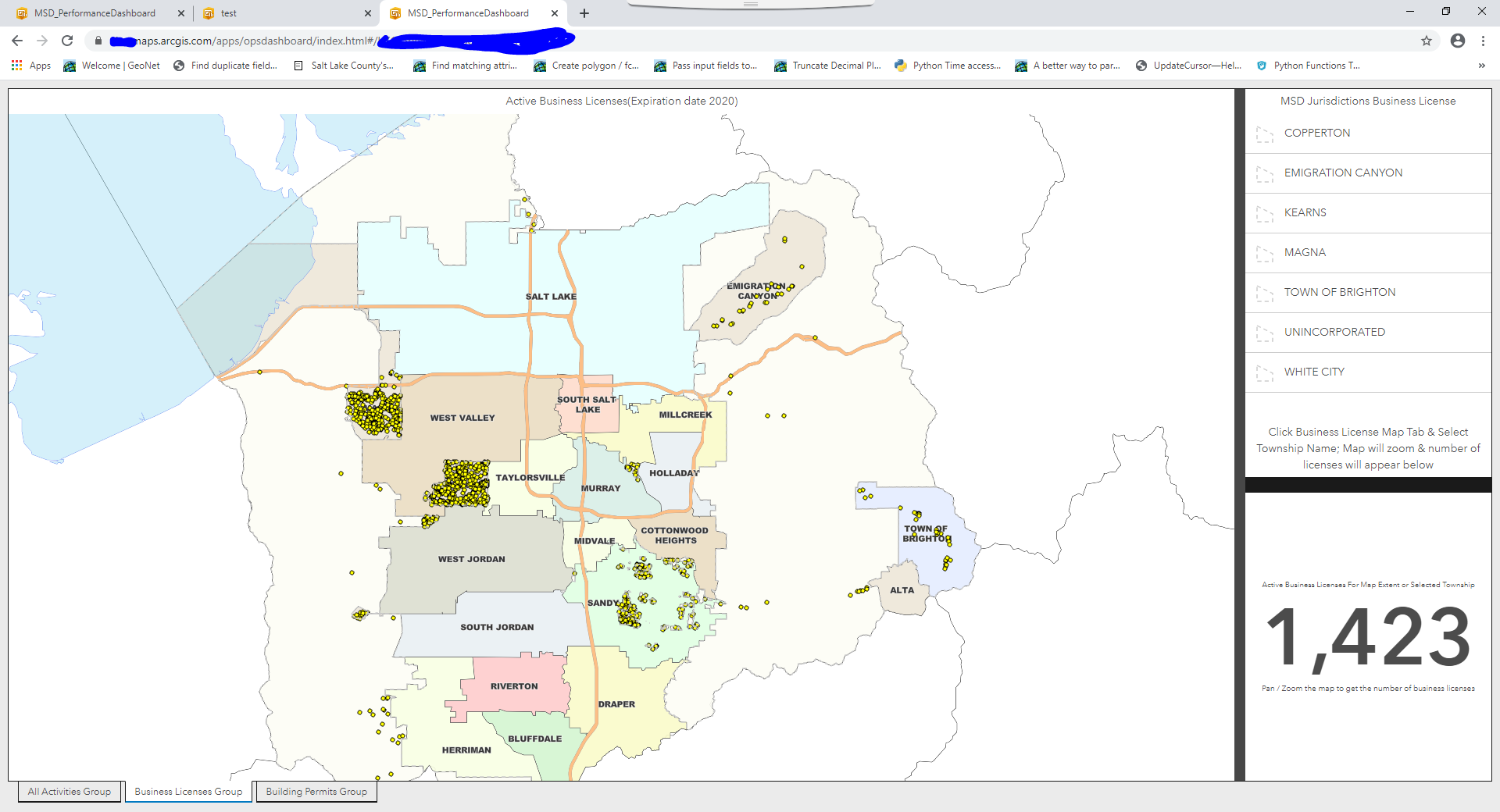
Simple, no-group:
Grouped elements. no borders between the 3 elements:
- Mark as New
- Bookmark
- Subscribe
- Mute
- Subscribe to RSS Feed
- Permalink
Yea that's an issue with grouping. It's a pain to maintain, but you can create borders between your elements using rich text elements. That's how I had the housing dashboard set-up.
- Mark as New
- Bookmark
- Subscribe
- Mute
- Subscribe to RSS Feed
- Permalink
I thought you had come up with a solution / work around for that!
- Mark as New
- Bookmark
- Subscribe
- Mute
- Subscribe to RSS Feed
- Permalink
For those following along, here is an example of what James is suggesting: the thick black borders between the map and the list / indicator as well as between the list and the indicator are actually two rich text elements that I squeezed down. Note though the difference in widths: hence the 'pain to maintain'.....
I think it's back to the drawing board for me. I have a number of dashboards that need to be created, so I may just create them individually.....
- Mark as New
- Bookmark
- Subscribe
- Mute
- Subscribe to RSS Feed
- Permalink
That's a bummer it's not really working out for ya. If you want to make each dashboard individually you could then present them all together by embedding the dashboards into separate Story Map Journal pages.
- Mark as New
- Bookmark
- Subscribe
- Mute
- Subscribe to RSS Feed
- Permalink
That's a really good idea!