- Home
- :
- All Communities
- :
- Products
- :
- ArcGIS Dashboards
- :
- ArcGIS Dashboards Questions
- :
- Re: Heat map style will not update based on date s...
- Subscribe to RSS Feed
- Mark Topic as New
- Mark Topic as Read
- Float this Topic for Current User
- Bookmark
- Subscribe
- Mute
- Printer Friendly Page
Heat map style will not update based on date selector
- Mark as New
- Bookmark
- Subscribe
- Mute
- Subscribe to RSS Feed
- Permalink
My operations dashboard on ArcGIS online has a map with records shown as both a point and a heat map, when using the date selector with associated action filters the point layer will update however the heat map does not.
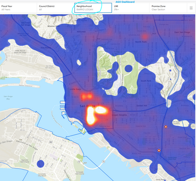
Below is a screen shot of web map from the dashboard which shows the heat map layer and the point layer, the heat map is reflecting all records in the layer but the point layer (3 green dots in centre) is filtering correctly via date selector actions. So why doesn't the heat map get regenerated based on the filtered records? The heat map is purely a style setting in the web map not a pre generated static density analysis output. All maps and content are stored on ArcGIS online with appropriate sharing rights. Zooming in/out forcing a refresh does not work.
My actions specified in the date selector tool - the 'Job Points layer' updates but the 'Job Heat Map' does not.
I thought a heat map would be popular to show on a dashboard but without the ability to filter records makes it almost useless. Any ideas? I am aware that I can do a 'static' pre set filter in the web map settings but it will not match the dates chosen for the dashboard making it confusing to viewers.
Cheers,
Graeme
Solved! Go to Solution.
- Mark as New
- Bookmark
- Subscribe
- Mute
- Subscribe to RSS Feed
- Permalink
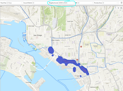
I am experiencing the same problem in AGO new dashboard. The Category Selector does not change a heat map, it will only change points. It appears to be a known bug https://support.esri.com/en/bugs/nimbus/QlVHLTAwMDEzOTUyMA==
The crazy thing is it does work in Enterprise 10.8.1
Can we please add back the ability to include a heatmap in dashboard. It makes stacked points much easier to see.
- Mark as New
- Bookmark
- Subscribe
- Mute
- Subscribe to RSS Feed
- Permalink
Now that Ops Dash Classic is officially being depreciated is there any update on a fix for this bug?
- Mark as New
- Bookmark
- Subscribe
- Mute
- Subscribe to RSS Feed
- Permalink
Good news, with the June 2022 update to ArcGIS Online this now appears to be resolved (and is working properly within my own dashboard)
- Mark as New
- Bookmark
- Subscribe
- Mute
- Subscribe to RSS Feed
- Permalink
Yep, seems like this is fixed. Works within my dashboards as well. Thanks for pointing this out!
- Mark as New
- Bookmark
- Subscribe
- Mute
- Subscribe to RSS Feed
- Permalink
that won't fix it in portal though...
- Mark as New
- Bookmark
- Subscribe
- Mute
- Subscribe to RSS Feed
- Permalink
Do I need to create multiple Hot Spot Analysis Features (one for each year) for this to work?
- Mark as New
- Bookmark
- Subscribe
- Mute
- Subscribe to RSS Feed
- Permalink
After the latest update to ArcGIS Online and ArcGIS Dashboards in June 2022, a heatmap layer can be filtered from a date selector or other elements.
- Mark as New
- Bookmark
- Subscribe
- Mute
- Subscribe to RSS Feed
- Permalink
great, now get it pushed into enterprise and portal.
- Mark as New
- Bookmark
- Subscribe
- Mute
- Subscribe to RSS Feed
- Permalink
How does one create a heat map layer with different years?
- Mark as New
- Bookmark
- Subscribe
- Mute
- Subscribe to RSS Feed
- Permalink
You would have a feature layer that contains a date field in your webmap and simply choose the symbology style of 'Heat Map'. WIthin a dashboard you can create a date filter for that layer if you wish and the heat map will dynamically update when toggling the filter.

