- Home
- :
- All Communities
- :
- Products
- :
- ArcGIS Dashboards
- :
- ArcGIS Dashboards Questions
- :
- Re: GUID/Related Table Question for Existing Data
- Subscribe to RSS Feed
- Mark Topic as New
- Mark Topic as Read
- Float this Topic for Current User
- Bookmark
- Subscribe
- Mute
- Printer Friendly Page
GUID/Related Table Question for Existing Data
- Mark as New
- Bookmark
- Subscribe
- Mute
- Subscribe to RSS Feed
- Permalink
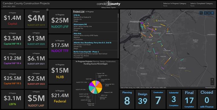
I have an existing Dashboard with Construction data on it. I've encountered a lot of issues with this data specifically where the data would just go corrupt suddenly and the dashboard would be unavailable. I've had to re-build this dashboard multiple times over the years, and recently, I just re-created the data from scratch to see if it would resolve the reoccurring issues.
Now that everything is resolved (yay!)... long story short, I don't want to modify anything unnecessarily, especially if it sends my data into a tailspin again. So here is my question.
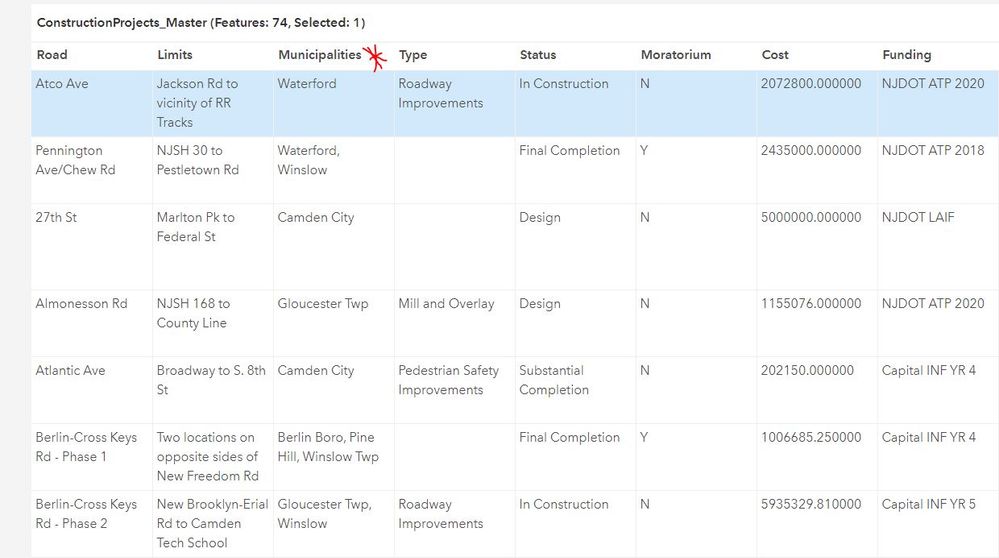
The intention of this dashboard is to see where our money is spent on Construction. The data is formatted by Funding Source, as you can see below. Many projects span multiple municipalities, so I have one field that just lists them out so they can be displayed on the pop-up.
Recently, an Administrator asked if we could display this data (in another dashboard) by Municipality. So think of bar charts rather than the $$ boxes. However, the data is not set up to display this currently, since the Municipal field I have just lists them out.
What is the easiest way to go about this? Like I said, I don't want to unnecessarily edit the data unless I have to. In the past, someone helped me add a Related Table and I took each construction project's GUID and entered it into the Related Table and typed the municipality there. But that was an older dataset, and I didn't think we needed it this time around.
If you're still reading, thanks for sticking around. I could really use the help on this one. The GUID/Related Table concept is really confusing for me. If there's an easier way, I'll take it!
Solved! Go to Solution.
Accepted Solutions
- Mark as New
- Bookmark
- Subscribe
- Mute
- Subscribe to RSS Feed
- Permalink
Well, if it's just breaking up that field, a Data Expression could handle this.
Check out this example, which takes a comma-delimited field and breaks it up to display the chart correctly. The same idea could as easily apply to a bar chart, or even to individual indicators, etc.
If you need the chart to be dynamic, the expression would need a bit of reworking. But to just get the per-municipality count, this will do it.
Kendall County GIS
- Mark as New
- Bookmark
- Subscribe
- Mute
- Subscribe to RSS Feed
- Permalink
When a project spans municipalities, are you somehow tracking the costs proportionate to each? Or does your admin just want to see "X projects were in / partially in Municipality Y"?
Kendall County GIS
- Mark as New
- Bookmark
- Subscribe
- Mute
- Subscribe to RSS Feed
- Permalink
Hi Josh,
Thank you for getting back to me on this, I appreciate it.
No, we are not tracking cost per Municipality. It's just the overall cost per project.
For the new Dashboard, they want the same data displayed (minus the cost widgets on the left), and they just want to see "X Municipality has 3 projects", "X Municipality has 7 projects" - displayed in chart form, such as a bar chart. So that we can see where the focus is.
As I stated in the initial post, I previously had a Related Table linked to the data where I did this via the GUID & Related Table, but I was not the one who set it up (and do not have access to this person moving forward). And since I re-created the data from scratch, I did not set it up that way since Municipal counts were not requested from Administration. But now they are.
Here's an example of what the data looks like:
- Mark as New
- Bookmark
- Subscribe
- Mute
- Subscribe to RSS Feed
- Permalink
Well, if it's just breaking up that field, a Data Expression could handle this.
Check out this example, which takes a comma-delimited field and breaks it up to display the chart correctly. The same idea could as easily apply to a bar chart, or even to individual indicators, etc.
If you need the chart to be dynamic, the expression would need a bit of reworking. But to just get the per-municipality count, this will do it.
Kendall County GIS
- Mark as New
- Bookmark
- Subscribe
- Mute
- Subscribe to RSS Feed
- Permalink
Oh wow, that example does look like it could work! This looks great.
I assume that I would need to replace most of the data within the expression, right? I haven't ever played with anything this complex, but I understand the general idea of creating queries/etc.
Where would I enter this expression? Within the widget configurations?
Thank you again for all of your help with this.
- Mark as New
- Bookmark
- Subscribe
- Mute
- Subscribe to RSS Feed
- Permalink
It's a lot to wrap your head around initially, but once you get the hang of them, Data Expressions aren't too bad.
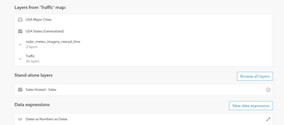
You'll need to create the Data Expression as though it were a new layer in your dashboard. When you add a new widget, you can see a section at the bottom for data expressions, and a button to add a new one.
Click to add a new expression, and that is where you would put all the code. And yes, you'll need to swap in your own values for:
- Portal URL (line 2)
- ItemID (line 5)
- Layer Index (line 6)
- Required Fields (line 7)
- Municipalities field name (line 17)
Kendall County GIS
- Mark as New
- Bookmark
- Subscribe
- Mute
- Subscribe to RSS Feed
- Permalink
Thank you so much Josh!
I appreciate your help. I am going to give this a shot over the next few days and once I complete it, then I will accept your suggestion as the solution.
- Mark as New
- Bookmark
- Subscribe
- Mute
- Subscribe to RSS Feed
- Permalink
Hi Josh,
Can we back up for one quick second? I opened up my new Dashboard and added a Serial Chart, selected the layer with the data, and I do not see a Data Expressions section. I think I may be in the wrong place. I'm super familiar with creating Dashboards, and I don't recall seeing that before. I'm currently in the Serial Chart configuration settings, and I went through all the tabs.
Thank you again.
**UPDATE** I see it now. Sorry, I prematurely commented. Will let you know how it goes!
- Mark as New
- Bookmark
- Subscribe
- Mute
- Subscribe to RSS Feed
- Permalink
Hi Josh,
Sorry for multiple messages.
I pasted in the code from the website you sent me and it says "Unable to parse script. Check your syntax". So I just continued modifying the script anyway, but it still says it for Line 24. Would you be able to look it over and let me know what you think? I put Line 24 in bold. If a screenshot is easier since it has the spacing, let me know.
// Reference layer using the FeatureSetByPortalItem() method.
var portal = Portal('https://sql2017.w2k.co.camden.nj.us/')
var fs = FeatureSetByPortalItem(
portal,
'7685831f1c4c4592ac7930bda21c9085',
0,
['Municipalities'],
false
);
// Create empty array for features and feat object
var features = [];
var feat;
// Split comma separated hazard types and store in dictionary.
for (var feature in fs) {
var split_array = Split(feature["Municipalities"], ',')
var count_arr = Count(split_array)
for(var i = 0; i < count_arr; i++ ){
feat = {
'attributes': {
'split_choices': Trim(split_array[i])
}
Push(features, feat);
}}}
// Empty dictionary to capture each hazard reported as separate rows.
var choicesDict = {
'fields': [
{ 'name': 'split_choices', 'type': 'esriFieldTypeString'}],
'geometryType': '',
'features': features
};
// Convert dictionary to featureSet.
var fs_dict = FeatureSet(Text(choicesDict));
// Return featureset after grouping by hazard types.
return GroupBy(fs_dict, ['split_choices'],
[{ name: 'split_count', expression: 'split_choices', statistic: 'COUNT' }]);
A side note: I also will need to add something in the code that basically says to only include features that fall under our "Status" Domain as: Planning, In Design, and In Construction. We also have Substantial Completion, Final Completion and Closed with Finance that are considered "completed" projects, and will not be on this bar chart. I think I'll need to have two charts - one for the first 3 categories, and another for the last 3 categories. Hopefully this makes sense. I basically need to query the data for the bar chart to only include specific categories of projects.
Thank you again for your time and help.
- Mark as New
- Bookmark
- Subscribe
- Mute
- Subscribe to RSS Feed
- Permalink
Ah, whoops! Looks like I didn't test this one enough, there's a misplaced bracket.
Add a second bracket to line 23, and remove one of the three brackets on line 25.
Kendall County GIS


