- Home
- :
- All Communities
- :
- Products
- :
- ArcGIS Dashboards
- :
- ArcGIS Dashboards Questions
- :
- Re: Arcade Expression for Separating "Multiple Cho...
- Subscribe to RSS Feed
- Mark Topic as New
- Mark Topic as Read
- Float this Topic for Current User
- Bookmark
- Subscribe
- Mute
- Printer Friendly Page
Arcade Expression for Separating "Multiple Choice" responses in Serial Chart
- Mark as New
- Bookmark
- Subscribe
- Mute
- Subscribe to RSS Feed
- Permalink
Hello everyone,
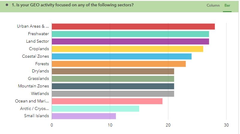
I am working on a dashboard that reports the activities of stakeholders, using data from Survey123, and my client is asking for more dynamic graphs. My problem is with the Multiple Choice responses using Survey123. I want to graph each response option category separately, with the number of responses for each category, but with the built-in options, the graphs (serial and pie chart) produce a unique category for each of the 64 stakeholder responses with the multiple choices separated by commas. I've attached a photo of what this looks like, as well as what I want the graph to look like, as it does in Survey123's "Analyze" tab.
It sounds like I need to use Arcade for this. I found a link to an example expression in a separate post and gave it a try: https://github.com/Esri/arcade-expressions/blob/master/dashboard_data/SplitCategories(PieChart).md
I changed the code to this:
// Reference layer using the FeatureSetByPortalItem() method.
var portal = Portal('https://www.arcgis.com')
var fs = FeatureSetByPortalItem(
portal,
'4a4974e1b74a45b2bbfc48d95c431e88',
0,
['GEO_focus'],
false
);
// Empty dictionary to capture each choice reported as separate rows.
var choicesDict = {'fields': [{ 'name': 'split_choices', 'type': 'esriFieldTypeString'}],
'geometryType': '', 'features': []};
var index = 0;
// Split comma separated choices and store in dictionary.
for (var feature in fs) {
var split_array = Split(feature["GEO_focus"], ',')
var count_arr = Count(split_array)
for(var i = 0; i < count_arr; i++ ){
choicesDict.features[index++] = {
'attributes': { 'split_choices': Trim(split_array[i]),
}
}}}
// Convert dictionary to featureSet.
var fs_dict = FeatureSet(Text(choicesDict));
// Return featureset after grouping by hazard types.
return GroupBy(fs_dict, ['split_choices'],
[{ name: 'split_count', expression: 'split_choices', statistic: 'COUNT' }]);
What I want is for the ecosystem types to appear on the x axis with the counts on the y axis. I've attached photos for what this expression translates into in graphic form in the dashboard. I'm not a programmer, so any help would be very much appreciated.
Thank you in advance!
Solved! Go to Solution.
Accepted Solutions
- Mark as New
- Bookmark
- Subscribe
- Mute
- Subscribe to RSS Feed
- Permalink
You're really 99% of the way there. The issue is with the chart configuration, not the expression.
When you set a chart to Grouped Values and use the statistic Count, it's counting the number of rows in the data table per category. Since your rows are already grouped together by the final GroupBy function in your expression, that gives you 1 for each category.
What you need to do is set the statistic to Sum, and it will give you to total value of the grouped field, as opposed to the number of rows.
Kendall County GIS
- Mark as New
- Bookmark
- Subscribe
- Mute
- Subscribe to RSS Feed
- Permalink
Hi Josh,
I can't thank you enough for your help! Another quick question: The "split_count" would be the total count for each of the choices or categories, and would be used for "field", correct?
Thank you again for your help!
- Mark as New
- Bookmark
- Subscribe
- Mute
- Subscribe to RSS Feed
- Permalink
Yes, "split_count" is your field that you're summing.
You're welcome!
Kendall County GIS
- Mark as New
- Bookmark
- Subscribe
- Mute
- Subscribe to RSS Feed
- Permalink
Hello! Thank you for the solution.
But I do not understand how I can do it! can you please assist me step by step?
Thank you so much
- Mark as New
- Bookmark
- Subscribe
- Mute
- Subscribe to RSS Feed
- Permalink
Is there a way to do this and break the results down further based on other data?
I am have audit data from survey 123 and this has been great for breaking down the multiple field data but I now want to be able to filter it based on a few other fields.
is this possible?
- Mark as New
- Bookmark
- Subscribe
- Mute
- Subscribe to RSS Feed
- Permalink
Hi! I was having the same issue. I can create the serial chart, but I want to be able to further filter it based on other widgets on my dashboard. I Suspect I would have to add more fields to the return array. Have you been able to figure this out?
- Mark as New
- Bookmark
- Subscribe
- Mute
- Subscribe to RSS Feed
- Permalink
I am trying to do the same! Let me know if you ever figured it out, please.
The split_count arcade worked great for my serial chart, but now I want it to filter other charts. Hoping there is an arcade solution to also create an array/list using GUID or something.
I have days of the week broken into the split_choices. Hoping to click "Friday" on the serial chart and filter features that contain that value.
- Mark as New
- Bookmark
- Subscribe
- Mute
- Subscribe to RSS Feed
- Permalink
This thread has some helpful code samples https://community.esri.com/t5/arcgis-dashboards-questions/arcade-split-comma-delimited-value-into-mu...
- Mark as New
- Bookmark
- Subscribe
- Mute
- Subscribe to RSS Feed
- Permalink
Hello!
Thank you for the solution, but I do not know how to do that, can you please show me step by step?