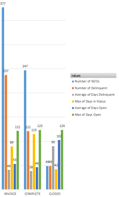
I am trying to use Ops Dashboard Serial Chart to recreate a graph made from pivot tables in excel where the Grouped Values Category Field is our "status" field and is split by various statistics. Essentially we need each bar in the grouped chart to be pulled from another field in the table and calculated as a count, avg, max value, etc. Does anyone know how to create a chart that allows the Category Field to be split by multiple fields to appear in the serial chart with this functionality?
Ryan O'Quinn