- Home
- :
- All Communities
- :
- Products
- :
- ArcGIS Dashboards
- :
- ArcGIS Dashboards Ideas
- :
- Ops Dashboard List Widget - Conditional Formatting...
- Subscribe to RSS Feed
- Mark as New
- Mark as Read
- Bookmark
- Follow this Idea
- Printer Friendly Page
Ops Dashboard List Widget - Conditional Formatting of Background Color
- Mark as New
- Bookmark
- Subscribe
- Mute
- Subscribe to RSS Feed
- Permalink
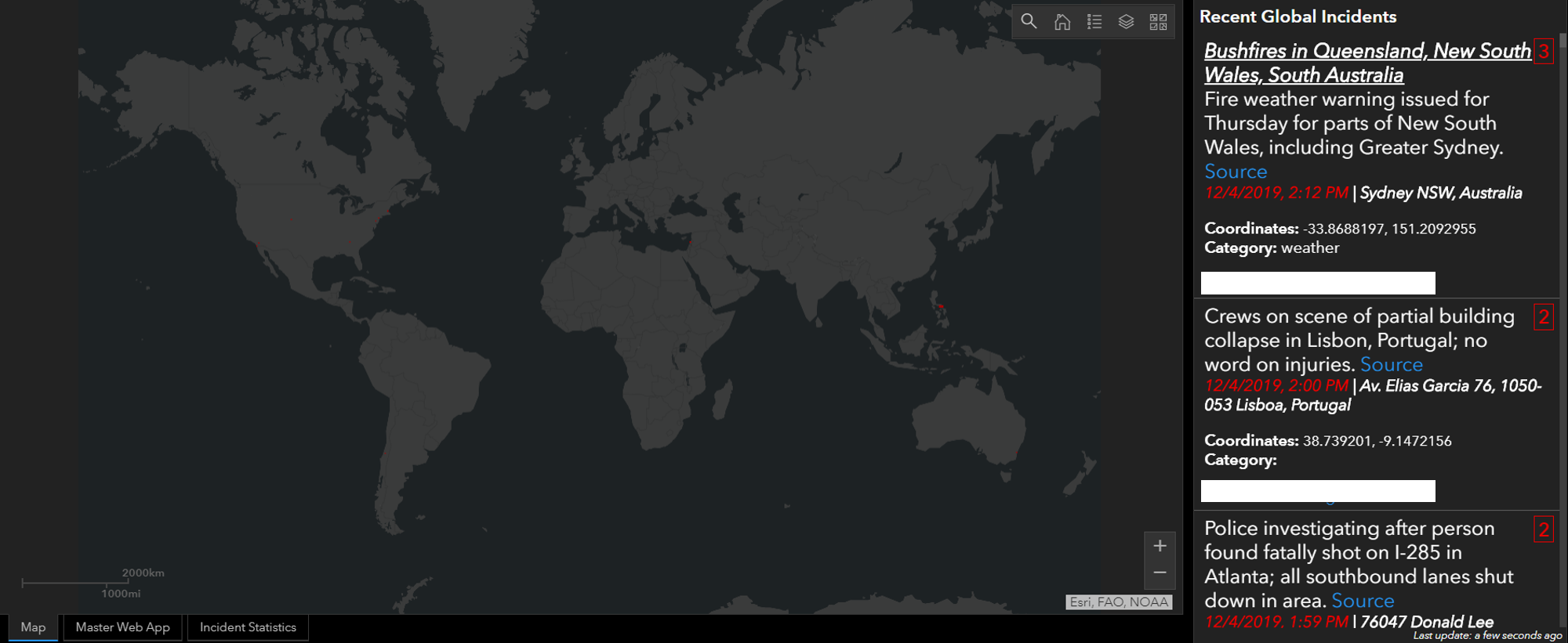
We utilize the Ops Dashboard's List widget as part of our incident management dashboard. The widget displays a live feed of breaking news events, all of which have been assigned a severity level. It would be incredibly beneficial for our watch floor analysts to quickly identify the severity of an incident by the tile's background color. For example, severity 5 incident tiles will turn red or incidents within 5 miles of an asset will turn yellow.
@RiannaAylward ArcGIS Dashboards Beta provides the ability to conditionally format Lists and Indicators via Arcade. Your example of "severity 5 incident tiles will turn red" example should be possible in the Beta today. Your "incidents within 5 miles of an asset will turn yellow" will not. To do this, you'd probably need to process/analyze your data in a way that it results in a 'closest asset' field which stores a number. Then, Arcade could be used to color based on the value in that field.
Thanks @patrickb - any timeline for when the Beta capabilities will be available in Enterprise? We deployed a workaround by creating a hexcode field that is populated in GeoEvent, but we would prefer to apply this logic via what you describe above.
ArcGIS Dashboards now supports Arcade in two ways: data expressions and advanced formatting. Used individually or together, these new additions open up many new possibilities. Examples were recently shown at the Esri Developer's Summit. A collection of samples has also been started on GitHub.
Currently, these new capabilities are available in ArcGIS Online only. We are targeting their inclusion for Enterprise 10.9.1.
You must be a registered user to add a comment. If you've already registered, sign in. Otherwise, register and sign in.