- Home
- :
- All Communities
- :
- Products
- :
- ArcGIS Dashboards
- :
- ArcGIS Dashboards Ideas
- :
- Operations Dashboard Suggestions
- Subscribe to RSS Feed
- Mark as New
- Mark as Read
- Bookmark
- Follow this Idea
- Printer Friendly Page
Operations Dashboard Suggestions
- Mark as New
- Bookmark
- Subscribe
- Mute
- Subscribe to RSS Feed
- Permalink
Two ideas here, and I know ESRI is actively working on #1.
1) Operations Dashboard needs the ability to size widgets equally. The idea of eyeballing height and width of widgets is poor, especially if an dashboard is utilizing many widgets across its space.
2) I apologize if this one has been previously posted. I don't know if this is possible, but resolution responsiveness needs to be "baked" into Operations Dashboard. My screen is set for high resolution, however we have several wall "monitors" throughout our organization that are often set at 720p with resolution differences for easy viewing by individuals in back of rooms/spaces. Often, a Dashboard built on high resolution will be have differently on lower resolutions. Is this even possible to account for in responsiveness? Not sure, but if it is it needs to be looked into.
I found a tool that super imposes a ruler on the screen and I use that to set the sizes makes short work of getting things equal or sized
I have the same problem mainly for #2 - I design the dashboard on my nice big screen and already doing the presentation with a projector forced to a resolution of 1024 pixels width it does not look very nice any longer. There is definitely a need of making it responsive to screen sizes and/or to have the option to test it for different resolutions/screen sizes without having to change the settings from my computer. I noticed that there is a certain degree of responsiveness with the web appbuilder dashboard layout but I generally prefer the operations dashboard in most of the cases.
#1: The ability to size widgets equally has been implemented and will be released as part of the December 2021 upgrade of ArcGIS Online.
#2: In their current implementation, dashboards will always take up 100% of the screen real estate, regardless of device They should be authored/designed at the resolution at which they will be displayed. We are definitely open to feedback on whether the 100% layout is meeting requirement/expectations, but that should be submitted as a separate idea for voting/tracking.
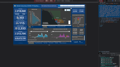
In the meantime, a tip: If you have a high resolution monitor and know a dashboard will be displayed on a monitor with less resolution, some browser developer tools (e.g. Chrome) allow you to toggle a device toolbar and set the resolution.
Closing this one due to lack of new activity.
1) Dashboards has the ability to distribute the width/height of its rows and columns evenly (since December 2021).
2) The idea to be able to author dashboards at different resolutions should be submitted separately for stakeholders to vote on.
You must be a registered user to add a comment. If you've already registered, sign in. Otherwise, register and sign in.
