- Home
- :
- All Communities
- :
- Products
- :
- ArcGIS Dashboards
- :
- ArcGIS Dashboards Ideas
- :
- Operations Dashboard: Serial Chart - Y Axis Scalin...
- Subscribe to RSS Feed
- Mark as New
- Mark as Read
- Bookmark
- Follow this Idea
- Printer Friendly Page
Operations Dashboard: Serial Chart - Y Axis Scaling
- Mark as New
- Bookmark
- Subscribe
- Mute
- Subscribe to RSS Feed
- Permalink
G'day All
I have noticed (for stacked bar charts at least) that an additional value is added to the axis when not required.
This may be to allow some room for a label for some other styles, though a label is not always placed above a bar for other styles and for a stacked chart, labels are placed within a bar.
My current chart has values to 20, and with a Y axis of 30, one third of the space is 'wasted.'
Can the value calculation, at least for a stacked chart, allow for the axis maximum to be equal to the data maximum.
Configuring a max value will not work as the chart is interactive and the data is updated automatically once a day.
The below may help to visualise. It would be great if the max value was 20.
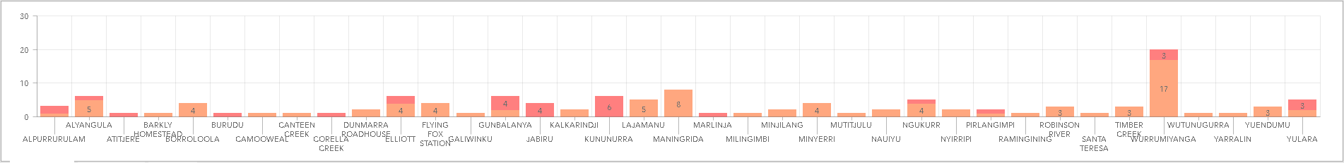
Thanks
@EdKnowles Closing this one as what you are seeing might be an issue that Support could help with. The value axis is supposed to automatically determine the values automatically. For customers who want/need more control, we offer the ability to manually set the value axis's minimum and maximum values.

G'day @patrickb
Unfortunately my axis values are dynamic so having a fixed value will not work for my situation.
Each day I reprocess the input data and the axis could be anything from 20 to 100.
The inbuilt auto determination seems to be more of a boundary condition (with the stacked style).
The above screenshot ideally would have set the scale max to 20 rather than adding the buffer.
For non stacked charts it makes a little sense, as this would then allow room for the label that appears above the bar. Stack charts have the label on the bar.
Hope this makes sense.
You must be a registered user to add a comment. If you've already registered, sign in. Otherwise, register and sign in.